Lecture: Correlation vs Linear Models

Relationships

Bill Perry

Where We Left Off

Covered last time:

  • A design has two jobs: kill bias, shrink sampling error
  • Controls, randomization and blinding; replication, balance and blocking
  • Natural versus manipulative experiments, and what each one licenses you to say
  • Your design has already chosen your analysis

Note

✅ Where today sits on that map

  • Last week ended with a table mapping designs onto analyses.
  • Today is its first row — one continuous predictor, one continuous response.
  • Everything after today adds predictors or changes their type. The machinery stays the same.

Part 1 · Overview

Today’s Objectives

Two techniques, one idea — a straight line through a cloud of points:

  • Correlation — how tightly do two variables move together?
  • Regression — what equation predicts Y from X?
  • Assumptions for each, and what to do when they fail
  • Sums of squares — how a fitted line becomes an ANOVA table

This lecture runs over two class days: correlation first, regression second.

📥 Booby data 📥 Rope trick data 📥 Lion data 📥 Script skeleton (.R)

Note

📖 Reading

  • Whitlock & Schluter, Ch. 16 (Correlation) and Ch. 17 (Regression).
  • Gotelli & Ellison, Ch. 9 (Regression).

🗳️ How Today Works

Warning

🗳️ Six times over the two days, you make the call

Six slides are marked 🗳️ DECIDE. Each asks a multiple-choice question, and I will not tell you the answer on that slide.

How it works: write your letter down — actually write it — then hold up fingers 1–4. If the room splits, turn to the person next to you, argue for ninety seconds, and we vote again. Nothing here is graded. The point is that you commit before you find out.

Part 2 · Correlation vs. Regression

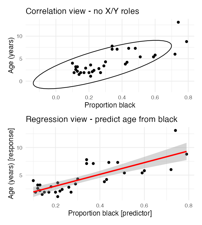
Correlation vs. Regression — What’s the Difference?

Correlation

  • Measures the strength and direction of a relationship
  • Both X and Y are measured; neither is manipulated
  • The variables are on equal footing — swap them and r is unchanged
  • r2 = percent variation explained
  • One number, from −1 to +1

Regression

  • Produces an equation predicting Y from X
  • You assume a direction, X → Y, when you choose which is which - Y is dependent on X
  • Swap X and Y and you get a different line - and it becomes a different type of regression
  • Gives you a slope, an intercept, and predictions

Two stacked scatterplots of the same lion data: the top panel shows the correlation view with a confidence ellipse and no predictor/response distinction, the bottom shows the regression view with a fitted line predicting age from proportion black.

Choosing X Does Not Make It a Cause

Warning

⚠️ Regression does not earn you causation

lm(y ~ x) will fit a slope to any two numeric columns you hand it, including ones with no causal link at all. Putting a variable on the right-hand side is a decision you made, not a finding.

What licenses a causal claim is the study design — manipulation, randomization, controls — not the model you fit afterwards.

Last week’s inference gradient, in one line: the same lm() output supports a weak claim from an observational survey and a strong claim from a randomized experiment. The design decides which one you are allowed to write.

Note

Which do I report?

  • Both variables measured, no direction implied → correlation
  • One variable predicts or sets the other, or you want predictions → regression
  • Reporting both is fine; claiming cause from either is not

Part 3 · Correlation Analysis

What Is Correlation?

Correlation measures the strength and direction of a linear relationship between two numerical variables. It runs from −1 to +1:

  • +1 — perfect positive
  • 0 — no linear relationship
  • −1 — perfect negative

The Pearson correlation coefficient:

\[r = \frac{\sum_{i}(X_i - \bar{X})(Y_i - \bar{Y})}{\sqrt{\sum_{i}(X_i - \bar{X})^2 \sum_{i}(Y_i - \bar{Y})^2}}\]

which is

\[r = \frac{\text{Covariance}(X, Y)}{s_X \cdot s_Y}\]
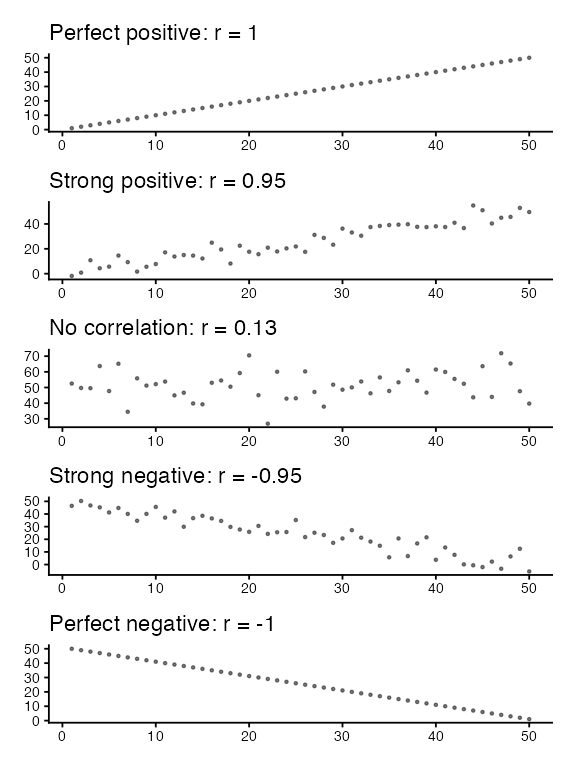
Five stacked scatterplots illustrating correlation strength from perfect positive through strong positive, none, strong negative, to perfect negative, each titled with its correlation coefficient.

🗳️ DECIDE · Which One Has r Closest to Zero?

Four datasets, plotted on the right. No correlation coefficients shown — on purpose.

Which panel has the Pearson correlation closest to zero?

  1. Panel A
  2. Panel B
  3. Panel C
  4. Panel D

Warning

✍️ Write your letter down, then vote.
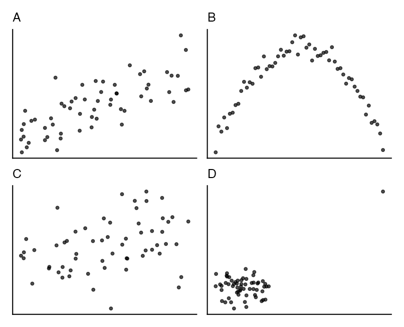
Four unlabelled scatterplots: A a moderate positive linear cloud, B a tight symmetric arch, C a diffuse cloud, D a flat cloud with one distant high point.

What r Can and Cannot See

Important

✅ The answer is (b) — Panel B.

  • Panel B is the most tightly related pair on the slide: give me x and I can tell you y almost exactly.
  • Its correlation is near zero anyway, because the relationship is an arch, not a line.
  • Panel C looks like the messiest, so most rooms vote (c). It has a weak but genuine linear trend, so its r sits farther from zero than B’s.
  • r measures one thing only: how close the points lie to a straight line.
  • A perfect relationship with a curve in it reads as “no correlation.”
  • Panel D is the other warning — a single far-out point can manufacture a large r out of a cloud with no trend in it.
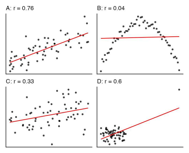
The same four scatterplots, now labelled with their Pearson correlation coefficients, showing the arch panel has r near zero despite being the tightest relationship.

Always plot the data before you trust a correlation coefficient.

Example 16.1 · Flipping the Bird

Nazca boobies (Sula granti): do the visits a chick receives from non-parent adults predict how aggressive it is as an adult?

booby_df <- read_csv("data/booby_aggression.csv")

cor.test(booby_df$visits_as_nestling,
         booby_df$future_aggression)

    Pearson's product-moment correlation

data:  booby_df$visits_as_nestling and booby_df$future_aggression
t = 2.9603, df = 22, p-value = 0.007229
alternative hypothesis: true correlation is not equal to 0
95 percent confidence interval:
 0.1660840 0.7710999
sample estimates:
      cor 
0.5337225 
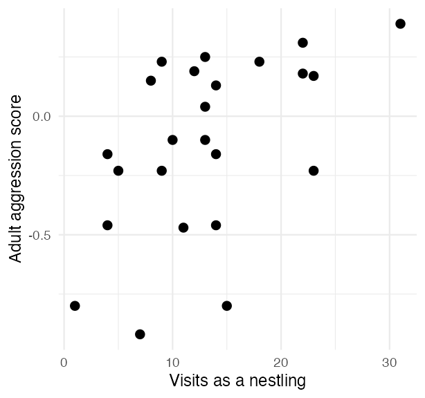
Scatterplot of Nazca booby adult aggression score against the number of nestling visits from non-parent adults, showing a positive trend.

Example 16.1 · Interpretation

r = 0.534 — a moderate positive relationship, p = 0.00723.

  • Square it for the variance explained: r² = 0.285, so about 28.5% of the variation in one variable is accounted for by the other
  • Standard error: \(\text{SE}_r = \sqrt{\dfrac{1-r^2}{n-2}}\) = 0.18
  • Tested with a t-test: \(t = r / SE_r\), df = n − 2

In words: boobies visited more often as nestlings tend to be more aggressive adults. Nothing here says the visits caused it.

Note

🔮 Predict first

Next we run Shapiro-Wilk on both booby variables, then look at their histograms and QQ plots.

If the formal test and the picture disagree at n = 24, which would you trust?

Testing Assumptions for Correlation

Pearson correlation assumes:

  1. Random sampling from the population
  2. Bivariate normality — each variable normal, and normal jointly
  3. A linear relationship — not a curve
  4. No extreme outliers driving the result
shapiro.test(booby_df$visits_as_nestling)

    Shapiro-Wilk normality test

data:  booby_df$visits_as_nestling
W = 0.95783, p-value = 0.3965
shapiro.test(booby_df$future_aggression)

    Shapiro-Wilk normality test

data:  booby_df$future_aggression
W = 0.91575, p-value = 0.04709

Note

H₀ is “these data ARE normal”

A large p-value is the good outcome — the same backwards logic as Levene’s test.

Checking the Same Assumptions by Eye

The two tests do not agree with each other:

  • visits, p = 0.396 — clean
  • aggression, p = 0.047 — just under 0.05

Now look at the pictures. No strong skew, points close to both QQ lines, and the scatterplot was straight rather than curved.

Important

✅ This is the case the last slide asked you to predict

At n = 24, a normality p of 0.047 is a coin-flip verdict, not evidence of a real problem. W&S report Pearson’s r for these data, and so do we.

Compare that with the next dataset, where the test and the picture agree that something is wrong.
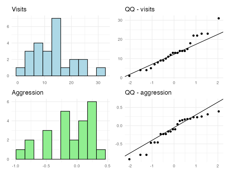
Four-panel figure for the booby data: histograms of nestling visits and adult aggression on the left, QQ plots of the same two variables on the right.

When the Assumption Fails — Example 16.5

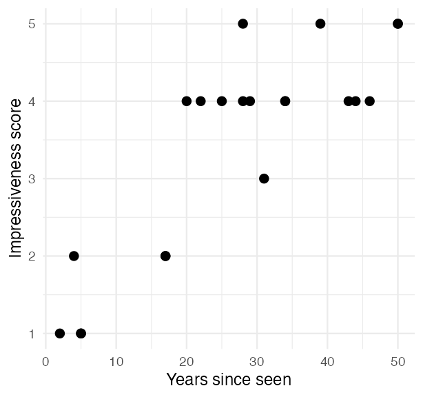
W&S Example 16.5: people who had seen the Indian rope trick were asked, years later, how impressive it was — on a subjective score.

That score is bounded and lumpy, and it fails Shapiro badly. Three options when normality fails:

  • Transform one or both variables (log, square root)
  • Switch to a rank-based correlation — Spearman’s ρ or Kendall’s τ
  • Hunt down the outlier that is doing the work
rope_df <- read_csv("data/rope_trick.csv")

shapiro.test(rope_df$impressiveness)

    Shapiro-Wilk normality test

data:  rope_df$impressiveness
W = 0.82319, p-value = 0.001517

Scatterplot of the reported impressiveness score against years since the rope trick was witnessed, showing an increasing but lumpy relationship.

The longer ago someone saw the trick, the more impressive they remember it being.

Spearman’s Rho nonparametric correlation

cor.test(rope_df$years_since_seen,
         rope_df$impressiveness,
         method = "spearman")

    Spearman's rank correlation rho

data:  rope_df$years_since_seen and rope_df$impressiveness
S = 332.12, p-value = 2.571e-05
alternative hypothesis: true rho is not equal to 0
sample estimates:
      rho 
0.7843363 

Spearman replaces each value with its rank and correlates the ranks — so it needs no normality and is not thrown by one extreme value.

  • Pearson r = 0.848
  • Spearman ρ = 0.784

Square ρ the same way: ρ² = 0.615 — about 61.5% of the variation in the ranks.

Note

The cost of switching

You keep an honest p-value and lose the original units. ρ is about ranks, so it can no longer be read as “score per year.”

🗳️ DECIDE · The Correlation That Shrank

A colleague reports r = 0.82 between body size and fecundity across a set of populations.

You repeat the study, carefully, at one site — where the animals are all close to the same size — and get r = 0.31 from data that are every bit as clean.

What is the most likely explanation?

(a) The original result was a false positive

(b) Your sample size was too small

(c) Restricting the range of X shrank r, with the underlying relationship unchanged

(d) Measurement error in your study inflated r

Warning

✍️ One letter. Write it down.

Note

The question to ask

Did the relationship change — or did the slice of the world I looked at change?

Two Things That Move r Without Touching the Biology

Important

✅ The answer is (c).

Range restriction. r depends on the spread of X you sampled. Look at a narrow slice of a real relationship and r falls, even though the slope is unchanged. This is why correlations from studies with different ranges cannot be compared head to head.

Warning

⚠️ Attenuation

Measurement error in X or Y pushes r toward zero, never away from it. The true correlation is usually stronger than the one you observed — so (d) has the direction backwards.
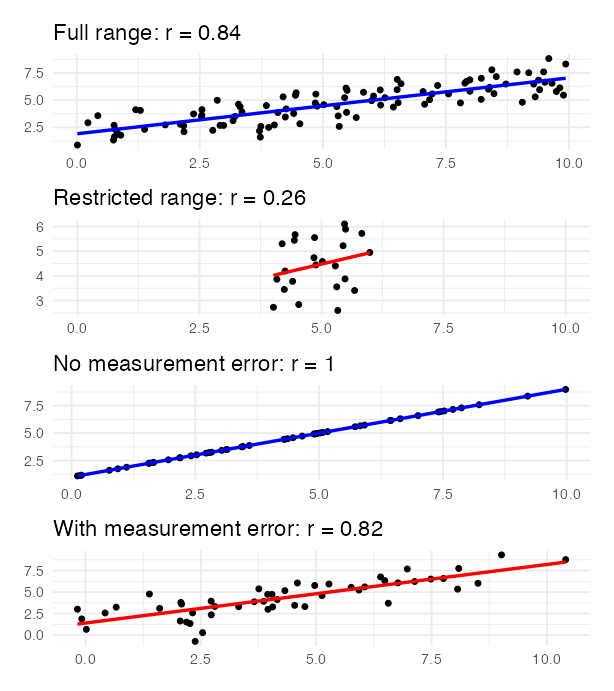
Four stacked scatterplots: the full range of a relationship versus a restricted range with a much lower r, and true values versus values with measurement error added, showing attenuation.

Correlation — What to Carry Forward

  • r measures straight-line association only — always plot first
  • r² is the variance the two variables share
  • The range you sampled sets the ceiling on r; measurement error lowers it further
  • Correlation does not imply causation. Three explanations always survive: X causes Y, Y causes X, or Z causes both
  • The test: H₀ is ρ = 0, statistic t = r / SE(r), df = n − 2
  • When normality fails, switch to rank-based Spearman’s ρ

Note

✅ End of the correlation half

You can now run cor.test(), check its assumptions on the raw variables, switch to Spearman when they fail, and say what r and r² mean.

Next: the same cloud of points — but now we fit a line to it and ask what that line is made of.

Part 4 · Linear Regression — the Model

The Simple Linear Regression Model

Regression models the response Y as a straight-line function of the predictor X.

The population model: \(Y = \alpha + \beta X + \varepsilon\)

  • α is the intercept — the value of Y when X = 0
  • β is the slope — the change in Y per one-unit change in X
  • ε is the error — the random deviation of a point from the line

The sample equation: \(\hat{Y} = a + bX\), where a estimates α and b estimates β.

Method of least squares: of all possible lines, take the one that makes

\[\sum_{i=1}^{n}(y_i - \hat{y}_i)^2\]

as small as possible — the sum of the squared vertical distances.
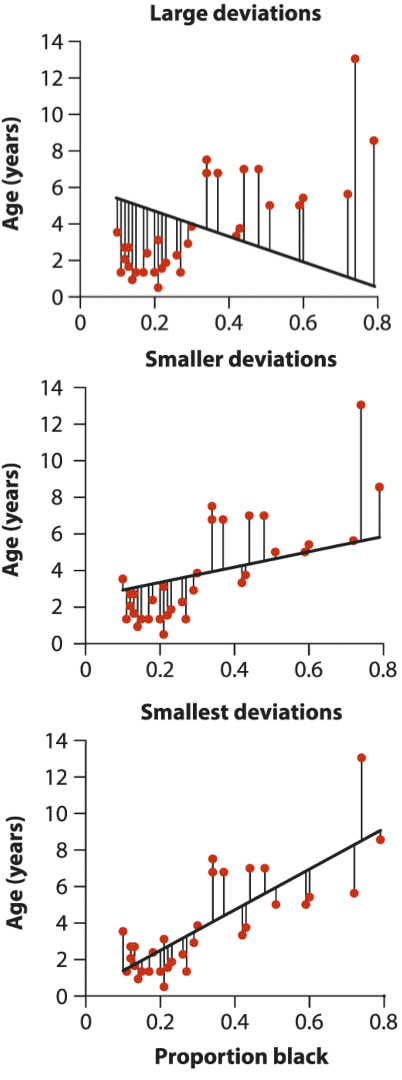
Three candidate lines through the lion data with vertical residual segments labelled large, smaller and smallest deviations.

Least squares picks the third one.

Fitting the Lion Model

Male lions accumulate black pigment on the nose as they age — so nose colour can age a lion in the field without anyone killing it.

lion_df <- read_csv("data/lion_noses.csv")

lion_model <- lm(age_years ~ proportion_black,
                 data = lion_df)
coef(lion_model)
     (Intercept) proportion_black 
       0.8790062       10.6471194 

Read the formula as response ~ predictor.
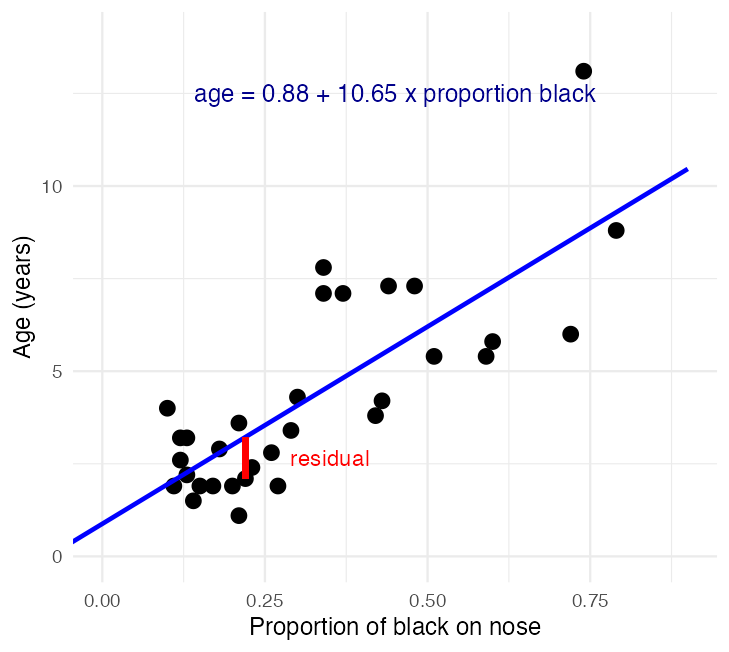
Scatterplot of lion age against proportion of black on the nose with the fitted regression line, annotated with the fitted equation and one point's residual drawn in red.

Reading the Model Output

summary(lion_model)

Call:
lm(formula = age_years ~ proportion_black, data = lion_df)

Residuals:
    Min      1Q  Median      3Q     Max 
-2.5449 -1.1117 -0.5285  0.9635  4.3421 

Coefficients:
                 Estimate Std. Error t value Pr(>|t|)    
(Intercept)        0.8790     0.5688   1.545    0.133    
proportion_black  10.6471     1.5095   7.053 7.68e-08 ***
---
Signif. codes:  0 '***' 0.001 '**' 0.01 '*' 0.05 '.' 0.1 ' ' 1

Residual standard error: 1.669 on 30 degrees of freedom
Multiple R-squared:  0.6238,    Adjusted R-squared:  0.6113 
F-statistic: 49.75 on 1 and 30 DF,  p-value: 7.677e-08

\[\widehat{\text{age}} = 0.88 + 10.65 \times \text{prop. black}\]

  • Estimate — the intercept and the slope
  • Std. Error — how precisely each is pinned down
  • t value — estimate ÷ SE, testing H₀: β = 0
  • Multiple R-squared = 0.624 — the share of variation in age explained by nose colour

Note

Notice

Correlating these same two variables and squaring r gives the same 0.624. Hold that thought — Part 5 explains why.

🗳️ DECIDE · What the Slope and Intercept Say

The fitted line is \(\widehat{\text{age}} = 0.88 + 10.65 \times \text{prop. black}\).

Which statement is correct?

(a) A lion’s nose darkens by 10.65 units for every year it ages

(b) Going from a nose 10% black to one 20% black predicts about 1.06 more years of age

(c) A newborn lion is predicted to be 0.88 years old, so the model is wrong

(d) 62.4% of lions are aged correctly by this equation

Warning

✍️ Write your letter down, then vote.

Note

Ask yourself

What are the units on this slope?

A slope is always units of Y per one unit of X — and here one unit of X is the whole range, from a clean nose to a fully black one.

Slope and Intercept, in Words

Important

✅ The answer is (b).

The slope is 10.65 years per unit of proportion black, and one unit is the entire 0-to-1 range. A 0.1 change in blackness therefore predicts about 1.06 years.

(a) reverses the variables — that is the regression of blackness on age, a different line.

(c) misreads the intercept: it is 0.88 years at proportion black = 0, and the youngest lion measured was 1.1 years old, so X = 0 sits outside the data. The intercept anchors the line; it is not a claim about newborns.

(d) confuses R² with an accuracy rate. R² is variance explained, not the percentage of lions got right.

Warning

⚠️ Extrapolation

A fitted line says nothing about X values you never sampled, and the confidence band is widest exactly where you have no data.

Tip

🖐 The habit to build

Write every slope out as a sentence in the units of the data — “for every extra , Y changes by” — before you write a word about significance.

Calculating the Slope and Intercept by Hand

\[b = \frac{\sum_i(X_i - \bar{X})(Y_i - \bar{Y})}{\sum_i(X_i - \bar{X})^2} \qquad a = \bar{Y} - b\bar{X}\]

The numerator is a sum of cross-products; the denominator is a sum of squares. Both are the same kind of quantity the ANOVA table is built from in a moment.

x <- lion_df$proportion_black
y <- lion_df$age_years

b <- sum((x - mean(x)) * (y - mean(y))) / sum((x - mean(x))^2)
a <- mean(y) - b * mean(x)
c(intercept = a, slope = b)
 intercept      slope 
 0.8790062 10.6471194 

Compare that with what lm() reported:

coef(lion_model)
     (Intercept) proportion_black 
       0.8790062       10.6471194 

Note

Same answer, no magic

lm() is doing this arithmetic. Everything harder than this — multiple predictors, ANOVA, mixed models — is the same idea written in matrix form.

Making Predictions

new_lion <- tibble(proportion_black = 0.50)

predict(lion_model, new_lion, interval = "confidence")
       fit      lwr     upr
1 6.202566 5.388042 7.01709
predict(lion_model, new_lion, interval = "prediction")
       fit      lwr     upr
1 6.202566 2.698512 9.70662

Both intervals sit on the same predicted age, and answer different questions:

  • Confidence interval — where the mean age of all lions with 50% black noses lies
  • Prediction interval — where a single new lion’s age lies

The prediction interval is always wider: it carries the scatter of individual lions plus the uncertainty in the line itself.

Both are narrowest at \(\bar{X}\) and flare out toward the edges of the data.

Example 17.3 · Prairie Biodiversity and Stability

Tilman et al. (2006): does a more diverse plant community produce more stable biomass? 161 plots, seeded with 1 to 16 species.

prairie_df <- read_csv("data/prairie_stability.csv")

prairie_model <- lm(log(biomass_stability) ~ species_number,
                    data = prairie_df)
summary(prairie_model)$coefficients
                Estimate  Std. Error   t value     Pr(>|t|)
(Intercept)    1.1982943 0.041298043 29.015766 2.075490e-65
species_number 0.0329259 0.004883691  6.742012 2.733315e-10
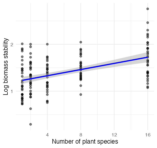
Scatterplot of log biomass stability against the number of plant species with a fitted regression line and confidence band, showing stability increasing with diversity.

The Prairie Model — Interpretation

The hypothesis test is about the slope:

  • H₀: β = 0 — species number has no effect on stability
  • H₁: β ≠ 0

Slope = 0.0329 — log stability rises by about 0.033 per extra species, so a 16-species plot sits roughly 0.49 log units above a monoculture.

p = 2.73e-10 — strong evidence against a zero slope.

R² = 0.222 — diversity explains about 22.2% of the variation in stability. Real, and nowhere near the whole story.

Note

Significant ≠ large

A tiny p-value alongside R² = 0.22 is completely ordinary in ecology.

The p-value says the slope is not zero. R² says how much of the world it accounts for. Report both.

Part 5 · Sums of Squares — the Engine of Everything After This

Where the Variation Goes

Take one data point. Its distance from the overall mean \(\bar{y}\) splits, exactly, into two pieces:

\[\underbrace{(y_i - \bar{y})}_{\text{total}} = \underbrace{(\hat{y}_i - \bar{y})}_{\text{explained}} + \underbrace{(y_i - \hat{y}_i)}_{\text{left over}}\]

Square those deviations and add them up over every point, and the same split holds for the whole dataset:

\[SS_{total} = SS_{regression} + SS_{residual}\]

  • \(SS_{regression}\) — variation the line accounts for; df = 1
  • \(SS_{residual}\) — variation it does not; df = n − 2
  • \(SS_{total}\) — all of it; df = n − 1
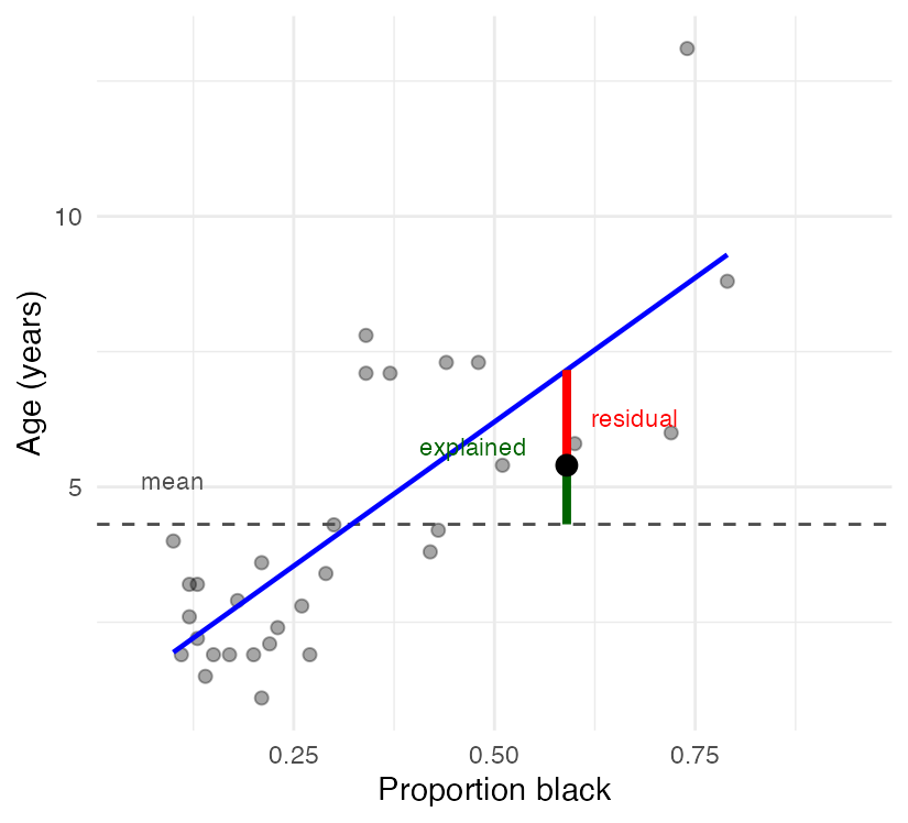
Lion scatterplot with the fitted line and a dashed line at the mean age; for one highlighted point a green segment runs from the mean to the fitted value and a red segment from the fitted value to the observation.

🗳️ DECIDE · Which Fit Has the Bigger Sums of Squares?

Four fitted regressions, on the right.

Which statement is true?

(a) \(SS_{regression}\) is larger in (d) than in (c)

(b) \(SS_{residual}\) is larger in (b) than in (a)

(c) \(SS_{total}\) is larger in (a) than in (b)

(d) \(SS_{residual}\) is zero in (c)

Warning

✍️ One letter. Write it down, then argue it with your neighbour.
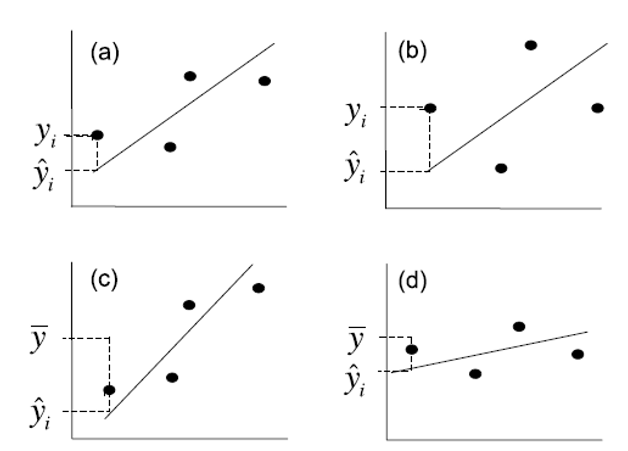
Four scatterplots with fitted regression lines of differing steepness and scatter, each marked with an observed point, its prediction, and the mean of Y.

Reading the Partition Off a Picture

Important

✅ The answer is (b).

\(SS_{residual}\) is the scatter around the line, and the points in (b) sit farther off their line than those in (a).

(a) is backwards: \(SS_{regression}\) grows with how steeply the fitted line climbs, and (c) is steeper than (d).

(c) is the trap — \(SS_{total}\) does not depend on the fit at all. It is the spread of Y around its own mean, and the line has nothing to do with it.

(d) would require every point to sit exactly on the line.

Note

The three pictures to keep

  • \(SS_{total}\) → distance from the flat mean line
  • \(SS_{regression}\) → how far the fitted line climbs away from that flat line
  • \(SS_{residual}\) → how far the points sit off the fitted line

A fit is good when the line does a lot of climbing and the points stay close to it.

Computing the Three Sums of Squares

fitted_age <- predict(lion_model)
mean_age   <- mean(lion_df$age_years)

ss_total <- sum((lion_df$age_years - mean_age)^2)
ss_reg   <- sum((fitted_age - mean_age)^2)
ss_resid <- sum((lion_df$age_years - fitted_age)^2)

c(total = ss_total, regression = ss_reg, residual = ss_resid)
     total regression   residual 
 222.08719  138.54398   83.54321 
ss_reg + ss_resid          # does it add back up?
[1] 222.0872

138.5 + 83.5 = 222.1 — exactly.

And the share the line accounts for:

\[R^2 = \frac{SS_{regression}}{SS_{total}} = \frac{138.5}{222.1} = 0.624\]

Important

✅ This is where R² comes from

R² is not a separate statistic. It is the regression sum of squares as a fraction of the total — and with one predictor it is exactly the correlation coefficient squared.

The Same Numbers, Straight from R

anova(lion_model)
Analysis of Variance Table

Response: age_years
                 Df  Sum Sq Mean Sq F value    Pr(>F)    
proportion_black  1 138.544 138.544   49.75 7.677e-08 ***
Residuals        30  83.543   2.785                      
---
Signif. codes:  0 '***' 0.001 '**' 0.01 '*' 0.05 '.' 0.1 ' ' 1

Every number in that table you have now built by hand:

  • Sum Sq — the two sums of squares, 138.5 and 83.5
  • Df — 1 for the predictor, n − 2 = 30 for the residual
  • Mean Sq — Sum Sq ÷ Df
  • F value — the ratio of those two mean squares

Note

This table has a shape, not a topic

The identical five columns show up for one-way ANOVA, two-way ANOVA, nested ANOVA and ANCOVA. Only the rows change.

From Sums of Squares to Mean Squares

A sum of squares keeps growing as you add data, so it cannot be compared across studies. Divide by degrees of freedom and you get a mean square — a variance, which does not grow with n:

\[MS = \frac{SS}{df} \qquad F = \frac{MS_{regression}}{MS_{residual}}\]

  • \(MS_{residual}\) = 2.785 — estimates the background variance σ²
  • \(MS_{regression}\) = 138.54 — estimates that same σ², plus whatever the X–Y relationship adds
  • If the slope is truly zero, both estimate the same thing and F ≈ 1. Here F = 49.75

Sums of squares add up. Mean squares do not.
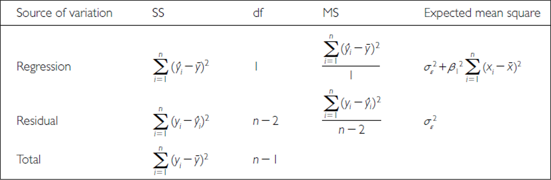
ANOVA table for simple linear regression listing regression, residual and total rows with sum-of-squares, degrees-of-freedom, mean-square and expected-mean-square formulas.

🗳️ DECIDE · You Double the Sample Size

You repeat the lion study and come back with 64 lions instead of 32. The relationship is identical — same slope, same scatter around the line.

Compared with the original analysis, what happens?

(a) \(SS_{total}\) roughly doubles, and \(MS_{residual}\) roughly doubles with it

(b) \(SS_{total}\) roughly doubles, but \(MS_{residual}\) stays about the same

(c) Both stay about the same — doubling n changes neither

(d) \(SS_{total}\) stays about the same and \(MS_{residual}\) halves

Warning

✍️ Write your letter down. This one decides whether you can read the table.

Note

The question to ask

Which of these is a total, and which is an average?

Why Mean Squares Exist At All

Important

✅ The answer is (b).

\(SS_{total}\) is a sum over every observation, so twice the data is roughly twice the sum. \(MS_{residual}\) is that sum divided by its degrees of freedom — an average squared deviation — so it estimates the same σ² no matter how many lions you measure.

That is exactly why the table converts sums of squares into mean squares before testing anything. You cannot compare two sums built from different amounts of data; you can compare two variances.

Tip

🖐 What doubling n actually buys

σ² does not change, but the standard error of the slope shrinks with √n — so F rises and the confidence band tightens.

More data does not reduce the scatter in nature. It reduces your uncertainty about the line running through it.

The Bridge · One Table, Every Model From Here

For the lion model, all of these are the same test:

Route Value
t on the slope 7.053
t² 49.75
F from anova() 49.75
p, either way 7.68e-08

t² = F. The t-test on a slope and the F-test in the ANOVA table are one test asked two ways — and \(r^2 = SS_{reg}/SS_{total}\) ties both back to the correlation half of this lecture.

Important

✅ Why this is the most important slide today

Every analysis for the rest of the course is this same partition with more rows:

  • One-way ANOVA — groups instead of a slope
  • Two-way ANOVA — a row per factor, plus interaction
  • Nested ANOVA — a row per level of nesting
  • ANCOVA — a slope row and a group row

Learn to read this table once and you can read all of them.

Part 6 · Testing Regression Assumptions

Testing Regression Assumptions — Overview

Simple linear regression assumes:

  1. Linearity — the true relationship is a straight line
  2. Independence — observations do not depend on each other
  3. Homoscedasticity — equal scatter at every value of X
  4. Normality — the residuals are normally distributed

Stated formally: the error \(\varepsilon_i\) is normal, with a mean of 0 and the same variance, at every value of x.
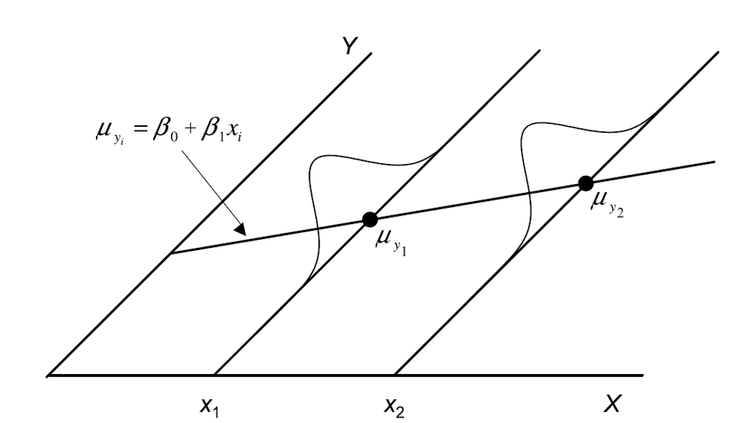
Diagram of a regression line with small normal distributions drawn around it at two X values, showing Y is assumed normal with constant variance at every X.

Every Check Is About the Residuals

Every assumption check from here on uses the residuals, not the raw data. That is the single most common mix-up in regression.

The error \(\varepsilon_i\) is estimated by the residual \(e_i = y_i - \hat{y}_i\) — the same red segment you have seen on every lion plot today, and the same quantity that got squared and summed to build \(SS_{residual}\).

Least squares already made these as small as possible. The diagnostics ask whether what is left over looks like random noise.
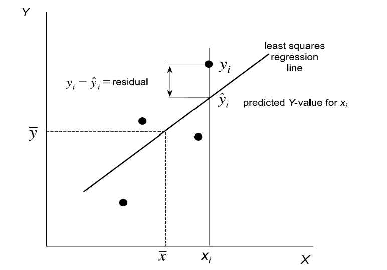
Scatterplot with a fitted least-squares line marking one observed point, its predicted value on the line, and the vertical residual between them.

Checking Linearity — Residuals vs. Fitted

What you want: a shapeless cloud, scattered evenly above and below the horizontal line at zero.

What is a problem: any curve in the trend line. A U-shape or an arch means a straight line is the wrong shape for these data — the exact failure Panel B showed back in the correlation half.

The plot doubles as a homoscedasticity check: if the cloud fans out or funnels in from left to right, the variance is not constant.
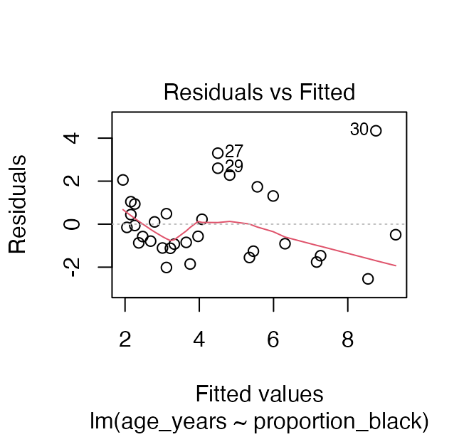
Residuals versus fitted values plot for the lion regression, used to check linearity and constant variance.

Checking Normality — QQ Plot of Residuals

The QQ plot compares your residuals with what perfectly normal residuals would look like.

What you want: points hugging the diagonal.

What is a problem: systematic curvature, or points peeling away at the ends. Tails are where non-normality shows up first, and tails are what p-values depend on.

Note we check the residuals, not age_years itself. The raw ages are right-skewed, and that is allowed. It is the residuals that have to behave.
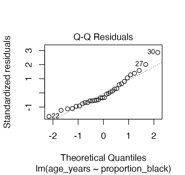
Normal QQ plot of residuals from the lion regression, used to check the normality assumption.

Checking Normality — Shapiro-Wilk on Residuals

shapiro.test(residuals(lion_model))

    Shapiro-Wilk normality test

data:  residuals(lion_model)
W = 0.93879, p-value = 0.0692

residuals(model) — not lion_df$age_years. Testing the raw response is a different, and usually wrong, question.

Note

H₀ is “the residuals ARE normal”

So a large p-value is the good outcome.

Warning

⚠️ Do not let this test overrule your eyes

At small n it has almost no power to detect a real problem; at large n it flags departures far too small to matter. Read the QQ plot first and use the test to support it — not to replace it.

What Violations Actually Look Like

When an assumption fails:

  1. Transform one or both variables (W&S §17.6) — a log on a curved or fanning relationship fixes both problems more often than not
  2. Weighted least squares for heteroscedasticity
  3. A non-linear model (§17.8), or a GLM in Week 11
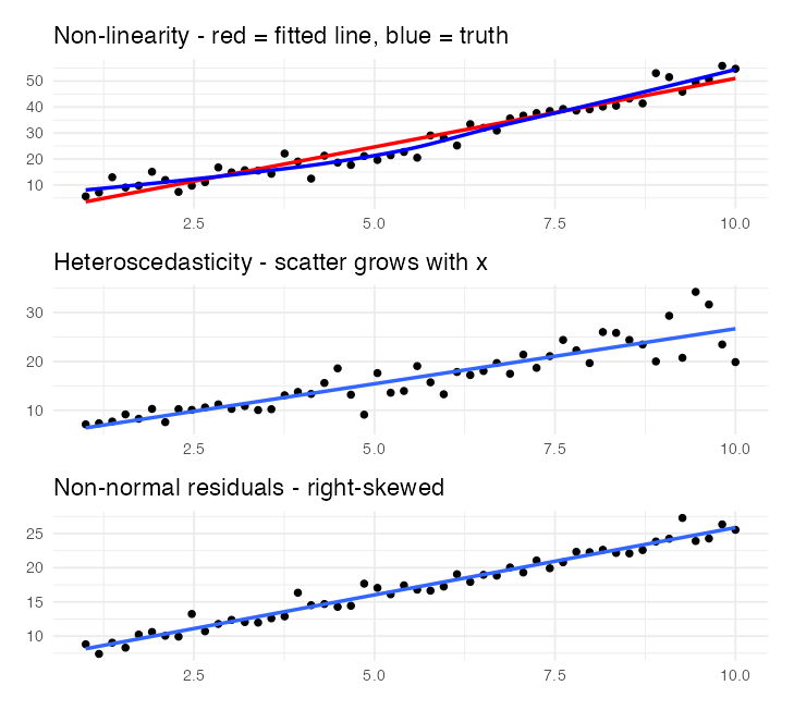
Three stacked scatterplots showing one assumption violation each: a curved relationship fitted with a straight line, variance increasing with x, and right-skewed residuals.

🗳️ DECIDE · One Island

Gotelli & Ellison’s Galápagos data: 17 islands, plant species richness against island area, both log-transformed. The fit is solid — R² = 0.585, p = 3.50e-04.

Now one more point arrives: a large island reported with very few species (red).

What does that single point do?

(a) Very little — one point in 18 cannot matter much

(b) It raises R², because the range of X just got wider

(c) It roughly halves R² and pushes p to the edge of significance

(d) It can change R² but not the slope

Warning

✍️ One letter, before the next slide.
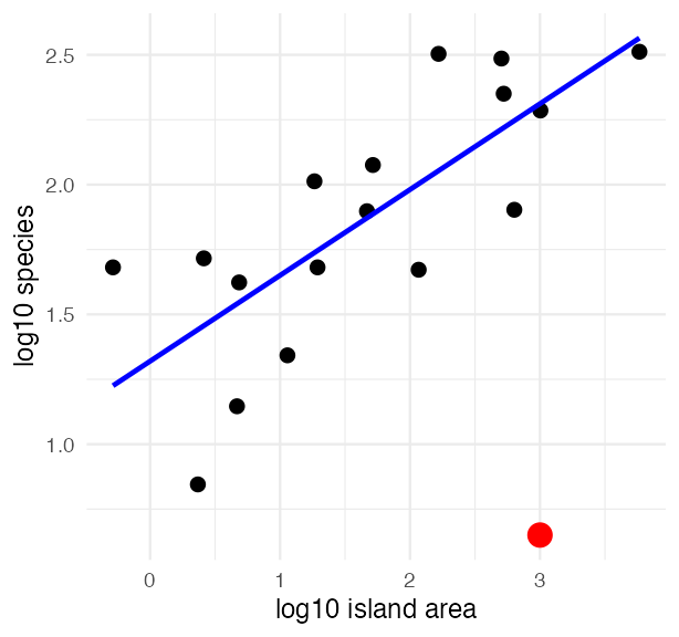
Log-log scatterplot of Galapagos island plant species richness against island area with a fitted line, plus one red point sitting far below the line at a large area.

What One Point Did

galap_plot <- galap_df %>%
  mutate(log_area = log10(area_km2),
         log_species = log10(n_species))

# a big island reported with very few species
galap_bad <- galap_plot %>%
  add_row(log_area = 3, log_species = 0.65)

clean_model <- lm(log_species ~ log_area, galap_plot)
bad_model   <- lm(log_species ~ log_area, galap_bad)

tibble(data  = c("17 islands", "plus the suspect point"),
       slope = c(coef(clean_model)[2], coef(bad_model)[2]),
       r2    = c(summary(clean_model)$r.squared,
                 summary(bad_model)$r.squared))
# A tibble: 2 × 3
  data                   slope    r2
  <chr>                  <dbl> <dbl>
1 17 islands             0.331 0.585
2 plus the suspect point 0.233 0.228

Important

✅ The answer is (c).

One point out of 18 cuts R² from 0.58 to 0.23 and moves p from 3.50e-04 to 0.0449 — from convincing to barely publishable. The slope drops too, so (d) is out.

It is influential because it lies far out in X and far off the trend. Cook’s distance flags it at once — that is what panel 4 of plot(model) is for.

No diagnostic can tell you whether it is a typo or a real island. That takes going back to the data sheet.

Part 7 · Wrap-up

Wrap-up

Over the two days you:

  • Separated correlation from regression, and saw that neither earns causation
  • Computed Pearson’s r, squared it for variance explained, and tested it with cor.test()
  • Switched to Spearman’s ρ when normality failed
  • Fitted a line with lm() and read the slope in the units of the data
  • Built \(SS_{regression}\) and \(SS_{residual}\) by hand, watched them add to \(SS_{total}\), and turned them into mean squares and an F
  • Confirmed t² = F and r² = SS_reg / SS_total
  • Checked all four assumptions on the residuals, and watched one influential island halve an R²

Important

✅ The one idea to keep

A line can be fitted to any two numeric columns. What makes it trustworthy lives in the residuals; what makes it interpretable lives in the sums of squares. Neither lives in the p-value.

Note

Up next — Multiple Regression

More than one predictor, predictors correlated with each other, and choosing between competing models. Same table, more rows.

Readings

  • Whitlock & Schluter, Ch. 16 — Correlation (§16.3 assumptions; §16.5 Spearman’s rank correlation), and Ch. 17 — Regression (§17.6 transformations; §17.8 non-linear relationships).
  • Gotelli & Ellison, Ch. 9 — Regression, for the variance-partitioning treatment and the Galápagos species–area example.
  • Tilman, D., Reich, P. B., & Knops, J. M. H. (2006). Biodiversity and ecosystem stability in a decade-long grassland experiment. Nature, 441, 629–632.