Lecture: Graphing Effectively
Boxplots, axis limits, a reusable themes file, multi-panel figures, and saving publication-ready output
The ggplot Grammar, Recapped
Every ggplot is three pieces joined with +:
- data — which data frame
- aes() — which columns map to x, y, color, fill…
- geom — how to draw it
Note
✅ Key idea
Everything today is the same three pieces — we’re just adding more layers and more polish on top of them.
Note
📖 Reference
Whitlock & Schluter, The Analysis of Biological Data, Ch. 2 — Displaying Data, is the core reference for this whole lecture.
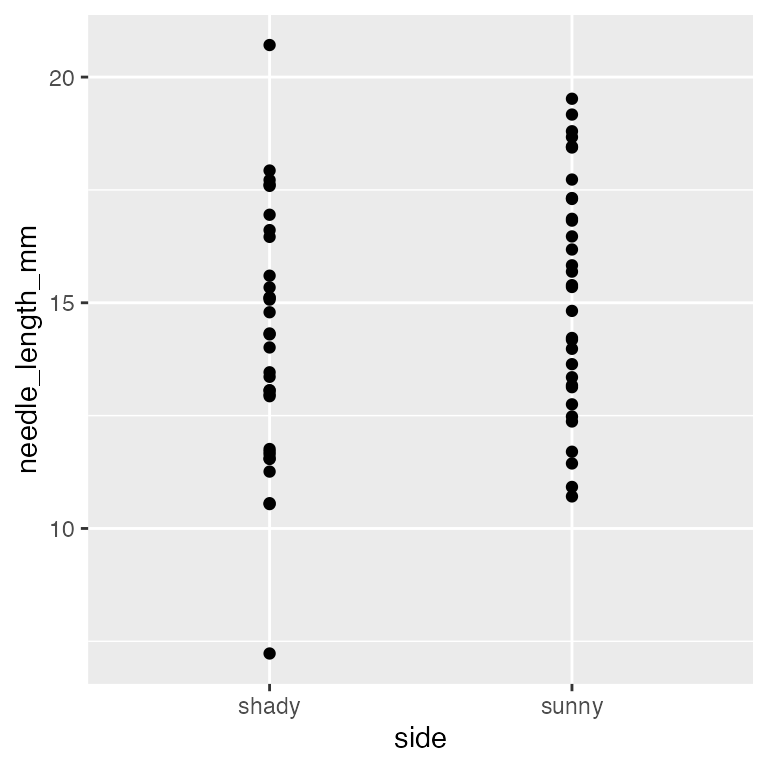
Boxplot Anatomy
pine_box_plot <- ggplot(pine_df, aes(x = side, y = needle_length_mm, fill = side)) +
  geom_boxplot(alpha = 0.6, outlier.shape = NA) +
  labs(
    title = "Needle Length by Side of Tree",
    x = "Side of tree",
    y = "Needle length (mm)",
    fill = "Side"
  ) +
  theme_minimal(base_size = 9) +
  theme(legend.position = "none")

pine_box_plot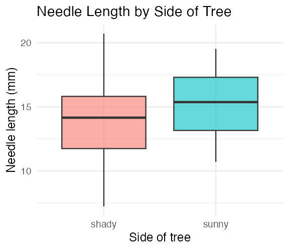
Boxplot anatomy:
- Middle line = median
- Box edges = 25th and 75th percentile (IQR)
- Whiskers = 1.5 × IQR
- Dots beyond whiskers = outliers
Whitlock & Schluter, Ch. 2 — Displaying Data, on the boxplot and the five-number summary it draws.
Boxplot + Raw Points
Note
🔮 Predict first: With only 8 needles per side per tree, does a boxplot alone show you everything? What might it hide?
pine_jitter_plot <- ggplot(pine_df, aes(x = side, y = needle_length_mm, fill = side)) +
  geom_boxplot(alpha = 0.5, outlier.shape = NA) +
  geom_point(
    position = position_jitter(width = 0.15),
    alpha = 0.6,
    size = 2
  ) +
  labs(
    title = "Needle Length by Side of Tree",
    x = "Side of tree",
    y = "Needle length (mm)",
    fill = "Side"
  ) +
  theme_minimal(base_size = 9) +
  theme(legend.position = "none")

pine_jitter_plot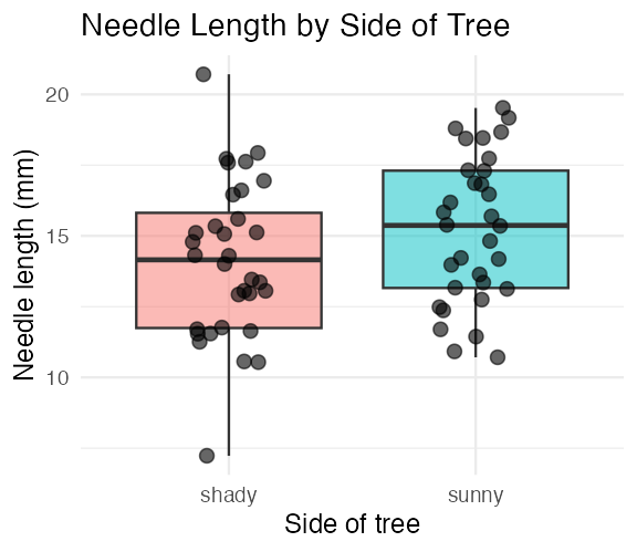
position_jitter(width = 0.15)spreads points sideways so they don’t overlapalpha = 0.6— semi-transparent, so overlapping points are still visible
Tip
Always show the raw points alongside a boxplot when n is small — every point matters, and a box alone can hide a bimodal or lopsided pattern.
Note
📖 Reference
Whitlock & Schluter, Ch. 2 — Displaying Data, “How to draw a good graph,” makes exactly this argument: show the data, not only the summary.
Before labs() — Never Ship This
Important
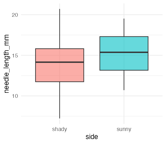
The x-axis reads side and the y-axis reads needle_length_mm — the literal column names, not something a reader outside your lab would understand.
Warning
⚠️ Watch out!
A plot with default column-name axes is a plot that only makes sense to you, today. Six months from now, even you may not remember what side meant.
labs() — Every Piece of Text on the Plot
ggplot(pine_df, aes(x = side, y = needle_length_mm, fill = side)) +
  geom_boxplot(alpha = 0.6, outlier.shape = NA) +
  labs(
    title = "Needle Length by Side of Tree",
    subtitle = "Four field teams, four trees",
    x = "Side of tree",
    y = "Needle length (mm)",
    fill = "Side",
    caption = "Data: pine_data.csv"
  ) +
  theme_minimal(base_size = 9) +
  theme(legend.position = "none")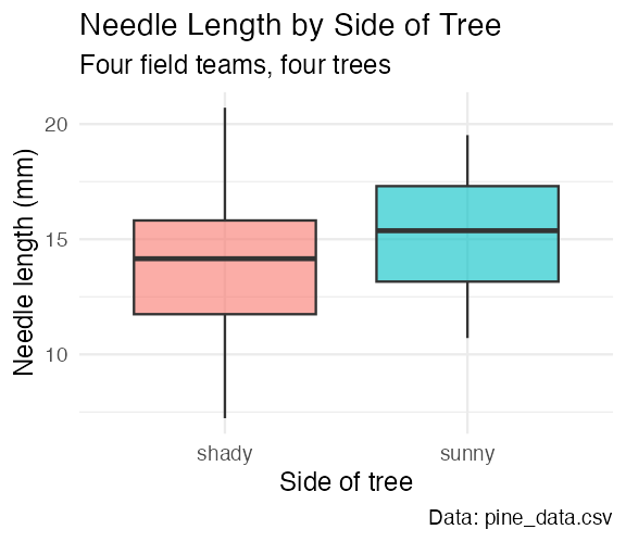
One function, five jobs:
| Argument | Controls |
|---|---|
title |
main title |
subtitle |
smaller text under the title |
x / y |
axis labels |
caption |
small text, bottom-right |
color/fill |
legend title for that aesthetic |
Note
✅ Key idea
labs() never touches the data or the statistics — only what a reader sees written on the plot. Change it freely.
Note
📖 Reference
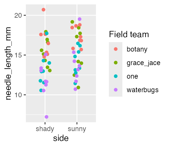
labs() — the Legend Title Trap
Warning
⚠️ Watch out!
The legend title comes from whatever you write for the aesthetic you mapped — color = "Field team" in labs() relabels a color = mapping. Write fill = "..." instead and it does nothing, because this plot never mapped fill.
coord_cartesian() — Choosing What the Reader Sees
ggplot(pine_df, aes(x = side, y = needle_length_mm, fill = side)) +
  geom_boxplot(alpha = 0.6, outlier.shape = NA) +
  labs(
    title = "Needle Length by Side of Tree",
    x = "Side of tree",
    y = "Needle length (mm)"
  ) +
  coord_cartesian(ylim = c(0, 25)) +
  theme_minimal(base_size = 9) +
  theme(legend.position = "none")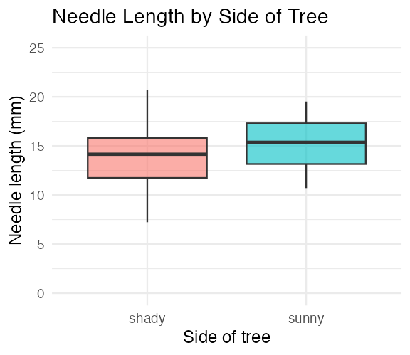
ggplot picks axis limits from your data. That is a fine default for exploring — and the wrong default the moment a reader has to judge how big a difference is.
coord_cartesian(ylim = c(0, 25))— set the y-axis rangecoord_cartesian(xlim = c(...))— same for x- Both at once:
coord_cartesian(xlim = c(...), ylim = c(...))
Note
✅ Key idea
Starting a measurement axis at zero is what keeps a 1 mm difference from looking like a canyon. Decide the limits deliberately; don’t inherit them.
coord_cartesian() — Both Axes at Once
pine_scatter_plot <- ggplot(pine_df, aes(x = needle_length_mm, y = needle_width_mm,
                                         color = side)) +
  geom_point(alpha = 0.6, size = 2) +
  labs(
    title = "Needle Width vs. Length",
    x = "Needle length (mm)",
    y = "Needle width (mm)",
    color = "Side"
  ) +
  coord_cartesian(xlim = c(5, 25), ylim = c(0.4, 1.8)) +
  theme_minimal(base_size = 9)

pine_scatter_plot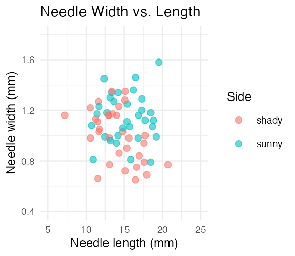
Tip
🖐 Notice
Two continuous axes, so both xlim = and ylim = are useful here. On the boxplot, x was a category — there is nothing to zoom.
Note
📖 Reference
The Trap — ylim() Deletes Data, coord_cartesian() Does Not
Note
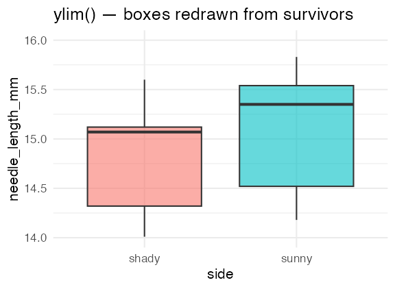
🔮 Predict first: Both plots below ask for a y-axis running 14 to 16 mm. One of them changes where the boxes are drawn. Which one, and why?
# ✅ coord_cartesian() keeps every row and just crops the view
ggplot(pine_df, aes(x = side, y = needle_length_mm, fill = side)) +
  geom_boxplot(alpha = 0.6) +
  coord_cartesian(ylim = c(14, 16)) +
  labs(title = "coord_cartesian() — same boxes, zoomed") +
  theme_minimal(base_size = 8) +
  theme(legend.position = "none")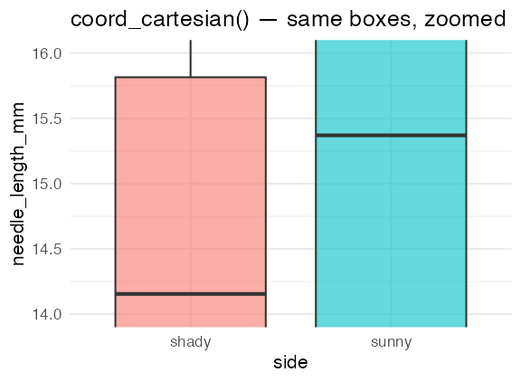
Warning
⚠️ Watch out!
ylim(14, 16) and scale_y_continuous(limits = c(14, 16)) filter the data before the geom draws it. Every needle outside 14–16 mm is silently dropped, and the median, the quartiles, and the whiskers are all recomputed from what is left. R warns about “removed rows” and students read past it every time.
coord_cartesian() computes the statistics on all the data and then zooms the camera. The boxes do not move.
Tip
🖐 The rule
Use coord_cartesian() to zoom. Use filter() when you actually mean to remove data — on purpose, in the data step, where you can see it.
Note
📖 Worth knowing — changing the axis scale, not just its limits
Right-skewed data (a few very large values squashing everything else into a corner) is usually better read on a log axis:
That is different again from logging the data itself with mutate(log_length = log(needle_length_mm)), which changes the numbers every later calculation sees.
Nothing today needs it — our needles are not skewed. Try it on your scatterplot if you are curious, and we will come back to it when a distribution actually calls for it.
Mapping Color by Group
pine_team_plot <- ggplot(pine_df, aes(x = side, y = needle_length_mm, color = team)) +
  geom_point(
    position = position_jitter(width = 0.15),
    size = 2.5,
    alpha = 0.8
  ) +
  labs(
    title = "Needle Length by Side, Colored by Team",
    x = "Side of tree",
    y = "Needle length (mm)",
    color = "Field team"
  ) +
  theme_minimal(base_size = 9)

pine_team_plot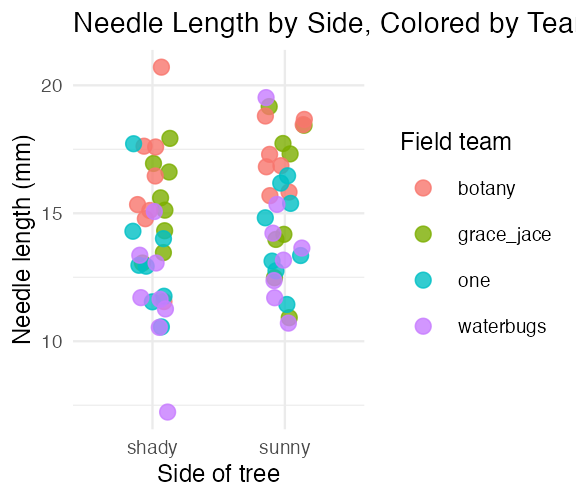
color = teammaps a third variable onto the plot — no new geom neededggplotauto-builds the legend and picks colors for you- Mapping inside
aes()always means “vary this by data” — not “make everything this color”
Warning
⚠️ Watch out!
color = "darkblue" outside aes() sets one fixed color. color = team inside aes() maps colors to a variable. Mixing these up is one of the most common ggplot mistakes.
Note
📖 Worth knowing — where you put aes() matters too
An aes() inside ggplot() is global: every layer inherits it. An aes() inside a single geom applies to that layer only:
# global — both layers colored by side
ggplot(pine_df, aes(x = side, y = needle_length_mm, color = side)) +
  geom_point() + stat_summary(fun = mean, geom = "point", size = 4)

# per-layer — points colored by team, the mean drawn in plain black
ggplot(pine_df, aes(x = side, y = needle_length_mm)) +
  geom_point(aes(color = team)) +
  stat_summary(fun = mean, geom = "point", size = 4)
Just know it exists for now — we will lean on it later, when a plot has to show raw data and a fitted model at the same time.
Note
📖 Reference
Histograms — the Shape Behind the Summary
Note
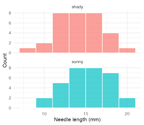
🔮 Predict first: In Describing Your Data we found the overall mean(needle_length_mm) ≈ 14.67 and the median ≈ 14.55 — nearly identical. What shape do you expect the full distribution to have — symmetric, or skewed?
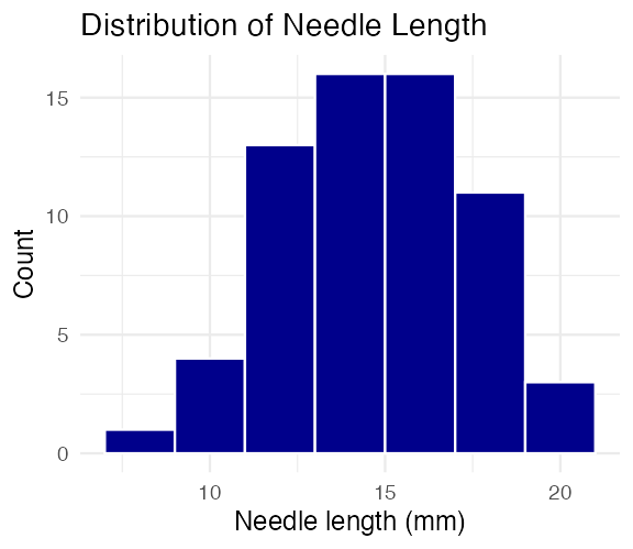
binwidthsets the width of each bar in data units (here, 2mm)- Too wide hides structure; too narrow shows noise — try a few values
Tip
🖐 Try it yourself
Change binwidth = 2 to binwidth = 0.5 and to binwidth = 5. Which tells the real story?
Note
📖 Reference
Whitlock & Schluter, Ch. 2 — Displaying Data, on frequency distributions and choosing bin width.
Histograms by Group — fill and facet_wrap() Together
Note
✅ Key idea
Overlapping histograms on one panel are hard to read. Faceting stacks them into separate panels sharing an x-axis — same comparison, much clearer.
Note
📖 Reference
Density Curves — a Smoothed Alternative
Tip
📖 Histogram vs. density
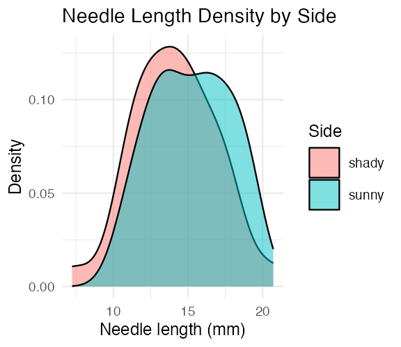
A density curve is a smoothed histogram, rescaled so the area under each curve sums to 1. It overlays cleanly for group comparisons — no faceting required, at the cost of hiding the raw bin counts.
Note
📖 Reference
Gotelli & Ellison, A Primer of Ecological Statistics, Ch. 3 — Summary Statistics, on the shape of a distribution behind any mean and SD you report.
Mean ± SE — Plotted Directly
pine_mean_se_plot <- ggplot(pine_df, aes(x = side, y = needle_length_mm, color = side)) +
  geom_point(
    position = position_jitter(width = 0.15),
    alpha = 0.3,
    size = 2
  ) +
  stat_summary(fun = mean, geom = "point", size = 4) +
  stat_summary(
    fun.data = mean_se,
    geom = "errorbar",
    width = 0.15,
    linewidth = 0.9
  ) +
  labs(
    title = "Mean ± SE Needle Length by Side",
    x = "Side of tree",
    y = "Needle length (mm)"
  ) +
  theme_minimal(base_size = 9) +
  theme(legend.position = "none")

pine_mean_se_plot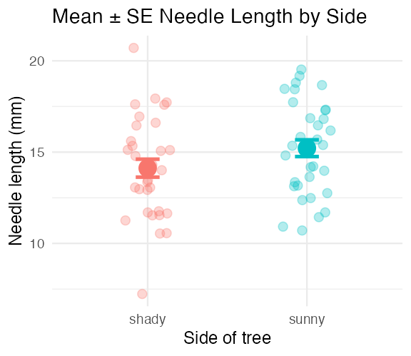
Two stat_summary() layers:
| call | draws |
|---|---|
fun = mean |
one large point at the mean |
fun.data = mean_se |
error bars for ± 1 SE |
stat_summary() computes the mean and SE for you, straight from the raw data — no summarize() step required first.
Warning
⚠️ Convenient, but read the fine print
“Straight from the raw data” means it used all 64 needles. Those are the naive error bars from Describing Your Data — the ones that treat 8 needles from one tree as 8 independent facts.
Note
📖 Reference
Whitlock & Schluter, Ch. 4 — Estimating with Uncertainty, on what an error bar is an estimate of.
Gotelli & Ellison, Ch. 6 — Designing Successful Field Studies, on why independence decides which rows you may average.
The error bar is a claim — make it an honest one
Note
🔮 Predict first: We are about to draw the same two means, but with error bars built from the 4 tree means instead of the 64 needles. Will the dots move? Will the bars?
team_means_df <- pine_df |>
  group_by(team, side) |>
  summarize(team_mean_mm = mean(needle_length_mm), .groups = "drop")

ggplot(team_means_df, aes(x = side, y = team_mean_mm, color = side)) +
  geom_point(size = 2, alpha = 0.6,
             position = position_jitter(width = 0.08)) +
  stat_summary(fun = mean, geom = "point", size = 4) +
  stat_summary(fun.data = mean_se, geom = "errorbar",
               width = 0.15, linewidth = 0.9) +
  labs(title = "Mean ± SE, computed from 4 trees",
       x = "Side of tree", y = "Mean needle length (mm)") +
  theme_minimal(base_size = 9) +
  theme(legend.position = "none")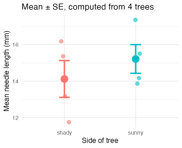
Important
Same dots. Longer bars.
The means are identical (14.12 and 15.21). The SEs went from 0.49/0.46 to 1.01/0.79 — roughly double.
Each small point here is one tree, not one needle. That is the plot our design actually supports.
Tip
🖐 The habit
Before you draw an error bar, ask what one point in it represents. stat_summary() will happily compute an SE over anything you hand it — including rows that aren’t independent.
Faceting — One Panel Per Group
pine_facet_plot <- ggplot(pine_df, aes(x = side, y = needle_length_mm, fill = side)) +
  geom_boxplot(alpha = 0.6, outlier.shape = NA) +
  facet_wrap(~team) +
  labs(
    title = "Needle Length by Side, Faceted by Team",
    x = "Side of tree",
    y = "Needle length (mm)"
  ) +
  theme_minimal(base_size = 7) +
  theme(legend.position = "none")

pine_facet_plot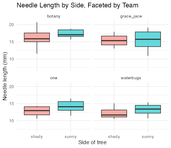
facet_wrap(~team)gives each field team its own small panel- Same x/y scale across panels — easy to compare
- Useful the moment “does every group show the same pattern?” is the real question
Tip
🖐 Notice
A faceted plot answers a different question than a single colored plot: not just “is there an overall pattern,” but “does the pattern hold for everyone?”
The Built-in Themes
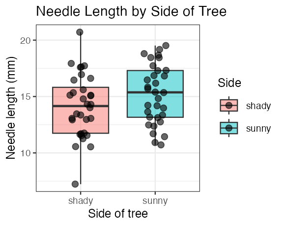
theme_minimal()— light, few gridlines (what we have used so far)theme_bw()— white background, black-and-white frametheme_classic()— just x/y axis lines, no gridlines
A theme changes appearance only — never the data or the statistics underneath.
Warning
⚠️ The problem with the built-ins
None of them is quite publication-ready, so you end up appending ten lines of theme(axis.title = element_text(...), ...) to every single plot — and retyping them in every script, slightly differently each time.
Using the Themes
pine_theme_plot <- ggplot(pine_df, aes(x = side, y = needle_length_mm, fill = side)) +
  geom_boxplot(alpha = 0.6, outlier.shape = NA) +
  labs(
    title = "Needle Length by Side of Tree",
    x = "Side of tree",
    y = "Needle length (mm)"
  ) +
  coord_cartesian(ylim = c(0, 25)) +
  theme_small() +
  theme(legend.position = "none")

pine_theme_plot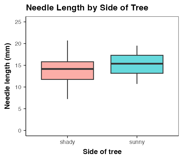
It is one more + layer, exactly like theme_minimal():
Tip
🖐 Match the theme to the size you will save
Pick the theme for the figure’s final printed size, then pass that same size to ggsave(). A theme_large() plot saved at 3 × 3 in is unreadable, and theme_small() on a poster disappears.
Note
Still your plot
Anything you add after the theme still wins — theme_small() + theme(legend.position = "none") keeps the theme and drops the legend.
patchwork — + for Whole Plots
Save each plot into an object, then combine them:
Note
✅ Key idea
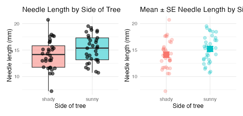
patchwork reuses the operators you already know. + puts plots beside each other, / puts one over the other — and the result is still a plot object you can save.
patchwork — Building a Real Figure
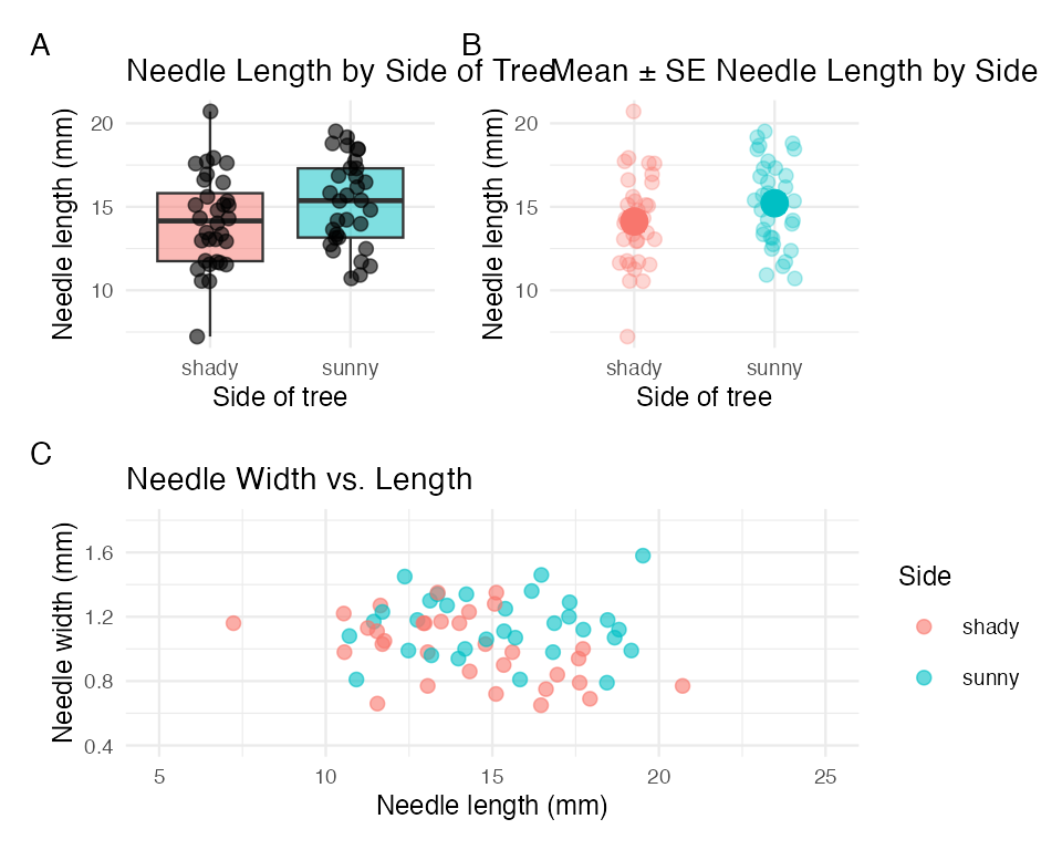
- Parentheses group plots, exactly like arithmetic:
(a + b) / cis two on top, one across the bottom plot_annotation(tag_levels = "A")tags the panels A, B, C — what a figure caption refers tocombined_plotis one object, soggsave()saves the whole multi-panel figure in one call
Tip
🖐 Size it for the whole figure
A three-panel figure needs roughly three panels’ worth of space. Give ggsave() a width/height for the combined plot, not for one panel.
scale_color_manual() — Choosing Your Own Colors
Tip
🚀 Advanced / extra work — ggplot’s default colors are fine for exploring data, but a real figure often needs specific colors (journal style, colorblind-safe palettes, matching a poster). This is how you take control.
ggplot(pine_df, aes(x = side, y = needle_length_mm, color = side)) +
  geom_point(
    position = position_jitter(width = 0.15),
    size = 2.5
  ) +
  stat_summary(fun = mean, geom = "point", size = 4, color = "black") +
  scale_color_manual(
    name = "Side of tree",
    labels = c(shady = "Shady side", sunny = "Sunny side"),
    values = c(shady = "#2c7fb8", sunny = "#d95f0e")
  ) +
  labs(x = "Side of tree", y = "Needle length (mm)") +
  theme_minimal(base_size = 9)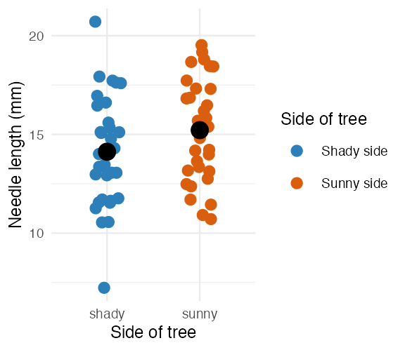
Three arguments, matched by name:
| Argument | Does what |
|---|---|
name |
the legend title |
labels |
text shown for each level |
values |
the actual color for each level |
Note
✅ Key idea
labels and values are both named vectors, keyed by the raw values in your data (shady, sunny) — not by the pretty text you want to display. ggplot looks up each raw value and substitutes the label/color you gave it.
Tip
📖 Why these two colors?
#2c7fb8 (blue) and #d95f0e (orange) are a blue–orange pair, the safest two-colour choice for colour-vision deficiency: red–green confusion, which affects roughly 8% of men, leaves the blue–orange axis intact.
Don’t take that on faith — check any pair you invent with a simulator (the colorblindr or dichromat packages), or start from a palette that was built for it: scale_color_viridis_d() or RColorBrewer::brewer.pal(n, "Dark2").
📖 R4DS §11.4 — Scales, including the ColorBrewer palettes.
scale_fill_manual() — the fill Twin
ggplot(pine_df, aes(x = side, y = needle_length_mm, fill = side)) +
  geom_boxplot(alpha = 0.7, outlier.shape = NA) +
  scale_fill_manual(
    name = "Side of tree",
    labels = c(shady = "Shady side", sunny = "Sunny side"),
    values = c(shady = "#2c7fb8", sunny = "#d95f0e")
  ) +
  labs(x = "Side of tree", y = "Needle length (mm)") +
  theme_minimal(base_size = 9)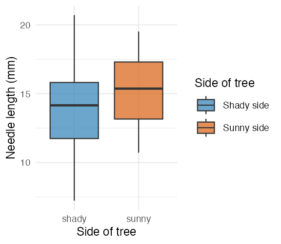
Tip
🖐 Notice
Same three arguments, same pattern — scale_fill_manual() is scale_color_manual() for the fill aesthetic instead of color. A boxplot’s box is fill; its jittered points (if you added geom_point(color = ...)) would be color. A plot can need both at once.