Lecture: Multivariate Statistics

Multivariate intro

Bill Perry

Part 1 · Why Multivariate Data?

Introduction to Multivariate Analysis

Why Study Multivariate Data?

  • In ecology, often measure many variables on the same organisms:
    • Plant morphology: height, width, leaf size, flower size
    • Environmental conditions: temperature, pH, nutrients
    • Species composition: presence/absence, abundance
  • Challenge: How do we make sense of all these variables at once?
  • PCA helps by:
    • Reducing many correlated variables to a few key dimensions
    • Visualizing patterns in high-dimensional data
    • Identifying the most important sources of variation

Note

Gotelli & Ellison, A Primer of Ecological Statistics, Ch. 12 — The Analysis of Multivariate Data, is the core reference for this lecture.

Darlingtonia californica (Cobra Lily)

Photo of a cobra lily (Darlingtonia californica) showing its hooded, pitcher-shaped leaves and forked, tongue-like appendages, the carnivorous plant whose morphology this lecture’s PCA example analyzes.

Our Study System: Darlingtonia

The Cobra Lily Dataset

  • Analyze morphological measurements from 89 individual Darlingtonia californica plants collected from 4 sites in the Siskiyou Mountains of Oregon.
  • Variables measured (10 total):
    • Morphological measurements (mm):
      • height - Height of pitcher
      • mouth_diam - Mouth diameter
      • tube_diam - Tube diameter
      • keel_diam - Keel diameter
      • wing1_length, wing2_length
      • Wing lengths (2 measurements)
      • wingsprea - Wing spread
    • Biomass measurements (g):
      • hoodmass_g - Hood mass

      • tubemass_g - Tube mass

      • wingmass_g - Wing mass

Darlingtonia pitcher structure showing measured features
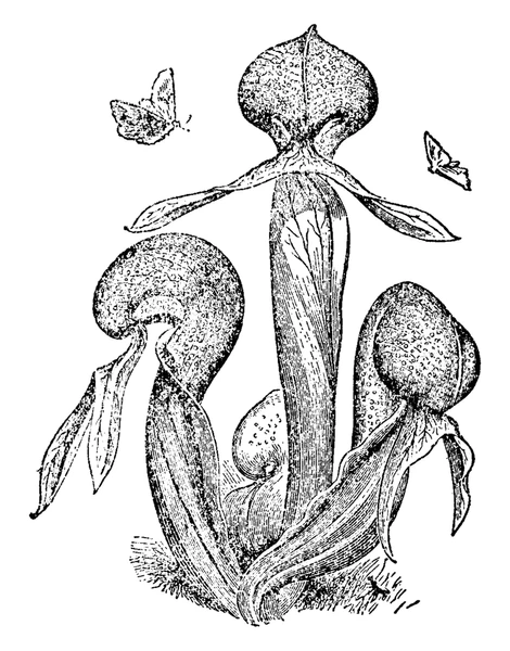
Vintage-style line illustration of three Darlingtonia pitcher-leaf structures with their hooded tops, tube bodies, and forked wing appendages labeled by shape, showing the plant parts behind variables like height, mouth diameter, tube diameter, and wing length/spread used in the PCA.
  • Sites:
  • TJH: T.J. Howell’s Fen
  • DG: Day’s Gulch
  • LEH: L.E. Hunter’s Fen
  • HD: High Divide

Loading the Data

Step 1: Import and Prepare the Data

# Load the data
darlingtonia <- read_csv("darlingtonia.csv")

# View the structure
head(darlingtonia)
## # A tibble: 6 × 11
##   site  height mouth_diam tube_diam keel_diam wing1_length wing2_length
##   <chr>  <dbl>      <dbl>     <dbl>     <dbl>        <dbl>        <dbl>
## 1 TJH      654       38.4      16.6       6.4           85           76
## 2 TJH      413       22.2      17.2       5.9           55           26
## 3 TJH      610       31.2      19.9       6.7           62           60
## 4 TJH      546       34.4      20.8       6.3           84           79
## 5 TJH      665       30.5      20.4       6.6           60           51
## 6 TJH      665       33.6      19.5       6.6           84           66
## # ℹ 4 more variables: wingsprea <dbl>, hoodmass_g <dbl>, tubemass_g <dbl>,
## #   wingmass_g <dbl>

darlingtonia %>%
  count(site, name = "n_plants")
## # A tibble: 4 × 2
##   site  n_plants
##   <chr>    <int>
## 1 DG          25
## 2 HD          12
## 3 LEH         25
## 4 TJH         25

Exploring the Raw Data

Initial Data Exploration

Before any analysis, we should always look at our data:

  • Check for outliers
  • Examine distributions
  • Look for patterns by site
  • Understand variable scales

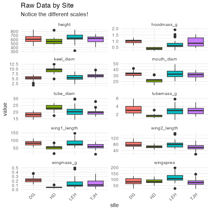
Key observations:

  • Variables measured in different units (mm vs. g)
  • Different ranges: height (hundreds) vs. biomass (fractions)
  • Need to standardize before PCA!

Faceted boxplots of each of the 10 raw Darlingtonia morphology and biomass variables by collection site, each panel on its own free y-axis scale, showing the variables have very different ranges.

The Problem of Different Scales

Why Standardization Matters

  • Without standardization:
    • Variables with larger values (like height in mm) would dominate the analysis over variables with smaller values (like biomass in g).
  • Example from data:
    • Height: mean ≈ 600 mm, range 322-845 mm -
    • Wing mass: mean ≈ 0.16 g, range 0.02-5.00 g
  • calculated distances without standardizing, height would have 1000× more influence than wing mass!
  • Solution: Z-score standardization
    • \(Z = \frac{(Y_i - \bar{Y})}{s}\)
  • transforms each variable to:
    • Mean = 0
    • Standard deviation = 1
    • Units: “standard deviations from the mean”
  • Before standardization: - Height dominates (larger scale)
  • After standardization:
    • All variables contribute equally
    • Measured in “standard deviations”
# Example: standardize height
darlingtonia %>%
  summarize(
    mean_height = mean(height),
    sd_height = sd(height),
    mean_wingmass = mean(wingmass_g),
    sd_wingmass = sd(wingmass_g)
  )
## # A tibble: 1 × 4
##   mean_height sd_height mean_wingmass sd_wingmass
##         <dbl>     <dbl>         <dbl>       <dbl>
## 1        616.      101.         0.154       0.102

# After standardization, both will have:
# mean = 0, sd = 1

Measuring Multivariate Distance

Euclidean Distance Between Individuals

  • How different are two plants?
    • For two plants measured on multiple variables, calculate Euclidean distance:
      • For 2 variables (height and spread):

        • \(d_{i,j} = \sqrt{(y_{i,1} - y_{j,1})^2 + (y_{i,2} - y_{j,2})^2}\)
      • For n variables:

        • \(d_{i,j} = \sqrt{\sum_{k=1}^{n}(y_{i,k} - y_{j,k})^2}\)
      • Pythagorean theorem extended to many dimensions!

      • Key point: Distance should use standardized values so all variables contribute equally

## 
## Distance between plants 1 and 2 (standardized):
##  3.53 standard deviations
## 
##  
## Note: Standardization uses mean and SD from ALL plants,
##  not just these two plants!

Standardizing the Data

Step 2: Z-score Transformation
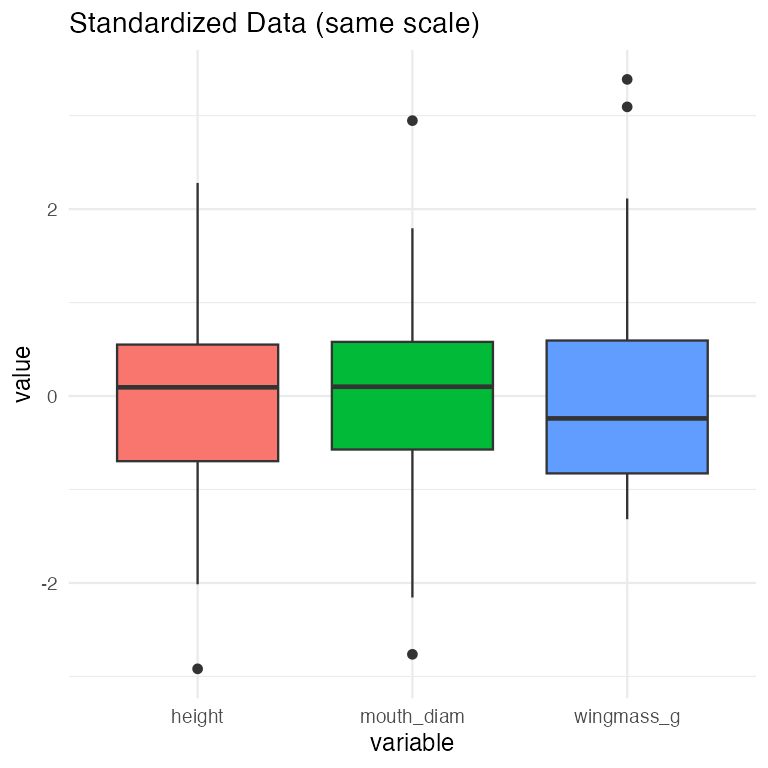
Boxplots of standardized (z-scored) height, mouth diameter, and wing mass, all shown on the same scale centered around zero, illustrating that standardization puts differently-scaled variables on equal footing.

Visualizing Standardized Data

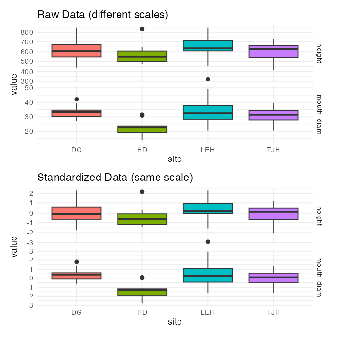
Two stacked panels of boxplots by site for height and mouth diameter: raw values on different scales on top, and standardized (z-scored) values on a common scale below, showing standardization equalizes the variables' influence.

Part 2 · Correlation and the Concept of PCA

Understanding Correlations

Why Correlations Matter for PCA

  • PCA works best when variables are correlated:
    • If variables are uncorrelated → PCA provides no benefit
    • If variables are highly correlated → PCA can reduce dimensions effectively
  • In data, expect correlations because:
    • Larger plants have larger measurements overall
    • Wing dimensions likely correlate with each other
    • Mass measurements correlate with size measurements
  • The correlation matrix shows relationships between all pairs of variables.
  • Strong correlations (positive or negative) suggest PCA will be useful!

Strong positive correlations (dark blue) suggest variables measure similar aspects of plant size/shape.
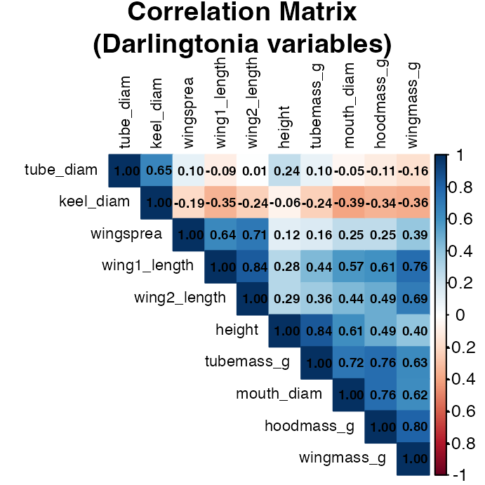
Correlation matrix heatmap of the 10 Darlingtonia morphology and biomass variables, colored and hierarchically clustered, with correlation coefficients printed in each cell, showing several strongly correlated variable clusters.

Correlation Matrix Details

Examining Variable Relationships

##              height mouth_diam tube_diam keel_diam wing1_length wing2_length
## height         1.00       0.61      0.24     -0.06         0.28         0.29
## mouth_diam     0.61       1.00     -0.05     -0.39         0.57         0.44
## tube_diam      0.24      -0.05      1.00      0.65        -0.09         0.01
## keel_diam     -0.06      -0.39      0.65      1.00        -0.35        -0.24
## wing1_length   0.28       0.57     -0.09     -0.35         1.00         0.84
## wing2_length   0.29       0.44      0.01     -0.24         0.84         1.00
## wingsprea      0.12       0.25      0.10     -0.19         0.64         0.71
## hoodmass_g     0.49       0.76     -0.11     -0.34         0.61         0.49
## tubemass_g     0.84       0.72      0.10     -0.24         0.44         0.36
## wingmass_g     0.40       0.62     -0.16     -0.36         0.76         0.69
##              wingsprea hoodmass_g tubemass_g wingmass_g
## height            0.12       0.49       0.84       0.40
## mouth_diam        0.25       0.76       0.72       0.62
## tube_diam         0.10      -0.11       0.10      -0.16
## keel_diam        -0.19      -0.34      -0.24      -0.36
## wing1_length      0.64       0.61       0.44       0.76
## wing2_length      0.71       0.49       0.36       0.69
## wingsprea         1.00       0.25       0.16       0.39
## hoodmass_g        0.25       1.00       0.76       0.80
## tubemass_g        0.16       0.76       1.00       0.63
## wingmass_g        0.39       0.80       0.63       1.00

Key Observations

  • Highly correlated variables:
    • Height with tube area (r=0.89)
      • Wing lengths with each other (r=0.80)
      • Wing area with wing spread (r=0.81)
  • These correlations indicate redundancy
  • multiple variables measuring similar things.
  • Moderate correlations:
    • Most morphological variables
    • Mass measurements with size
  • Lower correlations:
    • Some specific features like keel diameter
  • PCA will help by combining correlated variables into fewer components!

What is Principal Component Analysis?

The Concept of PCA

  • PCA creates new variables (components) that are:
    • Linear combinations of original variables
    • Uncorrelated with each other
    • Ordered by importance (amount of variance explained)
  • The mathematical idea:
    • For each plant i and component k:
    • \(Z_{ik} = a_{i1}Y_1 + a_{i2}Y_2 + ... + a_{in}Y_n\)
  • Where:
    • \(Z_{ik}\) = score on principal component k
    • \(Y_j\) = standardized value of original variable j
    • \(a_{ij}\) = loading (weight) of variable j on component i
  • Goal: Find loadings that maximize variance in first component, then second, etc.
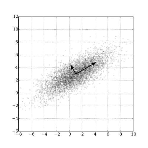
Scatterplot of a correlated two-variable Gaussian point cloud with two perpendicular black arrows overlaid, the longer arrow pointing along the direction of greatest spread (the first principal axis) and the shorter arrow perpendicular to it (the second), illustrating how PCA finds new axes aligned with the directions of maximum variance.
Conceptual diagram of PCA: reducing 2 variables to 1 principal axis

  • The first principal axis passes through maximum variance.
  • Key properties: - As many components as variables - First components explain most variation - Later components explain residual variation

Principal Components: Properties

Understanding Components are:

  • 1. Orthogonal (perpendicular)
    • Components are uncorrelated
    • Each captures independent information
  • 2. Ordered by variance
    • PC1 explains the most variance
    • PC2 explains second most (of remaining variance)
    • And so on…
  • 3. Linear combinations
    • Each component is a weighted sum of original variables
    • Weights (loadings) show variable importance

Why this matters:

  • Dimension reduction:
    • Start with 10 correlated variables
    • End with 2-3 uncorrelated components
    • Retain most information with fewer dimensions
  • Easier interpretation:
    • PC1 might represent “overall size”
    • PC2 might represent “shape”
    • Components often have biological meaning
  • Better for analysis:
    • Can use in regression, ANOVA
    • No multicollinearity problems
    • Variables are standardized

Part 3 · Running PCA in R

Performing PCA in R

Step 3: Run the Analysis

# Perform PCA using prcomp()
# center = TRUE: center variables (mean = 0)
# scale. = TRUE: scale variables (sd = 1)
pca_result <- prcomp(darl_numeric, 
                     center = TRUE, 
                     scale = TRUE)

# What's in the result?
names(pca_result)
## [1] "sdev"     "rotation" "center"   "scale"    "x"

Understanding the Output

## Importance of components:
##                           PC1    PC2    PC3     PC4     PC5     PC6     PC7
## Standard deviation     2.2332 1.3288 1.2354 0.75701 0.59301 0.51062 0.46177
## Proportion of Variance 0.4987 0.1766 0.1526 0.05731 0.03517 0.02607 0.02132
## Cumulative Proportion  0.4987 0.6753 0.8279 0.88521 0.92038 0.94645 0.96777
##                           PC8     PC9    PC10
## Standard deviation     0.3768 0.33982 0.25457
## Proportion of Variance 0.0142 0.01155 0.00648
## Cumulative Proportion  0.9820 0.99352 1.00000
  • Output components:
  • sdev: standard deviations of each PC (square root of eigenvalues)
  • rotation: loadings matrix (how variables load on PCs)
  • x: PC scores for each observation
  • center: variable means
  • scale: variable standard deviations

Eigenvalues and Variance Explained

How Much Variance Does Each PC Explain?

  • Eigenvalues (\(\lambda\)) measure variance explained by each component.
  • The proportion of variance for PC j is:
    • \(\text{Proportion}_j = \frac{\lambda_j}{\sum_{k=1}^{n}\lambda_k}\)
  • In practice:
    • PC1 always explains the most variance

    • We want the first few PCs to explain most (>70%) of total variance

    • allows dimension reduction

## # A tibble: 10 × 4
##    PC    Eigenvalue Proportion Cumulative
##    <chr>      <dbl>      <dbl>      <dbl>
##  1 PC1        4.99       0.499      0.499
##  2 PC2        1.77       0.177      0.675
##  3 PC3        1.53       0.153      0.828
##  4 PC4        0.573      0.057      0.885
##  5 PC5        0.352      0.035      0.92 
##  6 PC6        0.261      0.026      0.946
##  7 PC7        0.213      0.021      0.968
##  8 PC8        0.142      0.014      0.982
##  9 PC9        0.115      0.012      0.994
## 10 PC10       0.065      0.006      1

Scree Plot: Choosing Components

How Many Components to Use?

  • A scree plot shows variance explained by each component.
  • How to read it:
    • Look for an “elbow” - sharp change in slope
    • Keep components before the elbow
    • Discard components in the “scree” (rubble)
  • In this data:
    • PC1 explains 49.9% of variance
    • PC2 explains 17.7%
    • PC3 explains 15.3%
    • First 3 PCs explain 77.3% of variance
  • Decision: Use PC1, PC2, and PC3 for interpretation.
  • remaining 7 components explain 17.1% (mostly noise).
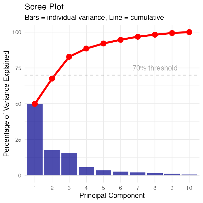
Scree plot of percentage variance explained by each of the 10 principal components as blue bars, with a red cumulative-variance line and a dashed reference line at 70%, showing the first three components already exceed that threshold.

Part 4 · Interpreting Loadings and Components

Understanding Loadings

What are Loadings?

  • Loadings are the weights (\(a_{ij}\)) that show how each original variable contributes to each principal component.
  • For PC1:
    • \(Z_1 = a_{11}Y_1 + a_{12}Y_2 + ... + a_{1p}Y_p\)
  • Interpreting loadings:
    • Large positive loading: variable increases with PC
    • Large negative loading: variable decreases with PC
    • Near-zero loading: variable unimportant for PC
  • Guidelines:
    • Loadings > 0.3 or < -0.3 are worth considering
    • Loadings > 0.5 or < -0.5 are important
    • Sign (+ or -) can flip; patterns matter more
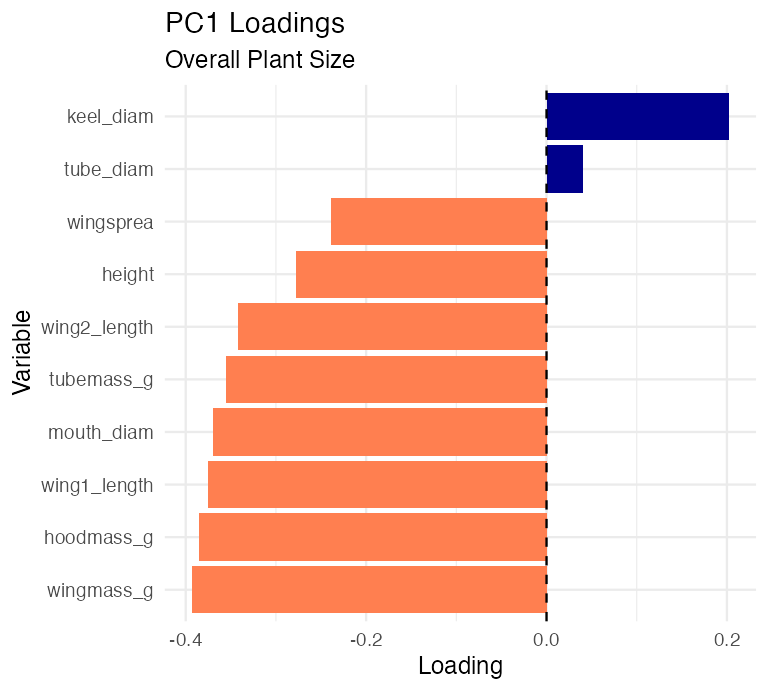
  • PC1 loadings:
    • Most variables have similar positive values
    • All ~0.31 to 0.40 except keel (-0.18) and tube (-0.002)
    • Suggests PC1 measures “overall size”
##                 PC1    PC2    PC3
## height       -0.278 -0.449  0.198
## mouth_diam   -0.369 -0.110  0.214
## tube_diam     0.040 -0.602 -0.390
## keel_diam     0.202 -0.491 -0.328
## wing1_length -0.375  0.171 -0.280
## wing2_length -0.342  0.131 -0.415
## wingsprea    -0.239  0.156 -0.549
## hoodmass_g   -0.385 -0.057  0.185
## tubemass_g   -0.355 -0.320  0.263
## wingmass_g   -0.393  0.080 -0.007

Interpreting PC1: Overall Size

  • PC1 Interpretation - Looking at PC1 loadings:
  • Key patterns:
  • Most variables load positively and similarly: - Height: 0.310 - Mouth diameter: 0.400
    • Wing lengths: 0.386, 0.372
    • Wing spread: 0.256
    • Biomass: 0.397, 0.380, 0.230
  • Exception: Keel diameter (-0.177) and tube diameter (~0)
  • Biological meaning: PC1 represents overall plant size
    • most measurements scale together (bigger plants have bigger everything).
## # A tibble: 10 × 2
##    Variable     Loading
##    <chr>          <dbl>
##  1 wingmass_g   -0.393 
##  2 hoodmass_g   -0.385 
##  3 wing1_length -0.375 
##  4 mouth_diam   -0.369 
##  5 tubemass_g   -0.355 
##  6 wing2_length -0.342 
##  7 height       -0.278 
##  8 wingsprea    -0.239 
##  9 keel_diam     0.202 
## 10 tube_diam     0.0402
  • High PC1 → large plants
  • Low PC1 → small plants

Horizontal bar chart of PC1 loadings for each of the 10 variables, colored by sign, showing most variables loading positively (darkblue) and only keel and tube diameter loading negatively (coral), consistent with PC1 representing overall plant size.

Interpreting PC2: Shape Contrast

PC2 Interpretation

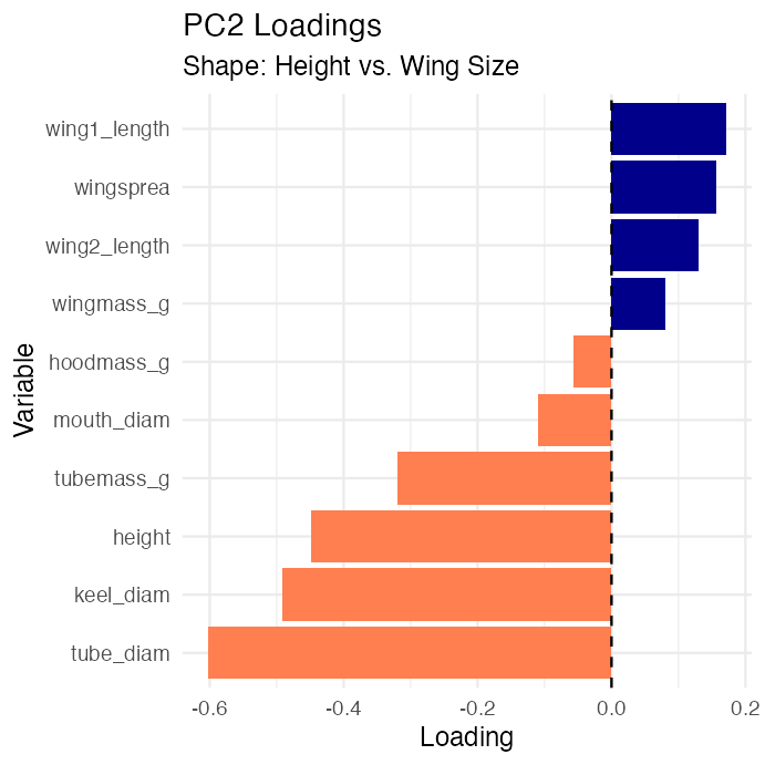
  • Looking at PC2 loadings:
  • Key patterns:
    • Height: -0.419 (negative, moderate)
    • Mouth: -0.250 (negative, moderate)
    • Wing measurements: positive (0.275-0.434)
    • Wing spread: 0.434 (positive, strong)
    • Biomass: mostly negative
  • Biological meaning: PC2 represents shape trade-offs
    • tall narrow pitchers vs. short wide pitchers with large wings.
## # A tibble: 10 × 2
##    Variable     Loading
##    <chr>          <dbl>
##  1 tube_diam    -0.602 
##  2 keel_diam    -0.491 
##  3 height       -0.449 
##  4 tubemass_g   -0.320 
##  5 wing1_length  0.171 
##  6 wingsprea     0.156 
##  7 wing2_length  0.131 
##  8 mouth_diam   -0.110 
##  9 wingmass_g    0.0800
## 10 hoodmass_g   -0.0575
  • High PC2 → short plants with large wings
  • Low PC2 → tall narrow plants

Horizontal bar chart of PC2 loadings for each of the 10 variables, colored by sign, showing height and mouth diameter loading negatively and wing measurements loading positively, consistent with PC2 representing a height-versus-wing-size shape trade-off.

Interpreting PC3

PC3 Interpretation

  • Looking at PC3 loadings:
  • Key patterns:
  • Dominated by:
    • Tube diameter: 0.743 (very strong positive)
    • Keel diameter: 0.576 (strong positive)
    • Most other variables near zero
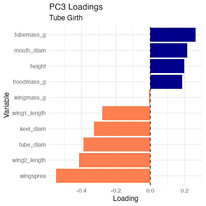
  • Biological meaning: PC3 represents tube girth
    • width/diameter of tube structure independent of height or wing size.
    • Plants with high PC3 scores = fat tubes, allowing to trap larger prey?
## # A tibble: 10 × 2
##    Variable      Loading
##    <chr>           <dbl>
##  1 wingsprea    -0.549  
##  2 wing2_length -0.415  
##  3 tube_diam    -0.390  
##  4 keel_diam    -0.328  
##  5 wing1_length -0.280  
##  6 tubemass_g    0.263  
##  7 mouth_diam    0.214  
##  8 height        0.198  
##  9 hoodmass_g    0.185  
## 10 wingmass_g   -0.00743
  • High PC3 → fat tubes
  • Low PC3 → skinny tubes

Horizontal bar chart of PC3 loadings for each of the 10 variables, colored by sign, showing tube diameter and keel diameter with strong positive loadings and all other variables near zero, consistent with PC3 representing tube girth.

Part 5 · Scores, Ordination and Biplots

Principal Component Scores

What are PC Scores?

  • PC scores are values of each principal component for each obs./plant
  • Each plant gets a score on each PC:
    • PC1 score = measure of size
    • PC2 score = measure of shape
    • PC3 score = measure of tube girth
  • How they’re calculated:
  • For plant i on PC1:
    • \(\text{PC1}_i = 0.31×height_i + 0.40×mouth_i + ...\)
    • Using the standardized values and loadings we saw earlier.
## # A tibble: 10 × 5
##    plant_id site     PC1     PC2    PC3
##       <int> <chr>  <dbl>   <dbl>  <dbl>
##  1        1 TJH   -1.92   0.0772  1.53 
##  2        2 TJH    3.35   1.53    0.755
##  3        3 TJH    0.918 -0.0320  0.248
##  4        4 TJH   -0.983  0.236  -0.242
##  5        5 TJH    1.15  -1.02    1.54 
##  6        6 TJH   -1.37  -0.613   0.847
##  7        7 TJH   -1.50  -1.63    0.693
##  8        8 TJH   -0.651  0.121  -0.412
##  9        9 TJH    2.48  -0.0786 -0.260
## 10       10 TJH   -1.11  -1.27    2.27

Visualizing PCA Results: Scores Plot

Ordination of Sites

  • We can plot PC scores to visualize:
    • How plants are distributed in PC space
    • Whether sites differ in morphology
    • Patterns and groupings
  • In this plot:
    • Each point = one plant
    • Position determined by PC1 and PC2 scores
    • Colors indicate collection site
  • Observations:
    • Sites show some separation
    • HD (orange) plants have lower PC1 (smaller)
    • TJH (pink) plants variable but lower PC2
    • Some overlap among sites
  • This is called ordination - ordering objects along axes.

The ordination
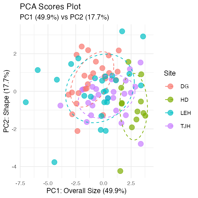
Scatterplot of PC1 versus PC2 scores for each plant, colored by site with 68% confidence ellipses, showing partial separation between sites in the size-shape plane.

Different visualization of PCA Scores

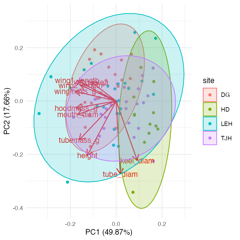
PCA Biplot: Combining Scores and Loadings

Reading a Biplot

  • A biplot shows both:
    • Points = plants (PC scores)
    • Arrows = original variables (loadings)
  • How to interpret arrows:
  • Length = how important the variable is
  • Direction = how the variable relates to PCs
  • Angle between arrows = correlation
    • Small angle = positively correlated
    • 90° = uncorrelated
    • 180° = negatively correlated
  • How to interpret points:
    • Plants in the direction of an arrow are high in that variable
    • Plants opposite an arrow are low in that variable

The plot
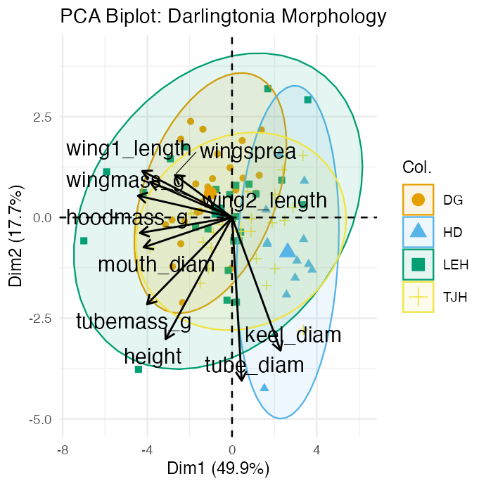
PCA biplot of PC1 and PC2 with plants as points colored by site with confidence ellipses, and arrows for each original variable showing its loading direction and strength, with most size-related arrows pointing right and wing arrows pointing up.

Biplot Interpretation

Key Patterns in the Biplot

  • Variable relationships:
    • Most morphological and biomass variables point together (right and slightly down):
      • Height, mouth, masses - These are highly correlated

      • All contribute to PC1 (size)

  • Wing variables (wing1_length, wing2_length, wingspread) point more upward:
    • Contribute positively to PC2
      • Represent the “wing dimension” of shape
  • Site separation:
    • HD (blue): Lower PC1, plants are smaller overall

    • DG (orange): Higher PC1, plants are larger

    • TJH (yellow) and LEH (green): Intermediate and variable

Biological Interpretation

  • What determines plant morphology?
    • Size (PC1, 45.8% variance)
      • Primary source of variation

      • Most measurements scale together

      • May reflect resource availability or age

    • Shape trade-offs (PC2, 16.7% variance)
      • Tall narrow vs. short wide with large wings
      • May reflect different trapping strategies
      • Or developmental/environmental constraints
    • Tube dimensions (PC3, 14.8% variance)
      • Independent aspect of morphology
      • May affect prey capture efficiency
    • Sites differ primarily in overall size, with some shape variation.

Part 6 · Testing Group Differences

Testing Site Differences with ANOVA

Step 4: Statistical Analysis

  • Now that we have PC scores, we can test if sites differ:
    • Result: Sites differ significantly in PC1 (F = 9.26, P < 0.001)
# Test for site differences on PC1 (size)
anova_pc1 <- aov(PC1 ~ site, data = pc_scores)
summary(anova_pc1)
##             Df Sum Sq Mean Sq F value   Pr(>F)    
## site         3  124.3   41.44   11.29 2.75e-06 ***
## Residuals   83  304.6    3.67                     
## ---
## Signif. codes:  0 '***' 0.001 '**' 0.01 '*' 0.05 '.' 0.1 ' ' 1

# Calculate means by site
pc_scores %>%
  group_by(site) %>%
  summarize(
    mean_PC1 = mean(PC1),
    sd_PC1 = sd(PC1),
    n = n()
  )
## # A tibble: 4 × 4
##   site  mean_PC1 sd_PC1     n
##   <chr>    <dbl>  <dbl> <int>
## 1 DG      -1.02   1.38     25
## 2 HD       2.63   0.857    12
## 3 LEH     -0.659  2.61     25
## 4 TJH      0.423  1.90     25

ANOVA for PC2 and PC3

Testing Shape and Tube Differences

  • Results:
    • PC2 (shape): F = 5.36, P = 0.002 (significant)
      • PC3 (tube girth): F = 1.45, P = 0.234 (not significant)
# Test for site differences on PC2 (shape)
anova_pc2 <- aov(PC2 ~ site, data = pc_scores)
summary(anova_pc2)
##             Df Sum Sq Mean Sq F value  Pr(>F)   
## site         3  21.63   7.209   4.595 0.00502 **
## Residuals   83 130.22   1.569                   
## ---
## Signif. codes:  0 '***' 0.001 '**' 0.01 '*' 0.05 '.' 0.1 ' ' 1
# Test for site differences on PC3 (tube girth)
anova_pc3 <- aov(PC3 ~ site, data = pc_scores)
summary(anova_pc3)
##             Df Sum Sq Mean Sq F value  Pr(>F)    
## site         3  43.68  14.561    13.8 2.2e-07 ***
## Residuals   83  87.58   1.055                    
## ---
## Signif. codes:  0 '***' 0.001 '**' 0.01 '*' 0.05 '.' 0.1 ' ' 1
# Summary statistics
pc_scores %>% group_by(site) %>% summarize(mean_PC2 = mean(PC2),mean_PC3 = mean(PC3))
## # A tibble: 4 × 3
##   site  mean_PC2 mean_PC3
##   <chr>    <dbl>    <dbl>
## 1 DG       0.604    0.542
## 2 HD      -0.863   -1.26 
## 3 LEH      0.155   -0.555
## 4 TJH     -0.345    0.618

Visualizing Site Differences

Box Plots of PC Scores

HD plants are significantly smaller than plants at other sites.
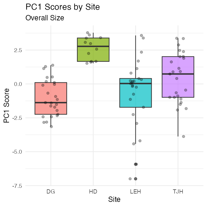
Boxplot of PC1 (overall size) scores by site with jittered points overlaid, showing the HD site's plants scoring noticeably lower (smaller) than other sites.

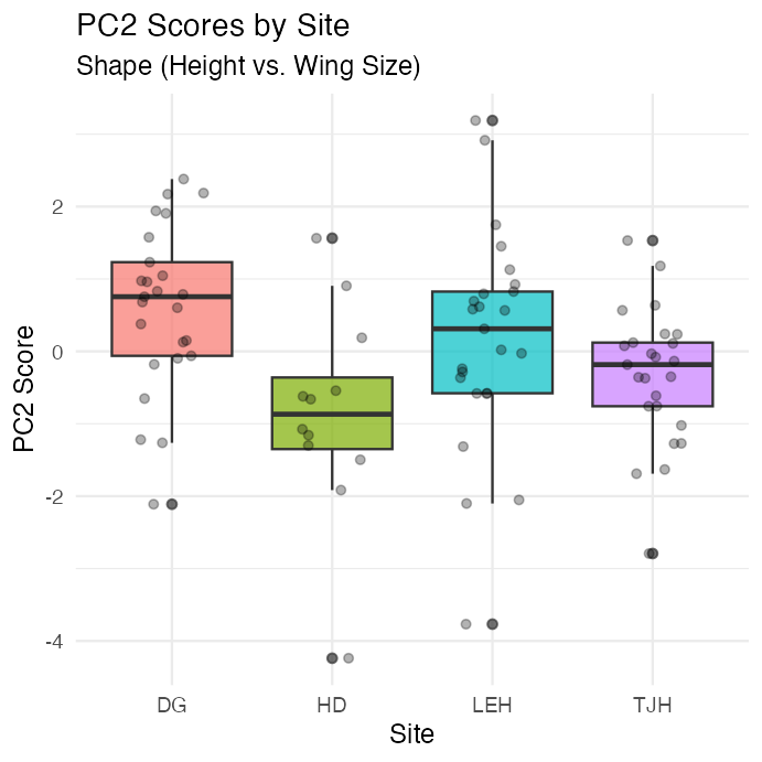
  • TJH plants have different shapes

    • taller and narrower with smaller wings.

    Boxplot of PC2 (shape) scores by site with jittered points overlaid, showing the TJH site's plants scoring differently, consistent with taller, narrower pitchers with smaller wings.

Post-hoc Comparisons

Which Sites Differ?

##  contrast  estimate    SE df t.ratio p.value
##  DG - HD     -3.651 0.673 83  -5.427 <0.0001
##  DG - LEH    -0.366 0.542 83  -0.675  0.9064
##  DG - TJH    -1.447 0.542 83  -2.671  0.0442
##  HD - LEH     3.285 0.673 83   4.883 <0.0001
##  HD - TJH     2.204 0.673 83   3.276  0.0082
##  LEH - TJH   -1.082 0.542 83  -1.996  0.1977
## 
## P value adjustment: tukey method for comparing a family of 4 estimates
##  site emmean    SE df lower.CL upper.CL .group
##  DG   -1.024 0.383 83   -1.786   -0.262  a    
##  LEH  -0.659 0.383 83   -1.421    0.103  ab   
##  TJH   0.423 0.383 83   -0.339    1.185   b   
##  HD    2.626 0.553 83    1.526    3.726    c  
## 
## Confidence level used: 0.95 
## P value adjustment: tukey method for comparing a family of 4 estimates 
## significance level used: alpha = 0.05 
## NOTE: If two or more means share the same grouping symbol,
##       then we cannot show them to be different.
##       But we also did not show them to be the same.

Distance Between Sites

Calculating Euclidean Distance Between Groups

  • Calculate the distance between site centroids (mean PC scores):
    • \(d_{k,j} = \sqrt{\sum_{i=1}^{p}(\bar{Z}_{i,k} - \bar{Z}_{i,j})^2}\)
    • Where \(\bar{Z}_{i,k}\) is the mean of PC i for site k.
  • Using all PCs preserves the true Euclidean distance from the original data.
  • Using just PC1-PC3 (77% of variance) gives approximate distances.

HD is most different from other sites (smallest plants).

# Calculate site centroids (means)
site_means <- pc_scores %>%
  group_by(site) %>%
  summarize(across(PC1:PC3, mean))

site_means
## # A tibble: 4 × 4
##   site     PC1    PC2    PC3
##   <chr>  <dbl>  <dbl>  <dbl>
## 1 DG    -1.02   0.604  0.542
## 2 HD     2.63  -0.863 -1.26 
## 3 LEH   -0.659  0.155 -0.555
## 4 TJH    0.423 -0.345  0.618

# Calculate distance matrix
site_dist <- site_means %>%
  dplyr::select(PC1, PC2, PC3) %>%
  dist() %>%
  round(3)
site_dist
##       1     2     3
## 2 4.328            
## 3 1.241 3.511      
## 4 1.732 2.942 1.672

Visualization of the distances

# 1. Prepare PC Scores with Site
pc_scores_for_dist <- as.data.frame(pca_result$x) %>%
  mutate(site = darlingtonia$site)

# 2. Calculate the mean PC scores for each site (the site "centroids")
site_centroids <- pc_scores_for_dist %>%
  group_by(site) %>%
  summarise(across(starts_with("PC"), mean)) %>%
  ungroup()

# 3. Set site names as row names BEFORE calculating distances
site_centroids_matrix <- site_centroids %>%
  column_to_rownames("site")  # This keeps site names as row names

# 4. Calculate the Euclidean distance matrix between site centroids
dist_matrix <- dist(site_centroids_matrix, method = "euclidean")

# Display the distance matrix
dist_matrix
##           DG       HD      LEH
## HD  4.346434                  
## LEH 1.621198 3.659711         
## TJH 1.843120 3.021386 1.960547

# Visualize the distance matrix
fviz_dist(dist_matrix,
          gradient = list(low = "#00AFBB", high = "#FC4E07"))
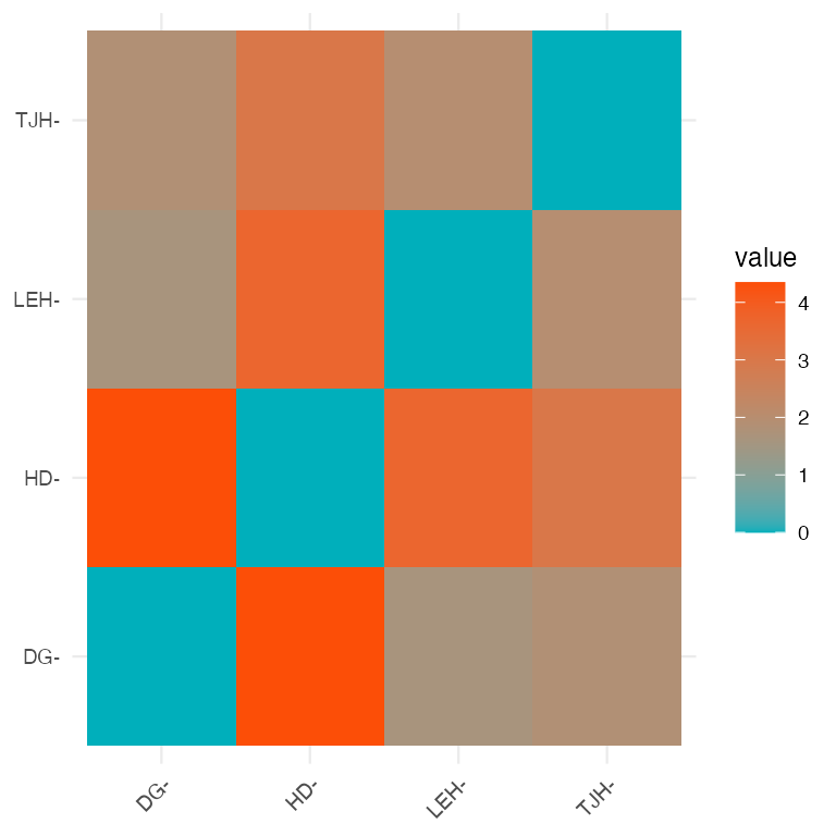
Heatmap of the Euclidean distance matrix between site centroids in PC space, colored from teal (small distance) to orange (large distance).

Part 7 · Summary and When to Use PCA

Summary: PCA Results for Darlingtonia

What We Learned

  • Dimension Reduction Success
  • This makes data easier to visualize, interpret, and analyze.
  • Biological Insights - Three major axes of morphological variation: - PC1 (45.8%): Overall size
    • Larger vs. smaller plants
    • HD site has smallest plants - PC2 (16.7%): Shape contrast
    • Tall/narrow vs. short/wide with large wings
    • TJH site has taller, narrower plants - PC3 (14.8%): Tube girth
    • Fat vs. skinny tubes
    • No significant site differences
  • Statistical Findings
    • Sites differ significantly in size (PC1)
    • Sites differ significantly in shape (PC2)
    • Sites do not differ in tube girth (PC3)
  • PCA Advantages
  • Key Take-Home Messages
    • PCA good for exploratory analysis of multivariate data
    • Always standardize when different units/scales
    • Loadings reveal variables contributions to each component
    • Scores used in subsequent analyses (ANOVA, regression)
    • Biplots visualize both samples and variables simultaneously

When to Use PCA

  • PCA is Appropriate When:
  • PCA Assumptions:
    • Linearity: relationships between variables are linear
    • Adequate correlation: variables must be correlated
    • No severe outliers: can distort results
    • Sample size: need enough observations
  • Always Check:
    • Correlation matrix (are variables correlated?)
    • Scree plot (how many components needed?)
    • Loadings (biological interpretation makes sense?)
    • Outliers (check scores plots)

When to Consider Alternatives:

  • Different data types:
    • Categorical variables → MCA (Multiple
    • Correspondence Analysis) - Species composition data → CA (Correspondence Analysis)
    • Distance/dissimilarity matrices → PCoA (Principal Coordinates Analysis)
  • Different goals: - Classification → Discriminant Analysis
    • Non-linear patterns → NMDS (Non-metric Multidimensional Scaling)
    • Hypothesis testing → MANOVA
  • Problems with PCA:
    • Strong outliers present
    • Non-linear relationships
    • Variables are uncorrelated
    • Many zeros in data
  • PCA works best for morphological, physiological, and environmental variables!

Additional PCA Diagnostics

Checking Assumptions and Quality

  1. Sampling Adequacy
  • Kaiser-Meyer-Olkin (KMO) Test:
  • Measures sampling adequacy
  • Values > 0.6 = acceptable
  • Values > 0.8 = good

Our overall KMO = 0.80 (good!)

# KMO test requires psych package
KMO(cor(darl_numeric))
## Kaiser-Meyer-Olkin factor adequacy
## Call: KMO(r = cor(darl_numeric))
## Overall MSA =  0.76
## MSA for each item = 
##       height   mouth_diam    tube_diam    keel_diam wing1_length wing2_length 
##         0.64         0.84         0.47         0.61         0.85         0.80 
##    wingsprea   hoodmass_g   tubemass_g   wingmass_g 
##         0.76         0.78         0.72         0.86

2. Outlier Detection

Check for influential observations:
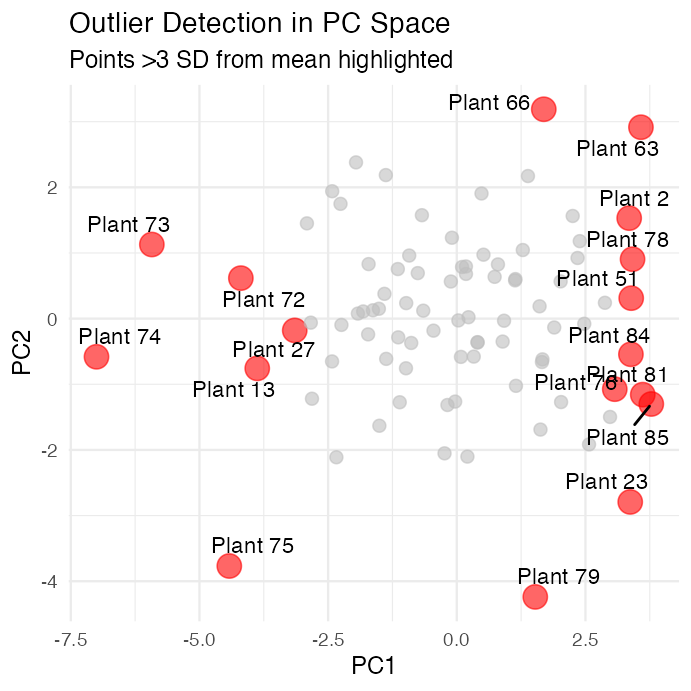
Scatterplot of PC1 versus PC2 scores with points more than 3 standard deviations from the mean highlighted in red and labeled by plant ID, used to check for multivariate outliers.

PCA vs. Other Ordination Methods

Comparison Table

Method Data Type Distance/Similarity Linear? Eigenanalysis?
PCA Continuous, correlated Euclidean (correlation) Yes Yes
CA Count data, species Chi-square No Yes
PCoA Any (via distance matrix) Any distance metric N/A Yes
NMDS Any (via distance matrix) Any distance metric No No
DCA Species abundance Weighted averaging No Yes

Advanced Topics in PCA

Topics We Haven’t Covered

  • Factor Analysis: - Similar to PCA but with different goals - Assumes latent “factors” cause observed variables - Uses rotation to improve interpretation - More common in social sciences
  • Robust PCA: - Less sensitive to outliers - Uses robust covariance estimators - Useful with messy ecological data
  • Sparse PCA: - Forces many loadings to exactly zero - Easier to interpret - Better for very high-dimensional data
  • Functional PCA: - For time series or spatial data - Treats curves as observations - Common in physiology
  • Probabilistic PCA: - Includes uncertainty estimation - Can handle missing data - Maximum likelihood framework
  • Kernel PCA: - Handles non-linear relationships - Uses kernel trick from machine learning - More flexible but harder to interpret
  • These are beyond our scope but worth knowing exist!

Part 8 · Best Practices and Reporting

Practical Tips for PCA

Best Practices

Before PCA:

  1. Explore your data
    • Check distributions
    • Identify outliers
    • Understand variable scales
  2. Check correlations
    • Make correlation plot
    • Ensure variables are correlated
    • Consider removing redundant variables
  3. Standardize appropriately
    • Use scale = TRUE for different units
    • Consider centering only for same units
  4. Check sample size
    • Need at least 3× variables
    • More is better (50+ ideal)

During PCA:

  1. Examine scree plot
    • Look for elbow
    • Consider cumulative variance
    • Usually keep 2-5 components
  2. Interpret loadings
    • Look for patterns
    • Consider biological meaning
    • Ignore very small loadings
  3. Check scores plots
    • Look for outliers
    • Identify patterns/groups
    • Consider site/treatment effects

After PCA:

  1. Report clearly
    • State why you used PCA
    • Report variance explained
    • Describe component interpretation
  2. Use results appropriately
    • PC scores can go into other analyses
    • Don’t over-interpret small components
    • Remember: exploratory tool!

Reporting PCA Results

What to Include in Papers/Theses

Methods Section:

“We performed principal component analysis (PCA) on 10 morphological and biomass variables measured on 89 Darlingtonia californica plants from four sites. Variables were standardized (mean = 0, SD = 1) prior to analysis to account for different measurement scales. PCA was conducted using the prcomp() function in R. We retained principal components with eigenvalues > 1 and that cumulatively explained >70% of variance.”

Results Section:

“The first three principal components explained 77.3% of variance (PC1: 45.8%, PC2: 16.7%, PC3: 14.8%). PC1 represented overall plant size, with high positive loadings for most morphological and biomass variables…”

Essential Figures:

  1. Scree plot - shows variance explained
  2. Loadings plot - shows variable contributions
  3. Scores plot or biplot - shows samples in PC space

Essential Tables:

  1. Variance explained by each PC
  2. Loadings for retained PCs (usually PC1-PC3)
  3. ANOVA results if testing groups

Don’t Report:

  • All 10 PCs if only 3 are meaningful
  • Tiny loadings (< 0.3)
  • Every individual PC score
  • Raw eigenvalues (report % variance instead)

Common PCA Mistakes to Avoid

Mistakes Students Make:

Not standardizing data with different units
→ ✓ Always use scale = TRUE for different units

Forgetting to check correlations
→ ✓ Make correlation plot first

Using too many components
→ ✓ Use scree plot, keep components above elbow

Over-interpreting small loadings
→ ✓ Focus on loadings > |0.3|

Ignoring signs on loadings
→ ✓ Sign can flip; look at patterns

Treating PC scores as original data
→ ✓ Remember PCs are derived variables

Using PCA on categorical data
→ ✓ Use appropriate method (CA, MCA)

Not checking for outliers
→ ✓ Plot scores, check for extreme values

Assuming PCs have biological meaning
→ ✓ Interpret carefully, components are mathematical

Using PCA with too few samples
→ ✓ Need n > 3p (preferably n > 50)

Not reporting variance explained
→ ✓ Always report % variance for each PC

Forgetting that PCA is exploratory
→ ✓ Use for patterns, not hypothesis testing

Practice Exercise

Exercise 1: Subset Analysis

Try running PCA on just the morphological variables (exclude biomass):

# Select only morphological variables
darl_morph <- darlingtonia %>%
  select(height, mouth_diam, tube_diam, 
         keel_diam, wing1_length, 
         wing2_length, wingsprea)

# Run PCA
pca_morph <- prcomp(darl_morph, 
                    scale. = TRUE)

# Examine results
summary(pca_morph)

# How do results differ from full PCA?

Exercise 2: Site-Specific PCA

Run PCA on just one site (e.g., DG):

# Filter to one site
darl_dg <- darlingtonia %>%
  filter(site == "DG") %>%
  select(-site)

# Run PCA
pca_dg <- prcomp(darl_dg, 
                 scale. = TRUE)

# Compare to overall PCA
summary(pca_dg)

# Do the same patterns emerge?

Exercise 3: Interpretation

  1. What does PC1 represent in each analysis?
  2. How much variance is explained?
  3. Do you see the same patterns?

Part 9 · PERMANOVA — Testing Group Differences

Alternative PCA Visualization: FactoMineR

# Create dataset with row names
darl_pca_data <- darlingtonia %>%
  select(height, mouth_diam, tube_diam, keel_diam,
         wing1_length, wing2_length, wingsprea,
         hoodmass_g, tubemass_g)

# PCA
pca_facto <- PCA(darl_pca_data,
                 graph = FALSE,
                 scale.unit = TRUE)

# Create grouping factor with same length
site_groups <- factor(darlingtonia$site)

# Plot with grouping
fviz_pca_biplot(pca_facto,
                col.ind = site_groups,  # Use col.ind instead
                palette = "jco",
                addEllipses = TRUE,
                ellipse.level = 0.95,
                repel = TRUE)
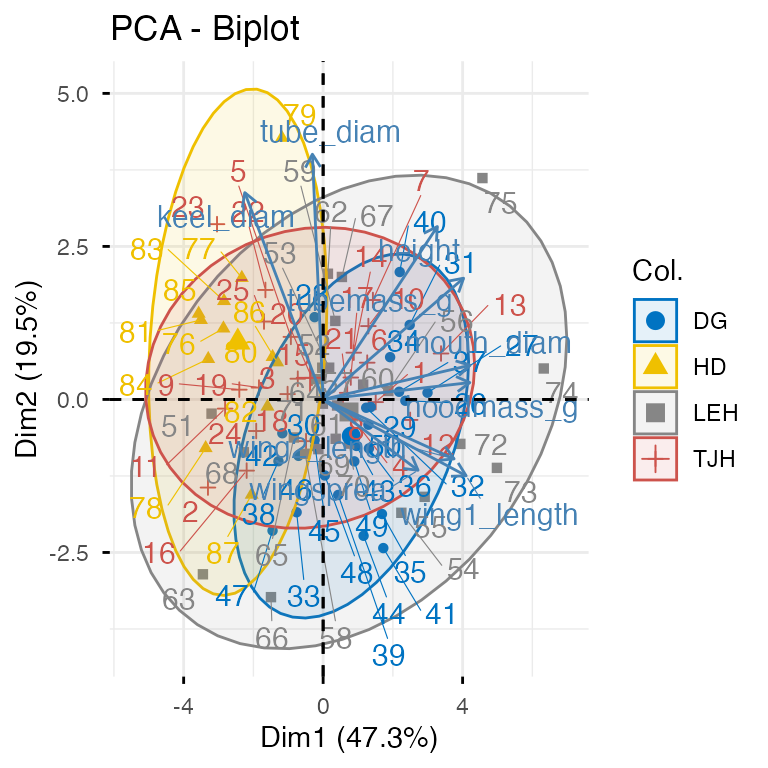
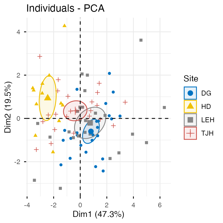
Two PCA plots from FactoMineR/factoextra: a biplot with plants colored by site, confidence ellipses, and variable arrows; and a separate individuals-only plot with plants colored by site and 95% confidence ellipses.


# Individual plot with better options
fviz_pca_ind(pca_facto,
             geom.ind = "point",
             col.ind = darlingtonia$site,
             palette = "jco",
             addEllipses = TRUE,
             ellipse.type = "confidence",
             legend.title = "Site",
             repel = TRUE)

Two PCA plots from FactoMineR/factoextra: a biplot with plants colored by site, confidence ellipses, and variable arrows; and a separate individuals-only plot with plants colored by site and 95% confidence ellipses.

Quick PCA Plot with ggfortify

# Quick PCA plot with ggplot2
autoplot(pca_result,
         data = darlingtonia,
         colour = 'site',
         loadings = TRUE,
         loadings.label = TRUE,
         frame = TRUE,  # Adds ellipses
         frame.type = 'norm')  # or 't' for confidence

Quick PCA plot built with ggfortify::autoplot(): plants plotted on PC1 and PC2, colored by site, with variable loading arrows and labels overlaid, and normal-distribution ellipses around each site's points.

PCA with vegan: rda() and Distance Metrics

# Prepare data matrix (samples × variables)
darl_matrix <- darlingtonia %>%
  select(height, mouth_diam, tube_diam, keel_diam,
         wing1_length, wing2_length, wingsprea,
         hoodmass_g, tubemass_g) %>%
  scale()

# PCA with vegan (uses SVD, similar to prcomp)
pca_vegan <- rda(darl_matrix)

# Quick plot
biplot(pca_vegan, scaling = 2)
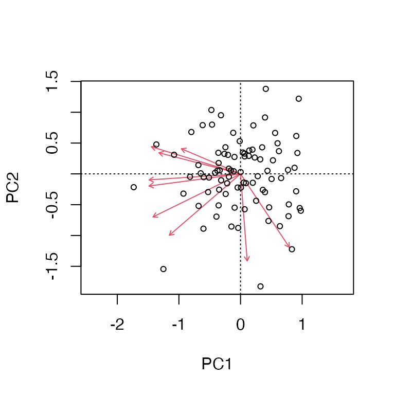
Two base-R vegan plots: a PCA biplot of samples and variable arrows from rda(), and an ordination plot of sites with spider lines connecting each point to its site centroid and shaded confidence ellipses around each site.


# Calculate distances between sites
site_matrix <- darlingtonia %>%
  select(height, mouth_diam, wingmass_g) %>%
  mutate(site = darlingtonia$site) %>%
  group_by(site) %>%
  summarise(across(everything(), mean)) %>%
  column_to_rownames("site")

# Euclidean distance (many distance metrics available!)
dist_euclidean <- vegdist(site_matrix, method = "euclidean")
dist_bray <- vegdist(site_matrix, method = "bray")  # Bray-Curtis
dist_manhattan <- vegdist(site_matrix, method = "manhattan")

# Create a nice color palette
site_factor <- factor(darlingtonia$site)
n_sites <- length(levels(site_factor))
colors <- brewer.pal(min(n_sites, 8), "Set1")  # Use Set1 palette
site_colors <- colors[as.numeric(site_factor)]

# Ordination plot with sites
ordiplot(pca_vegan, type = "none")
points(pca_vegan, display = "sites", col = site_colors, pch = 19, cex = 1.5)
ordispider(pca_vegan, groups = darlingtonia$site, col = colors)
ordiellipse(pca_vegan, groups = darlingtonia$site, draw = "polygon",
            col = colors, alpha = 0.2)

# Add legend
legend("topright", legend = levels(site_factor),
       col = colors, pch = 19, bty = "n")
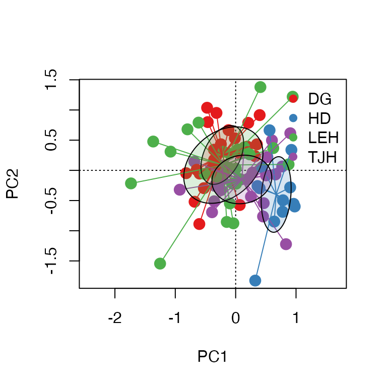
Two base-R vegan plots: a PCA biplot of samples and variable arrows from rda(), and an ordination plot of sites with spider lines connecting each point to its site centroid and shaded confidence ellipses around each site.

Testing Group Differences: PERMANOVA

# Analysis
pca_vegan <- rda(darl_matrix)
permanova <- adonis2(darl_matrix ~ site, data = darlingtonia)

# Visualization
fviz_pca_biplot(pca_result,
                habillage = darlingtonia$site,
                addEllipses = TRUE) +
  labs(title = paste0("PERMANOVA: p = ",
                      round(permanova$`Pr(>F)`[1], 3)))
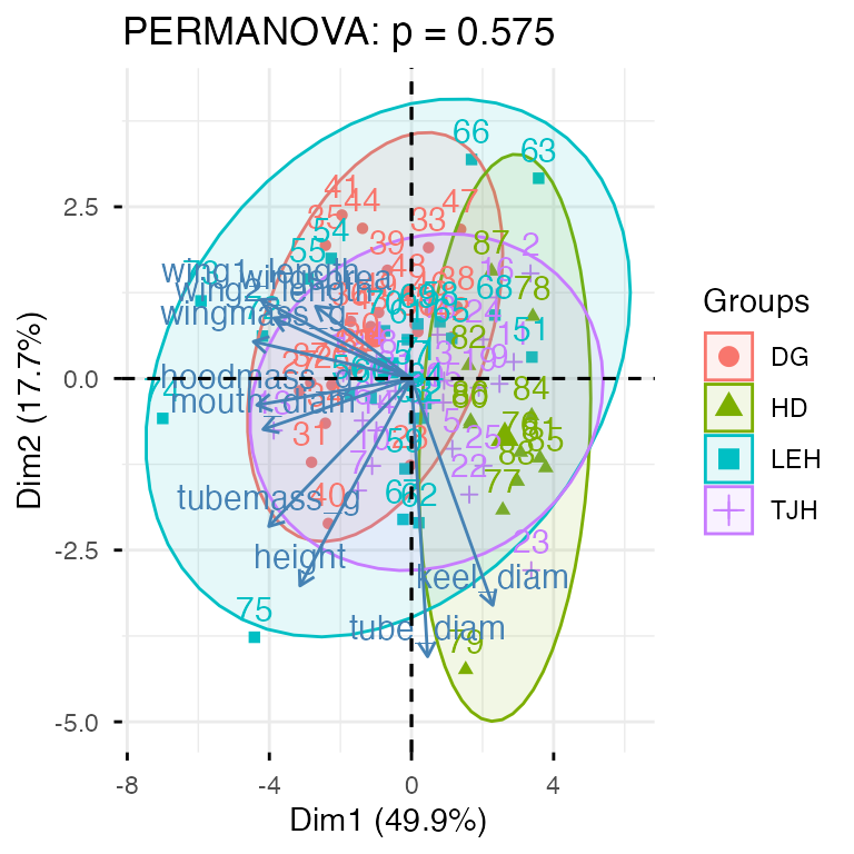
PCA biplot of plants colored and grouped by site with confidence ellipses, titled with the PERMANOVA p-value testing whether site groups differ significantly in multivariate space.


# Scale the data properly
darl_scaled <- darlingtonia %>%
  select(height, mouth_diam, tube_diam, keel_diam,
         wing1_length, wing2_length, wingsprea,
         hoodmass_g, tubemass_g) %>%
  scale() %>%
  as.data.frame()  # Convert back to data frame

# PERMANOVA
permanova_scaled <- adonis2(darl_scaled ~ site,
                           data = darlingtonia,
                           method = "euclidean",
                           permutations = 999)
permanova_scaled
## Permutation test for adonis under reduced model
## Permutation: free
## Number of permutations: 999
## 
## adonis2(formula = darl_scaled ~ site, data = darlingtonia, permutations = 999, method = "euclidean")
##          Df SumOfSqs      R2      F Pr(>F)    
## Model     3   189.72 0.24512 8.9836  0.001 ***
## Residual 83   584.28 0.75488                  
## Total    86   774.00 1.00000                  
## ---
## Signif. codes:  0 '***' 0.001 '**' 0.01 '*' 0.05 '.' 0.1 ' ' 1

Ordination with Convex Hulls

# Ordination plot with convex hulls (simpler)
ordiplot(pca_vegan, type = "none")
ordihull(pca_vegan, groups = darlingtonia$site,
         draw = "polygon", col = 1:n_sites, alpha = 50)
points(pca_vegan, display = "sites", pch = 21,
       bg = as.numeric(factor(darlingtonia$site)), cex = 1.5)
legend("topright", legend = levels(factor(darlingtonia$site)),
       pt.bg = 1:n_sites, pch = 21, bty = "n")
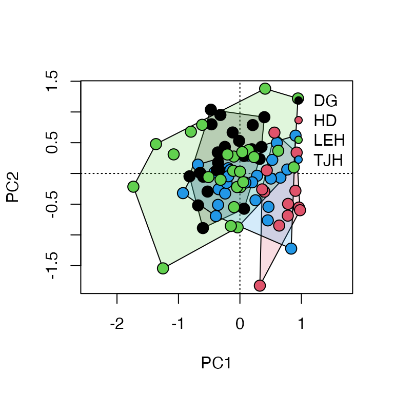
Ordination plot of sites with a convex hull polygon drawn around each site's points and points colored/filled by site, showing the spatial extent of each site's morphological variation.

Pairwise PERMANOVA Comparisons

# Pairwise comparisons between sites
pairwise_result <- pairwise.adonis2(darl_scaled ~ site,
                                    data = darlingtonia,
                                    method = "euclidean",  # Add this!
                                    p.adjust.m = "bonferroni")
pairwise_result
## $parent_call
## [1] "darl_scaled ~ site , strata = Null , permutations 999"
## 
## $TJH_vs_DG
##          Df SumOfSqs      R2      F Pr(>F)   
## Model     1   32.602 0.10636 5.7128  0.002 **
## Residual 48  273.930 0.89364                 
## Total    49  306.532 1.00000                 
## ---
## Signif. codes:  0 '***' 0.001 '**' 0.01 '*' 0.05 '.' 0.1 ' ' 1
## 
## $TJH_vs_LEH
##          Df SumOfSqs      R2      F Pr(>F)   
## Model     1    47.72 0.10517 5.6414  0.005 **
## Residual 48   406.06 0.89483                 
## Total    49   453.78 1.00000                 
## ---
## Signif. codes:  0 '***' 0.001 '**' 0.01 '*' 0.05 '.' 0.1 ' ' 1
## 
## $TJH_vs_HD
##          Df SumOfSqs      R2      F Pr(>F)    
## Model     1   69.308 0.25135 11.751  0.001 ***
## Residual 35  206.432 0.74865                  
## Total    36  275.740 1.00000                  
## ---
## Signif. codes:  0 '***' 0.001 '**' 0.01 '*' 0.05 '.' 0.1 ' ' 1
## 
## $DG_vs_LEH
##          Df SumOfSqs      R2      F Pr(>F)  
## Model     1    26.24 0.06493 3.3333   0.02 *
## Residual 48   377.85 0.93507                
## Total    49   404.09 1.00000                
## ---
## Signif. codes:  0 '***' 0.001 '**' 0.01 '*' 0.05 '.' 0.1 ' ' 1
## 
## $DG_vs_HD
##          Df SumOfSqs      R2      F Pr(>F)    
## Model     1   131.09 0.42382 25.745  0.001 ***
## Residual 35   178.22 0.57618                  
## Total    36   309.31 1.00000                  
## ---
## Signif. codes:  0 '***' 0.001 '**' 0.01 '*' 0.05 '.' 0.1 ' ' 1
## 
## $LEH_vs_HD
##          Df SumOfSqs     R2      F Pr(>F)    
## Model     1   101.69 0.2468 11.468  0.001 ***
## Residual 35   310.35 0.7532                  
## Total    36   412.04 1.0000                  
## ---
## Signif. codes:  0 '***' 0.001 '**' 0.01 '*' 0.05 '.' 0.1 ' ' 1
## 
## attr(,"class")
## [1] "pwadstrata" "list"

Pairwise MANOVA-Based Comparisons

# install.packages("RVAideMemoire")
library(RVAideMemoire)

# Pairwise PERMANOVA
pairwise.perm.manova(vegdist(darl_scaled, method = "euclidean"),
                     darlingtonia$site,
                     test = "Wilks",
                     nperm = 999,
                     p.method = "bonferroni")
## 
##  Pairwise comparisons using permutation MANOVAs on a distance matrix 
## 
## data:  vegdist(darl_scaled, method = "euclidean") by darlingtonia$site
## 999 permutations 
## 
##     DG    HD    LEH  
## HD  0.006 -     -    
## LEH 0.126 0.006 -    
## TJH 0.006 0.006 0.012
## 
## P value adjustment method: bonferroni

Comparing the Pairwise Test Results

These results come from different statistical tests being used:

1. pairwise.adonis2() — PERMANOVA on subsets

  • What it does: For each pair, it subsets the data to just those 2 sites and runs a separate PERMANOVA.
  • Results: All p-values ≤ 0.016 (5 of 6 are p = 0.001).
  • Interpretation: Tests if centroids (mean positions) differ between site pairs.

2. pairwise.perm.manova() — a different test entirely

  • What it does: Uses a MANOVA-based approach with permutations on the full distance matrix.
  • Results: More conservative — DG vs LEH now p = 0.078 (not significant).
  • Interpretation: Also tests centroid differences but uses a different statistical framework.

Why the differences matter — both are Location (Centroid) tests:

pairwise.adonis2() and pairwise.perm.manova() both test if site means differ. They give slightly different p-values due to different algorithms, but similar conclusions. Use these to answer: “Are sites morphologically different?”