Lecture 01 — Introduction
Our question, our data, and a first look at what we will do
2026-10-05
Lecture 1 · Syllabus
- The syllabus has all the details — topics, grading, policies, schedule
- Read it before Thursday
- It will evolve — check Canvas for the current version
Note
✅ Key idea
The syllabus is the contract between us. If something is unclear, ask now — not at exam time.
Lecture 1 · Who am I?
- Bill Perry — call me Bill or Dr. Perry
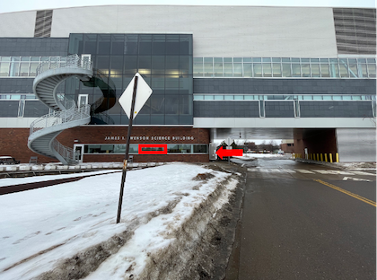
- Office: Swenson Science Building 13
- Phone: 218-726-8145
- Email: wlperry@d.umn.edu
- Drop-in hours: Monday 12:15–1:15, Tuesday 2–3 (tentative)
- Lab: SSB 170
Tip
Best way to reach me: email or drop in. If I am in the lab I am usually around.
Lecture 1 · My goals for this course
- Help you learn the tools to organize and present data from potentially very large datasets
- How to use Excel for some tasks — and when to stop using it
- How to use R — a coding language — to work with data and graphics
- How to organize, clean, summarize, and visualize data — the pipeline
- How to formulate and test hypotheses
- How to use statistics to test those hypotheses
- How to interpret what the data is telling us
Note
The pipeline: raw data → clean → summarize → visualize → test → report.
This course teaches every step.
Lecture 1 · My expectations
- Communication — ask questions in class, in office hours, by email
- Practice — the only way to learn to code is to write code
- Failure — every error message is information; celebrate finding bugs
- Learn to troubleshoot — reading error messages is a skill we will practice
Important
Getting stuck is not failing — it is the job.
Every working data scientist searches Google for error messages every single day.
What I will do:
- Provide clear examples
- Walk through code line by line
- Give you real datasets to work with
What you need to do:
- Type the code yourself (do not copy-paste)
- Run it, break it, fix it
- Bring questions to class
Lecture 1 · Science
- Science is a way to acquire, organize, and apply knowledge
- We make predictions and test them with a falsifiable approach — statistics
- Explanations that cannot be tested or falsified are not science
Example:
- “Leaves on the shady side are bigger” testable
- “The forest has a spirit that controls leaf size” — not testable
Note
📖 New vocabulary
Falsifiable = a prediction that could, in principle, be shown to be wrong.
A good hypothesis is one you could prove false.
Note
📚 Suggested reading (outside of class)
Whitlock & Schluter, Ch. 1 — Statistics and Samples. Covers how biologists turn a question about nature into something we can measure and test — the same path we take today with leaves.
Today · Real-world data science
- Talking about data science is super boring
- The only way to learn it is to do it — collect data, enter it, analyze it
- This lecture and the next will be about how to work with data from the very start
- Your task: collect data → organize it → enter it into a spreadsheet → develop metadata
Tip
🖐 Try it yourself
We are going to go outside, collect leaves, and build our first dataset today. That dataset will follow us for the first part of the course.
What will we do
- We are going to measure something in nature
- Suggestion: leaf mass, width, length, and surface area from the sunny side vs. shady side of a tree
- Do leaves respond to light intensity?
- The null hypothesis (H₀):
- There is no difference in leaf size or shape between the two sides of a tree.
- The alternate hypothesis (Hₐ):
- Leaf size differs between the sunny and shady sides.
Note
📖 New vocabulary
Null hypothesis (H₀) — the “nothing is happening” claim. Statistics will tell us whether the data are consistent with this or not.
Alternate hypothesis (Hₐ) — the claim we think might be true.
How does leaf size vary?
- Does the sunny side vs. shady side of a tree differ due to light?
- Predict: what do you think will happen before we collect any data?
- Your prediction:
- Hypothesize: what is the formal testable statement?
Your null hypothesis: ____________________________
Your alternate hypothesis: ____________________________
- Predict: what do you think will happen before we collect any data?
Tip
Key distinction
- A prediction says what you think will happen and usually has a direction.
- A hypothesis is a formal statement that can be accepted or rejected with data.
How would we collect data to test this?
- Can we collect leaves from one tree to do this? — Yes or no?
- Discuss
- What is the problem with using only one tree?
- How might results from many trees differ from one tree?
- Do we need to be sure our sample is randomly selected?
- Why do we need to randomize?
- How can we randomize our sampling?
Important
Replication and randomization
These two principles are the foundation of all experimental design. One tree is a sample size of one — we cannot generalize from that.
Note
📚 Suggested reading (outside of class)
Whitlock & Schluter, Ch. 1, section on samples and populations — why we sample instead of measuring every leaf on every tree, and what makes a sample representative.
What variables could we record?
- What variables could we record about the tree?
- What variables could we record about the leaf?
Dependent variable (response):
- The thing we measure — it depends on our treatment
- Example: leaf mass, leaf area
Independent variable (explanatory):
- The thing we control or group by
- Example: side of tree (sunny vs. shady)
Note
📖 New vocabulary
- Dependent variable → what you measure (Y)
- Independent variable → what you control or group by (X)
- In a graph: Y goes on the vertical axis, X goes on the horizontal axis.
→ ACTIVITY 1 starts now
🛑 Go to Activity 1 — “Measuring Leaves and Entering Data”
Close the slides. Open the Activity 1 worksheet, form your field group, and head outside to the pine stand.
The worksheet walks you through everything from here: collecting leaves, deciding what to measure, building your spreadsheet, and sketching a first graph. Come back to these slides only if you want to re-check a definition.
Each group collects 3 sunny + 3 shady leaves per tree
- Collect 3 mature leaves from the sunny side and 3 from the shady side of the same tree
- Do this on at least 1 tree per group (more trees if time allows — we share trees since we are limited)
- Standardize your collection: (DISCUSS AND FIGURE IT OUT BY YOURSELVES)
How high do we collect from?
What does “mature” mean?
What will we measure with — calipers or a ruler?
Any other decisions to standardize?
Important
⚠️ Watch out!
If everyone collects differently (different heights, different leaf ages), we cannot combine our data.
Agree on the rules or methods before collecting…..
Back in the lab · Before we begin
- What can we measure?
- mass (grams)
- length (mm or cm)
- width (mm or cm)
- surface area (cm²) — how?
- others?
- Decisions to make as a group:
What units?
What abbreviations or vocabulary for the variables?
What if a leaf is damaged?
Note
📖 New vocabulary
- Metadata = data about your data.
- Who collected it? When? Where? With what instrument? Under what conditions?
- Without metadata, data are nearly useless to anyone else — including future you.
Back in the lab · Setting up the spreadsheet
- How do you enter this into the Excel sheet?
- What does the sheet look like? Mock something up
- What are the column names you will use?
- What are the units for each column?
- What is the vocabulary? (no spaces in column names, use
_instead) - Where does the metadata go?
Tip
Best practice for column names:
leaf_mass_g, not Leaf Mass (g) - why???
Consistent, no spaces, no special characters, units in the name and all lower case - why?????
Can you make a graph in Excel?
- Using what you collected, make a simple Excel chart
- What would the graph look like?
- What goes on the X axis? The Y axis?
- What can you derive from the data already?
Note
Excel is great for a first look. But as datasets grow larger and analyses more complex, we need another approach - R.
What R code looks like · A preview
You do not need to understand this yet — just look at the shape of it.
# Load the tools we need
library(tidyverse)
library(readxl)

# Read our leaf data into R
tree_df <- read_excel("data/tree_experiment.xlsx")

# Compute the mean weight for each side
tree_df %>%
  group_by(side) %>%
  summarize(mean_weight = mean(weight_g))

# Make a plot
ggplot(tree_df, aes(x = side, y = weight_g)) +
  geom_boxplot()
Tip
🖐 Notice
It reads almost like English: take tree_df, then group by side, then compute the mean. That is the goal — code that tells a clear story.
Before Thursday · Install R and Positron
Downloading R and Positron:
- Download R — cran.r-project.org
- Installs to your computer — can you find it?
- Download Positron — positron.posit.co
- Install R first, then Positron — Positron needs to find R on your machine
Important
⚠️ Watch out!
Install R first, then Positron. If you install Positron first, it may not find R automatically.
Suggested reading before Lecture 2
- Whitlock & Schluter, Ch. 1 — Statistics and Samples
- Read the whole chapter — it is short and covers everything we discussed today: forming a question, samples vs. populations, and why we replicate and randomize
- R for Data Science (2e), Ch. 1 — Data Visualization (skim only)
- You do not need to run any code yet. Just look at the pictures and read the first few pages — it previews what we build in Lecture 2
Note
Both PDFs are in the course readings/ folder. Neither reading requires you to write anything — just read and come with questions.
See you Thursday — bring your laptop and the leaf data you entered in Excel.