Reshaping Lake Superior ice cover data with pivot_longer() and pivot_wider()
2026-07-05
GSODR package, Duluth stationgroup_by() %>% summarize() reveals themlm() to estimate a rate of change — °C per year, converted to °C per decadecase_when() to build a new categorical variable — summer vs. winterNote
✅ Transition
pivot_longer() — turn wide data into tidy long datapivot_wider() — turn long data back into a human-readable summary tableTip
🖐 Try it yourself
By the end you’ll have reshaped real NOAA ice data and built the same kind of plot NOAA scientists publish.
Tools today:
tidyverse, janitorTextbook:
This lecture runs in four short chunks. After each chunk you switch to the activity and type the code yourself.
For every code block, do three things:
Note
✅ Why bother? (the evidence)
We will cover: where the ice data comes from, why “wide” data breaks tidy tools, and reading the messy text file into R.
Tip
🖐 After this chunk: Activity Parts 1–2 (read the raw file and inspect its wide shape).
NOAA-GLERL (Great Lakes Environmental Research Laboratory) has tracked daily Great Lakes ice cover since 1973 — over 50 years of satellite-derived ice charts.
Today’s dataset: daily percent ice cover for Lake Superior, one row per day-of-winter, one column per year.
Source:
https://www.glerl.noaa.gov/data/ice/glicd/daily/sup.txt
Important
This is a plain text file living on a government server — not a tidy CSV. This is what real environmental data often looks like.

Note
🔮 Predict first: This table has one column per year — 53 of them. Before the next slides: can ggplot() use this shape directly? If not, what has to change first?
1973 1974 1975 ... 2024 2025
Nov-10 NA NA NA NA NA
Nov-11 NA NA NA NA NA
...
Jan-15 2.1 4.0 1.8 8.2 6.5
...
NA — many days simply had no ice that year or that monthThis format is perfect for a human scanning a printed table. It’s terrible for R and ggplot.
Why this breaks tidy tools:
ggplot() wants one column to map to x, one to ygroup_by(year) is impossible — there’s no year column to group by!📖 R4DS Ch. 5.2 — “every value in its own cell”
# A tibble: 6 × 55
date X1973 X1974 X1975 X1976 X1977 X1978 X1979 X1980 X1981 X1982 X1983 X1984
<chr> <dbl> <dbl> <dbl> <dbl> <dbl> <dbl> <dbl> <dbl> <dbl> <dbl> <dbl> <dbl>
1 Nov-10 NA NA NA NA NA NA NA NA NA NA NA NA
2 Nov-11 NA NA NA NA NA NA NA NA NA NA NA NA
3 Nov-12 NA NA NA NA NA NA NA NA NA NA NA NA
4 Nov-13 NA NA NA NA NA NA NA NA NA NA NA NA
5 Nov-14 NA NA NA NA NA NA NA NA NA NA NA NA
6 Nov-15 NA NA NA NA NA NA NA NA NA NA NA NA
# ℹ 42 more variables: X1985 <dbl>, X1986 <dbl>, X1987 <dbl>, X1988 <dbl>,
# X1989 <dbl>, X1990 <dbl>, X1991 <dbl>, X1992 <dbl>, X1993 <dbl>,
# X1994 <dbl>, X1995 <dbl>, X1996 <dbl>, X1997 <dbl>, X1998 <dbl>,
# X1999 <dbl>, X2000 <dbl>, X2001 <dbl>, X2002 <dbl>, X2003 <dbl>,
# X2004 <dbl>, X2005 <dbl>, X2006 <dbl>, X2007 <dbl>, X2008 <dbl>,
# X2009 <dbl>, X2010 <dbl>, X2011 <dbl>, X2012 <dbl>, X2013 <dbl>,
# X2014 <dbl>, X2015 <dbl>, X2016 <dbl>, X2017 <dbl>, X2018 <dbl>, …
What’s happening here:
read.table() (base R) handles this better than read_csv() since the file isn’t comma-separatedna.strings tells R which placeholder values actually mean “missing”Nov-10, Nov-11…) were row names, not a real column — rownames_to_column() fixes thatImportant
Look at the column names: X1973, X1974… R adds an X because column names can’t start with a number!
Read sup.txt straight from the web with read.table(), turn the row labels into a real date column, and look at the wide shape. Predict how many columns it has before you run it.
We will cover: pivot_longer() to make the data tidy, the before/after shape, and the tricky winters-cross-the-new-year date fix.
Tip
🖐 After this chunk: Activity Parts 3–4 (pivot to long, then fix the calendar-year wrinkle).
pivot_longer() — Collapsing Wide to LongNote
🔮 Predict first: ice_raw is ~190 rows × 53 columns. After pivot_longer() collapses every year column, how many columns will ice_long have, and roughly how many rows?
# A tibble: 6 × 3
date year ice_cover
<chr> <chr> <dbl>
1 Apr-01 1973 3
2 Apr-02 1973 2.7
3 Apr-03 1973 2.4
4 Apr-04 1973 2
5 Apr-05 1973 1.7
6 Apr-06 1973 1.4
Reading the arguments:
cols = -date — pivot every column except datenames_to = "year" — the old column names become values in a new year columnnames_prefix = "X" — strip the X that R glued onto the numbersvalues_to = "ice_cover" — the old cell values become a new ice_cover column📖 R4DS Ch. 5.3 — pivot_longer() for wide-to-long
Suppose I forgot rownames_to_column(), so there is no date column yet:
R stops:
Error in `pivot_longer()`:
! Can't select columns that don't exist.
✖ Column `date` doesn't exist.
The fix — make the row labels a real column first:
Tip
✅ Why show a broken run?
“Column date doesn’t exist” means you referenced a column R can’t see — here because the day labels were still row names, not data. Reading the message points you straight to the fix.
Wide (ice_raw):
| date | X1973 | X1974 | X1975 |
|---|---|---|---|
| Nov-10 | NA | NA | NA |
| Jan-15 | 2.1 | 4.0 | 1.8 |
Long (ice_long):
| date | year | ice_cover |
|---|---|---|
| Jan-15 | 1973 | 2.1 |
| Jan-15 | 1974 | 4.0 |
| Jan-15 | 1975 | 1.8 |
Same information. Completely different shape.
ggplot() and group_by() expectTip
This is the single most important reshaping skill in all of data science — almost every messy dataset needs this.
The problem: an ice season runs Nov → May, but NOAA labels the whole season by the year winter ends in. So Nov-10 under column 1974 actually happened in November 1973.
# Assign Nov/Dec to the PREVIOUS calendar year ----------
ice_clean <- ice_long %>%
mutate(
year = as.numeric(year),
calendar_year = if_else(
str_starts(date, "Nov|Dec"),
year - 1,
year
),
full_date = ymd(paste(calendar_year, date, sep = "-")),
month = month(full_date, label = TRUE)
) %>%
drop_na(ice_cover, full_date)
head(ice_clean)# A tibble: 6 × 6
date year ice_cover calendar_year full_date month
<chr> <dbl> <dbl> <dbl> <date> <ord>
1 Apr-01 1973 3 1973 1973-04-01 Apr
2 Apr-02 1973 2.7 1973 1973-04-02 Apr
3 Apr-03 1973 2.4 1973 1973-04-03 Apr
4 Apr-04 1973 2 1973 1973-04-04 Apr
5 Apr-05 1973 1.7 1973 1973-04-05 Apr
6 Apr-06 1973 1.4 1973 1973-04-06 Apr
Reading the logic:
str_starts(date, "Nov|Dec") — does this row’s day-of-winter text start with “Nov” or “Dec”?year to get the real calendar yearymd() (from lubridate) glues the pieces into one real R Datedrop_na() removes rows with no real date or no ice reading📖 R4DS Ch. 17 — working with dates and times
Pivot the data long with pivot_longer(), then fix the winters that cross the new year with if_else() + ymd(). Predict the new shape before you run it.
We will cover: group_by() %>% summarize() on the newly-tidy data, and pivot_wider() to build a readable year-by-month table.
Tip
🖐 After this chunk: Activity Parts 5–6 (summarize by month, then make a pivot table).
# A tibble: 6 × 4
year month mean_ice month_date
<dbl> <ord> <dbl> <date>
1 1973 Jan 18.1 1973-01-01
2 1973 Feb 32.8 1973-02-01
3 1973 Mar 28.2 1973-03-01
4 1973 Apr 2.2 1973-04-01
5 1973 Dec 12.0 1973-12-01
6 1974 Jan 24.1 1974-01-01
This should look familiar.
group_by() %>% summarize() pattern from Lecture 06’s Duluth weather datayear or month column to group by until we pivotedThe reshape wasn’t just cosmetic — it unlocked every tidyverse tool we already know.
pivot_wider() — Going Back the Other Direction# A tibble: 54 × 9
year Apr Dec Feb Jan Mar May Nov Jun
<dbl> <dbl> <dbl> <dbl> <dbl> <dbl> <dbl> <dbl> <dbl>
1 1973 2.2 12.0 32.8 18.1 28.2 NA NA NA
2 1974 23.9 8.4 58.4 24.1 64.0 3.3 NA NA
3 1975 8.70 NA 35.9 10.7 17.2 NA NA NA
4 1976 6.52 5.48 27.8 15.4 32.3 NA NA NA
5 1977 24.2 19.1 92.0 61.1 78.0 2.15 NA NA
6 1978 9.67 5.98 55.4 17.3 63.7 2.57 NA NA
7 1979 48.5 3.31 85.4 36.8 87.6 21.3 NA NA
8 1980 15.6 NA 58.8 8.95 41.9 NA NA NA
9 1981 11.7 14.2 74.5 30.7 41.3 NA NA NA
10 1982 14.5 1.91 66.5 25.2 54.1 2.5 NA NA
# ℹ 44 more rows
pivot_wider() is the mirror image of pivot_longer():
id_cols = year — one row per yearnames_from = month — month values become new column headersvalues_from = ice_cover — fills the cellsvalues_fn = mean — averages if multiple days land in the same year-month cellThis recreates an Excel-style pivot table — but computed, not copy-pasted.
📖 R4DS Ch. 5.4 — pivot_wider()
| Direction | When to use it |
|---|---|
pivot_longer() |
Data arrives wide (one column per year/site/etc.) and you need it tidy for ggplot() or group_by() |
pivot_wider() |
You have tidy long data but need a human-readable summary table — for a report, a colleague, or Excel |
Real data rarely arrives tidy. Spreadsheets from agencies, field data sheets, and government text files are almost always shaped for human eyes, not for R.
Important
You will use pivot_longer() constantly in your own research. This is one of the most-used functions in the entire tidyverse.
Summarize mean ice cover by year-month, then use pivot_wider() to build the Excel-style table. Predict how many rows and columns the wide table will have.
We will cover: rebuilding NOAA’s spaghetti plot, pulling each year’s peak ice with slice_max(), and modeling whether maximum ice cover is declining.
Tip
🖐 After this chunk: Activity Parts 7–9 (spaghetti plot, yearly maximum, trend model).
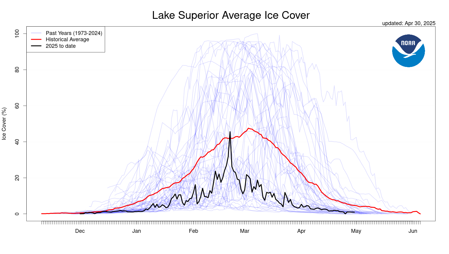
NOAA publishes a live version of this exact plot every winter, comparing the current year (black), the historical average (red), and every past year (thin blue lines):

Today, we’ll build our own version of this plot from the raw data we just tidied.
Why “spaghetti plot”?
This is a great example of how the same chart type appears in real published science.
# Force every date onto one fake shared year -------------
ice_plot_data <- ice_clean %>%
mutate(
plot_date = if_else(
month(full_date) >= 10,
update(full_date, year = 1999),
update(full_date, year = 2000)
)
)
# Historical average for each day-of-winter ---------------
historical_avg <- ice_plot_data %>%
group_by(plot_date) %>%
summarize(avg_ice = mean(ice_cover, na.rm = TRUE))
current_yr <- max(ice_plot_data$year)
past_years <- ice_plot_data %>% filter(year < current_yr)
current_year_data <- ice_plot_data %>% filter(year == current_yr)The trick: every winter spans two real calendar years (e.g. Nov 1973–May 1974). To overlay them, we relabel every date onto one fake shared year (1999 for fall, 2000 for spring) — only the month/day matters for the x-axis.
This is a common trick for any seasonal, cyclical time series.
ice_spaghetti_plot <- ggplot() +
geom_line(
data = past_years,
aes(x = plot_date, y = ice_cover, group = year),
color = "blue",
alpha = 0.15
) +
geom_line(
data = historical_avg,
aes(x = plot_date, y = avg_ice),
color = "red",
linewidth = 1.2
) +
geom_line(
data = current_year_data,
aes(x = plot_date, y = ice_cover),
color = "black",
linewidth = 1.2
) +
scale_x_date(date_labels = "%b", date_breaks = "1 month") +
labs(
title = "Lake Superior Average Ice Cover",
subtitle = paste("Comparing", current_yr, "to Historical Data"),
x = NULL,
y = "Ice Cover (%)"
) +
theme_bw()
ice_spaghetti_plot
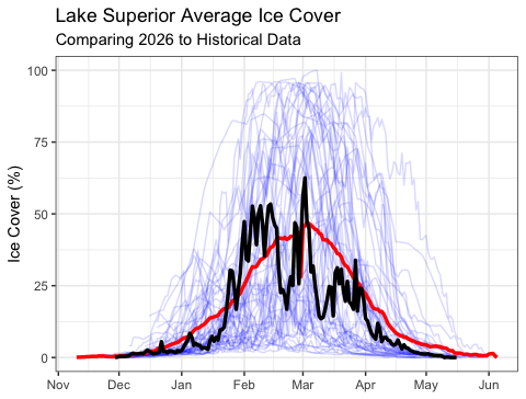
Three layers, three geom_line() calls:
Compare your version to NOAA’s published plot — did we recreate it?
Note
🔮 Predict first: Commit now — over 50+ years, is Lake Superior’s maximum winter ice cover declining, flat, or rising? Write your guess before the model runs.
So far: we’ve visualized the shape of each ice season.
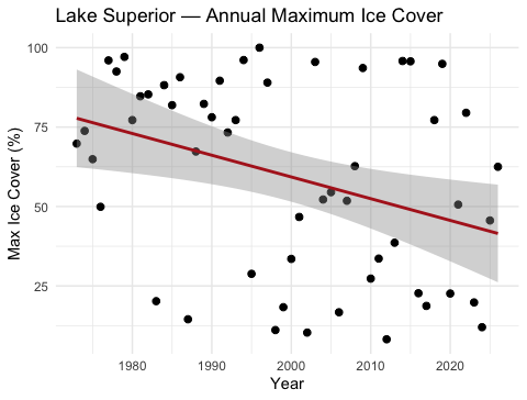
New question: has the peak (maximum) ice cover of each winter changed over the last 50 years?
# A tibble: 6 × 6
# Groups: year [6]
date year ice_cover calendar_year full_date month
<chr> <dbl> <dbl> <dbl> <date> <ord>
1 Jan-22 2012 8.2 2012 2012-01-22 Jan
2 Mar-17 2002 10.3 2002 2002-03-17 Mar
3 Jan-16 1998 11.1 1998 1998-01-16 Jan
4 Feb-19 2024 12 2024 2024-02-19 Feb
5 Jan-25 1987 14.5 1987 1987-01-25 Jan
6 Mar-02 2006 16.7 2006 2006-03-02 Mar
slice_max() keeps only the single row with the highest value in each group — here, one row per year: the date and value of that winter’s ice peak.
This also gives us the “ice-on/ice-off” story:
Note
🔮 Predict first: Given the huge year-to-year scatter in Great Lakes ice, do you expect the slope’s p-value to be below or above 0.05? Predict before you read summary().
Call:
lm(formula = ice_cover ~ year, data = max_ice_per_year)
Residuals:
Min 1Q Median 3Q Max
-53.692 -24.810 3.811 20.982 48.599
Coefficients:
Estimate Std. Error t value Pr(>|t|)
(Intercept) 1427.4557 498.1910 2.865 0.00600 **
year -0.6841 0.2492 -2.746 0.00827 **
---
Signif. codes: 0 '***' 0.001 '**' 0.01 '*' 0.05 '.' 0.1 ' ' 1
Residual standard error: 28.54 on 52 degrees of freedom
Multiple R-squared: 0.1266, Adjusted R-squared: 0.1098
F-statistic: 7.539 on 1 and 52 DF, p-value: 0.008274
Same lm() syntax as Lecture 06 — only now X = year and Y = ice_cover (the yearly peak, not a daily or monthly mean).
This is real data — the story is messier (and more honest) than a clean line.
Build the spaghetti plot, pull each winter’s peak with slice_max(), and fit lm(ice_cover ~ year). Predict the trend’s direction and significance before you run it.
Concepts:
pivot_longer() collapses many columns into key-value pairs — unlocking group_by(), summarize(), and ggplot()pivot_wider() does the reverse — builds a readable summary table from tidy dataslice_max() pulls out the single extreme value per group — useful for “ice-on/ice-off” type questionslm() workflow from Lecture 06 applies to any time-indexed variable, including a yearly maximumR skills:
read.table() + rownames_to_column() for messy text filespivot_longer() / pivot_wider()str_starts(), if_else(), ymd(), update() for date wranglingslice_max(order_by = ..., n = 1)References:
Data source:
glerl.noaa.gov/data/iceUp next — Homework: