Intermediate GGPlot Stats
Bill Perry
2021/06/15
Load libraries
# install.packages("devtools")
# devtools::install_github("thomasp85/patchwork")

# load the libraries each time you restart R
library("readxl") # read in excel files
library("tidyverse") # dplyr and piping and ggplot etc
library("lubridate") # dates and times
library("scales") # scales on ggplot ases
library("skimr") # quick summary stats
library("janitor") # clean up excel imports
library("patchwork") # multipanel graphs
##Read files
# So now we have seen how to look at the data
# What if we wanted to modify the data in terms of columns or rows

# Making graphs this way can get a bit cumbersome as you might imagine.
# This is because the data is in what we call wide format
# The long format is the format often used for Anovas and other stats
# We will go over how to do this later but for now lets just look at the file

mm.df <- read_csv("data/mms.csv")
##
## ── Column specification ────────────────────────────────────────────────────────
## cols(
## center = col_character(),
## color = col_character(),
## diameter = col_double(),
## mass = col_double()
## )# Plotting long format data ------
# notice that it plots all the data and is sort of a mess...
# there are no groupings of cladocerans or copepods
ggplot(mm.df, aes(color, mass)) + # sometimes necessary is , group = group
geom_point()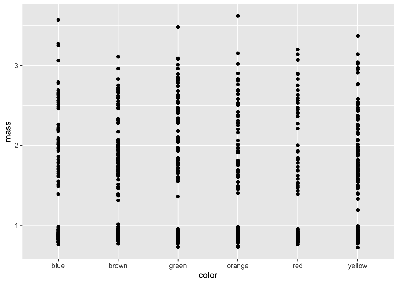
# Mapping a color to data groups ----
# If you add ", color=group" inside of the aes statement it will map a color to
# each group and it is sometimes necessary to add ", group = group"
ggplot(mm.df, aes(color, mass, color=color)) +
  geom_point()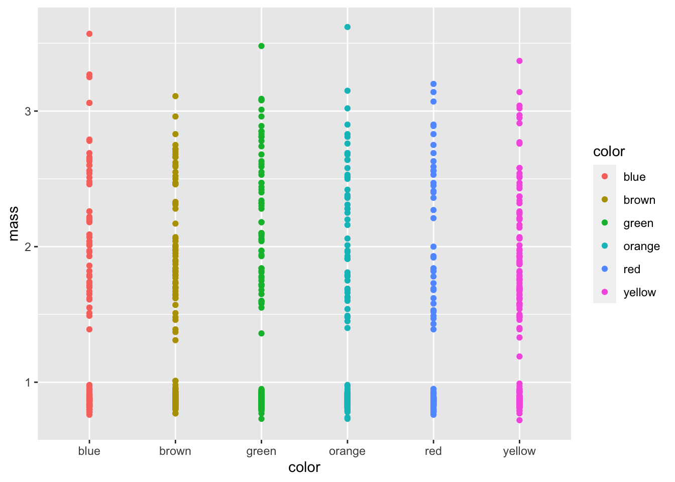
Adding grouping aestethics
We know shape is in there so we should add that
ggplot(mm.df, aes(color, mass, color=color, shape = center)) +
geom_point()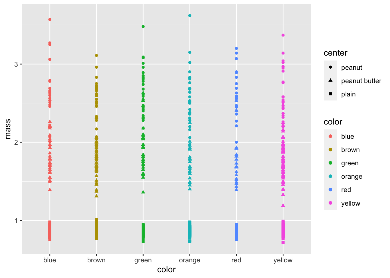 # Dodging points Now lest try to dodge the points
ggplot(mm.df, aes(color, mass, color=color, shape = center)) +
  geom_point(position= position_jitterdodge(jitter.width = 0.4))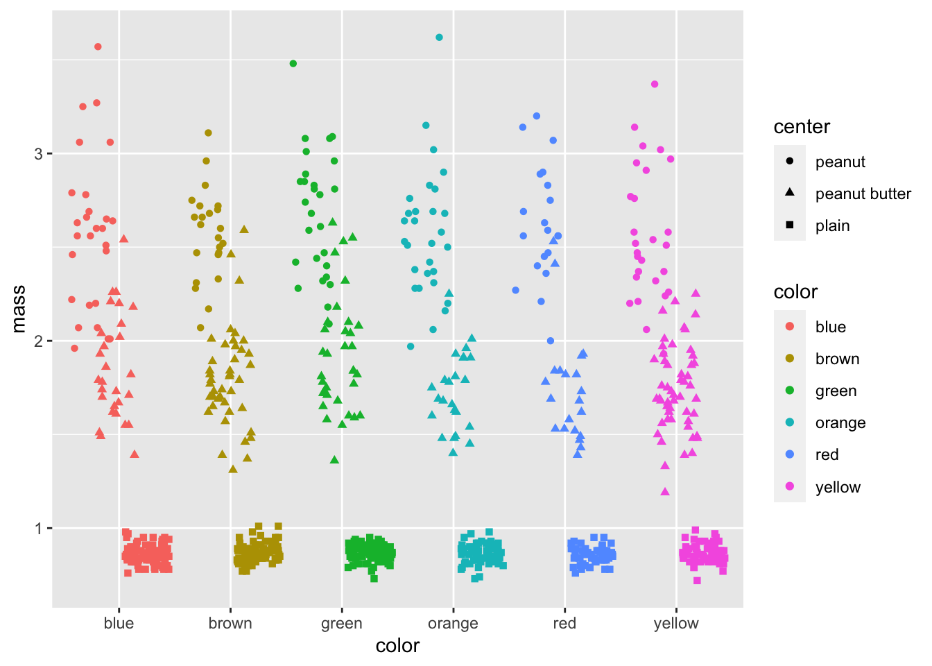
# Now lets look at some statistical plot
# try adding in geom_boxplot()

ggplot(mm.df, aes(color, mass, color=color, shape = center)) +
geom_point(position= position_jitterdodge(jitter.width = 0.4)) 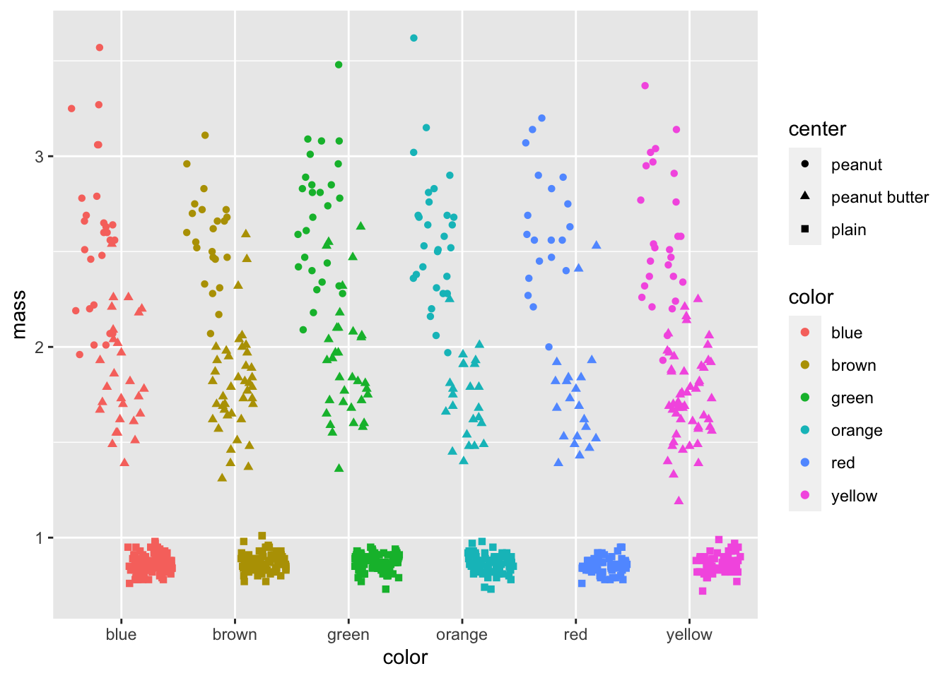
# Final publication quality graph-----
# now we can add axes labels and custom colors
ggplot(mm.df, aes(color, mass, color=color, shape = center)) +
geom_boxplot() +
geom_point(position= position_jitterdodge(jitter.width = 0.4)) +
labs(x = "color", y = "Mass") +
scale_color_manual(name = "Color",
values = c("blue", "brown", "green", "orange", "red", "yellow"),
labels = c("Blue", "Brown", "Green", "Orange", "Red", "Yellow"))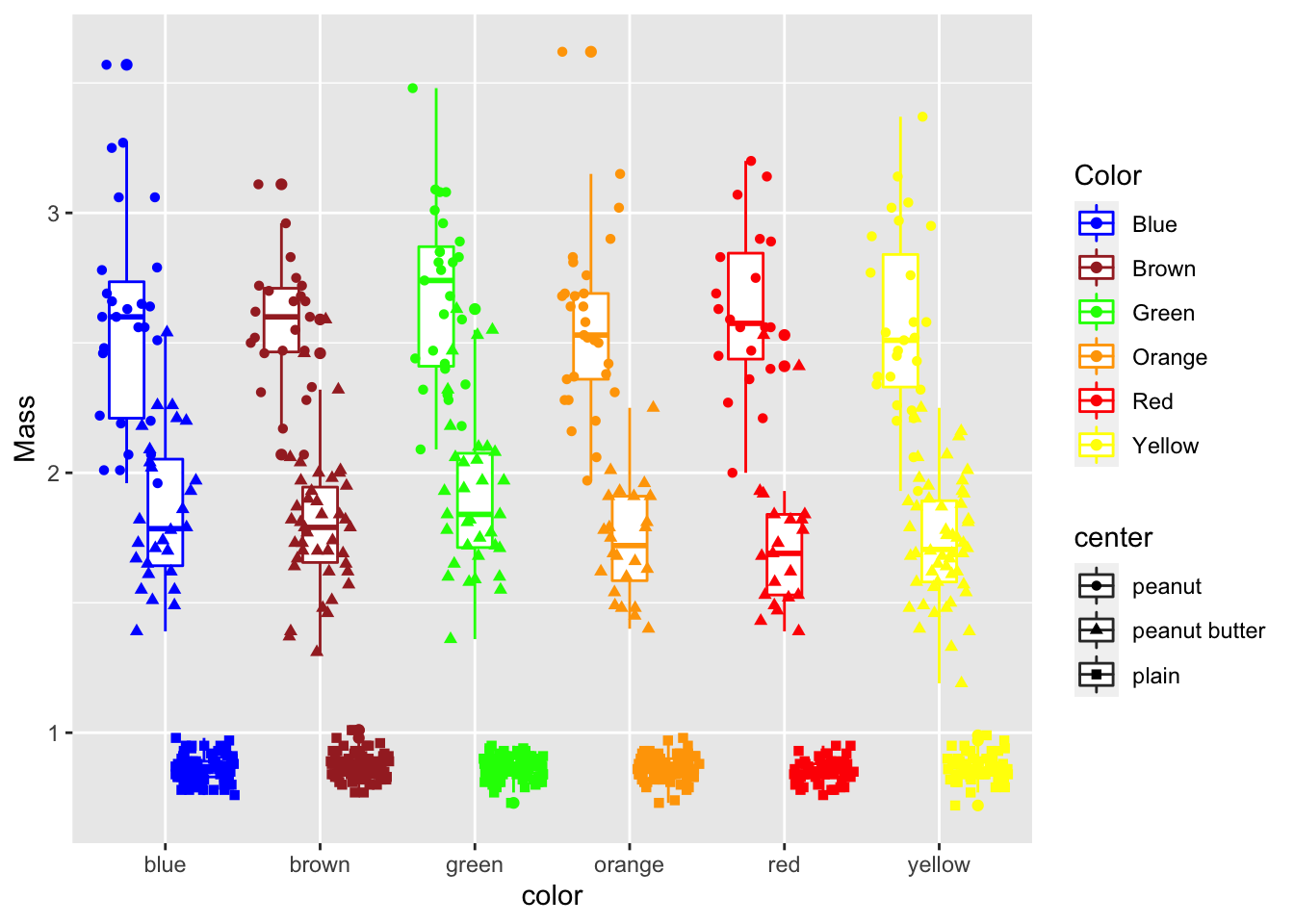 # Facetting graphs
what if we wanted to break up this graph
ggplot(mm.df, aes(color, mass, color=color, shape = center)) +
  geom_boxplot() +
  geom_point(position= position_jitterdodge(jitter.width = 0.4)) +
  labs(x = "color", y = "Mass") +
  scale_color_manual(name = "Color",
                     values = c("blue", "brown", "green", "orange", "red", "yellow"),
                     labels = c("Blue", "Brown", "Green", "Orange", "Red", "Yellow"))+
  facet_wrap(~center)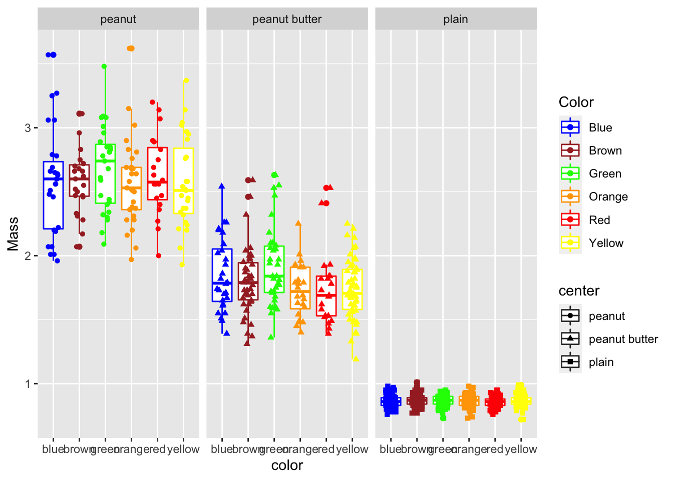
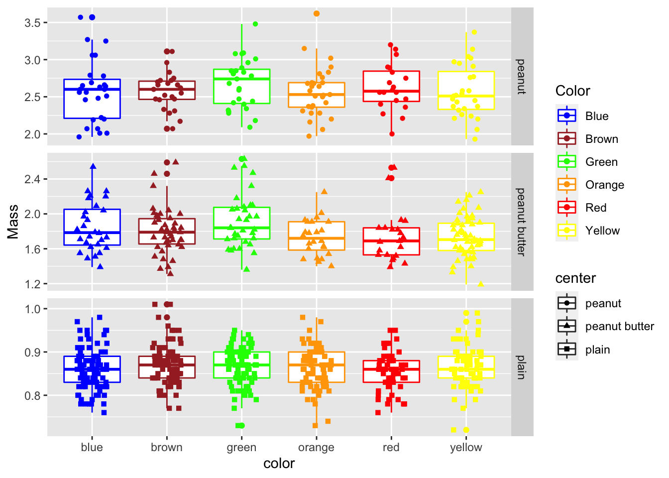
# Facet_grid -----
# lets you make a grid of one or two variables in a grid

ggplot(mm.df, aes(color, mass, color=color, shape = center)) +
  geom_boxplot() +
  geom_point(position= position_jitterdodge(jitter.width = 0.4)) +
  labs(x = "color", y = "Mass") +
  scale_color_manual(name = "Color",
                     values = c("blue", "brown", "green", "orange", "red", "yellow"),
                     labels = c("Blue", "Brown", "Green", "Orange", "Red", "Yellow"))+
  facet_grid(center~., scales="free_y")