# Uncomment these lines if you need to install the packages:
# install.packages("tidyverse")
# install.packages("readxl")

library(tidyverse)  # Loads ggplot2 and other tidyverse packages
library(readxl) # For reading Excel filesPlotting with ggplot2
An introduction to plotting with ggplot2 using tidyverse.
Introduction
In this tutorial you will learn how to: - Read data from an Excel file.
- Create basic plots using ggplot2.
- Layer multiple geoms and add custom axis labels.
For more sample data files, check out the Data Files page.
Load Libraries
Before plotting, load the required libraries. If you haven’t installed these packages, run the install.packages() commands separately.
Reading the Data
We’ll read a sample M&M dataset from an Excel file.
# Read the M&M Excel file into a data frame called mm_df
mm_df <- read_excel("data/mms.xlsx")

# View the first few rows to check the data
head(mm_df)
# A tibble: 6 × 4
center color diameter mass
<chr> <chr> <dbl> <dbl>
1 peanut butter blue 16.2 2.18
2 peanut butter brown 16.5 2.01
3 peanut butter orange 15.5 1.78
4 peanut butter brown 16.3 1.98
5 peanut butter yellow 15.6 1.62
6 peanut butter brown 17.4 2.59Introduction to ggplot2
ggplot2 builds plots in layers. The first layer sets up your data and aesthetics (what goes on the x‑ and y‑axes), and additional layers add geoms (graphical objects) like points or boxplots.
Basic Scatter Plot
This example creates a simple scatter plot showing the relationship between candy color and diameter.
# Create a scatter plot:
# - data = mm_df: specifies the data frame to use.
# - aes(x = color, y = diameter): maps the 'color' variable to the x-axis and 'diameter' to the y-axis.
# - geom_point(): adds points for each observation.
ggplot(data = mm_df, aes(x = color, y = diameter)) +
  geom_point()
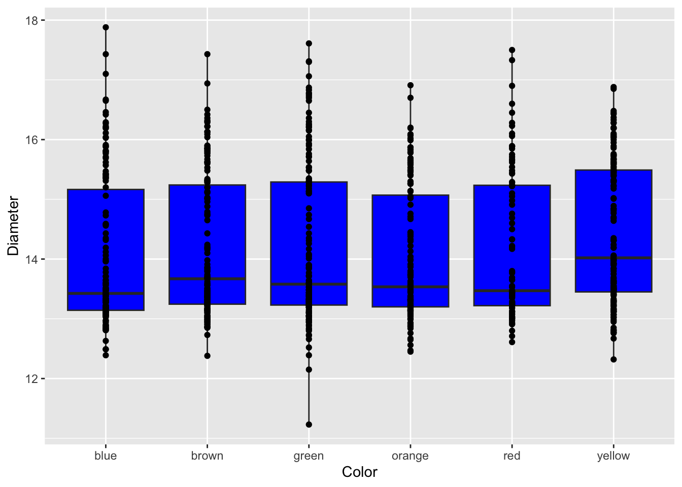
Adding Layers
You can combine multiple geoms to enrich your plot. Here, we add a boxplot behind the points.
ggplot(mm_df, aes(x = color, y = diameter)) +
  geom_boxplot(fill = "blue") +  # Adds a boxplot with blue fill for each candy color group.
  geom_point()                   # Overlays the scatter plot on top.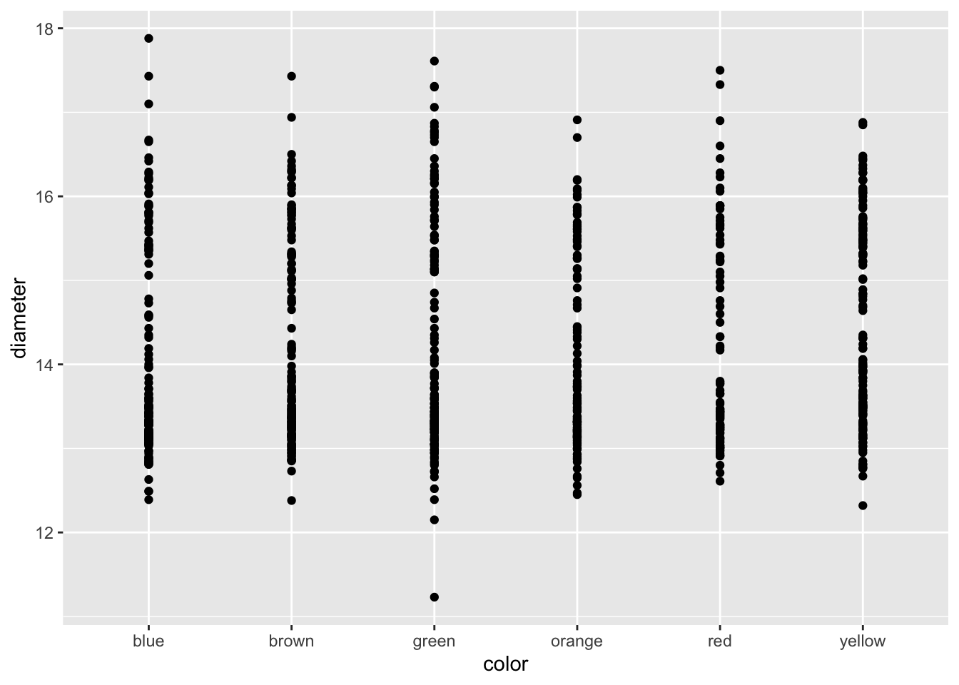
Adding Axis Labels
Custom axis labels help explain what your plot shows. Use the labs() function to add plain text labels.
ggplot(mm_df, aes(x = color, y = diameter)) +
  geom_boxplot(fill = "blue") +
  geom_point() +
  labs(
    x = "Candy Color",
    y = "Candy Diameter (mm)"
  )
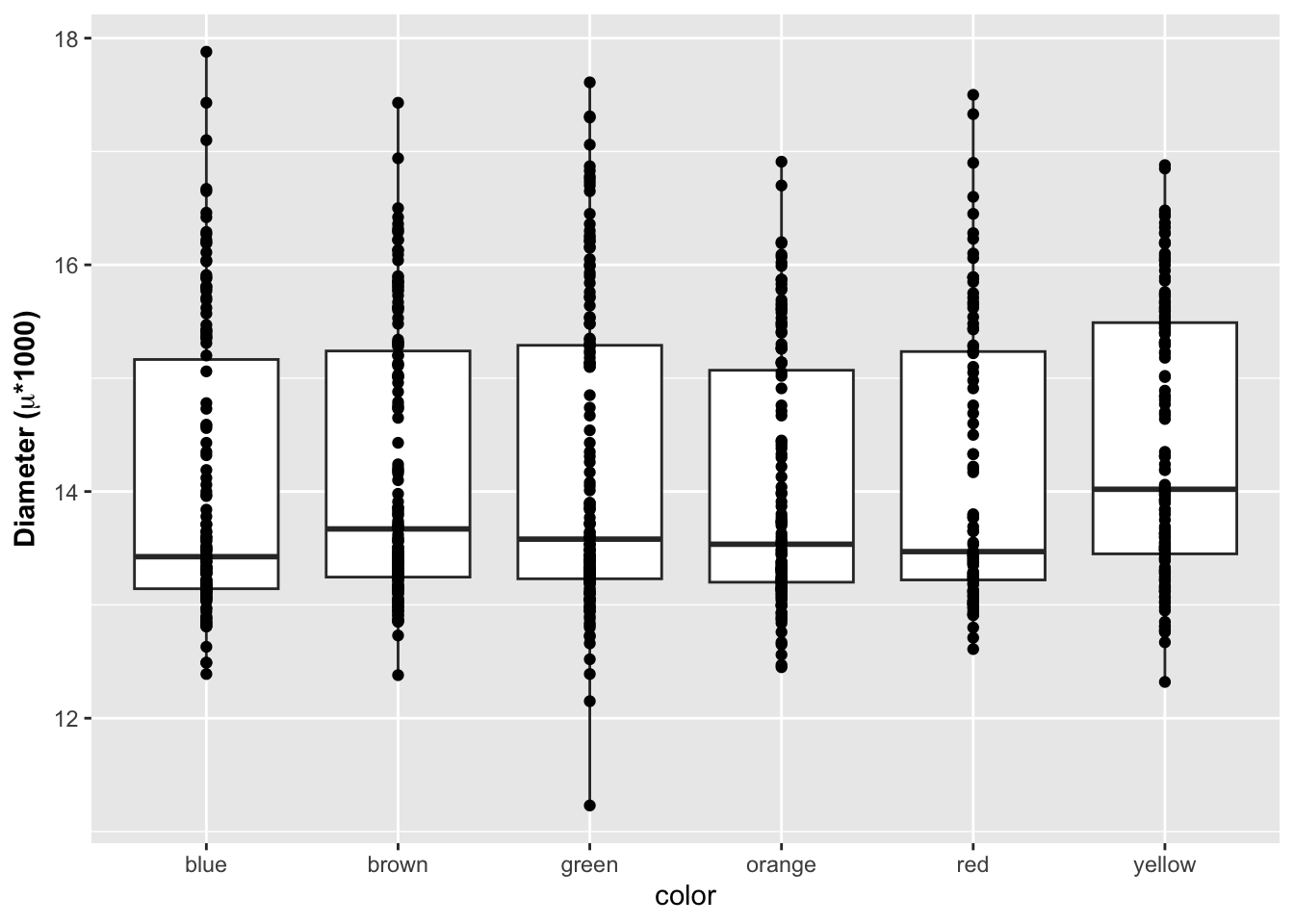
Formatted Axis Labels
For more advanced labeling, you can use expressions to format text. In the example below, the y-axis label is bold and includes the Greek letter µ.
ggplot(mm_df, aes(x = color, y = diameter)) +
  geom_boxplot() +
  geom_point() +
  labs(
    x = "Color",
    y = expression(bold("Diameter (" * mu * "m)")) # it is als a code "\u00b5"
  )
Summary
In this guide, you learned how to:
Load data from an Excel file.
Create a basic scatter plot with ggplot2.
Layer additional geoms (like boxplots) on your plot.
Add plain and formatted axis labels