# Uncomment the following lines
# if you need to install these packages:
# install.packages("tidyverse")
# install.packages("readxl")
# install.packages("skimr")
# install.packages("janitor")
# install.packages("patchwork")
# install.packages("lubridate")
# install.packages("scales")

library(tidyverse)    # Includes ggplot2 and dplyr
library(readxl)       # For reading Excel files
library(skimr)        # For quick summary stats
library(janitor)      # For cleaning data
library(patchwork)    # For combining plots
library(lubridate)    # For handling dates and times
library(scales) # For formatting scales in plotsggplot2: Customizing Plots
Learn how to customize ggplot2 graphs by mapping aesthetics, adjusting positions, setting manual colors, and facetting.
Objective
This guide demonstrates how to customize ggplot2 graphs. You will learn to: - Map additional aesthetics (color, shape) to your data. - Adjust point positions using jittering and dodging. - Manually assign colors with scale_color_manual. - Facet your graphs using facet_wrap() and facet_grid().
Data for the Exercise
We will use a sample M&M dataset. For more sample data files, see the Data Files page.
Load Libraries
Make sure you have installed these packages. If not, run the install.packages() commands separately.
Read in the Data
Read the M&M dataset from an Excel file.
mm_df <- read_excel("data/mms.xlsx")
head(mm_df)  # View the first few rows of the data
# A tibble: 6 × 4
center color diameter mass
<chr> <chr> <dbl> <dbl>
1 peanut butter blue 16.2 2.18
2 peanut butter brown 16.5 2.01
3 peanut butter orange 15.5 1.78
4 peanut butter brown 16.3 1.98
5 peanut butter yellow 15.6 1.62
6 peanut butter brown 17.4 2.59Basic ggplot2 Customization
1. Creating a Simple XY Plot
Start with a basic scatter plot of color versus mass. The aes() function maps your variables to the x and y axes.
ggplot(mm_df, aes(color, mass)) +
  geom_point()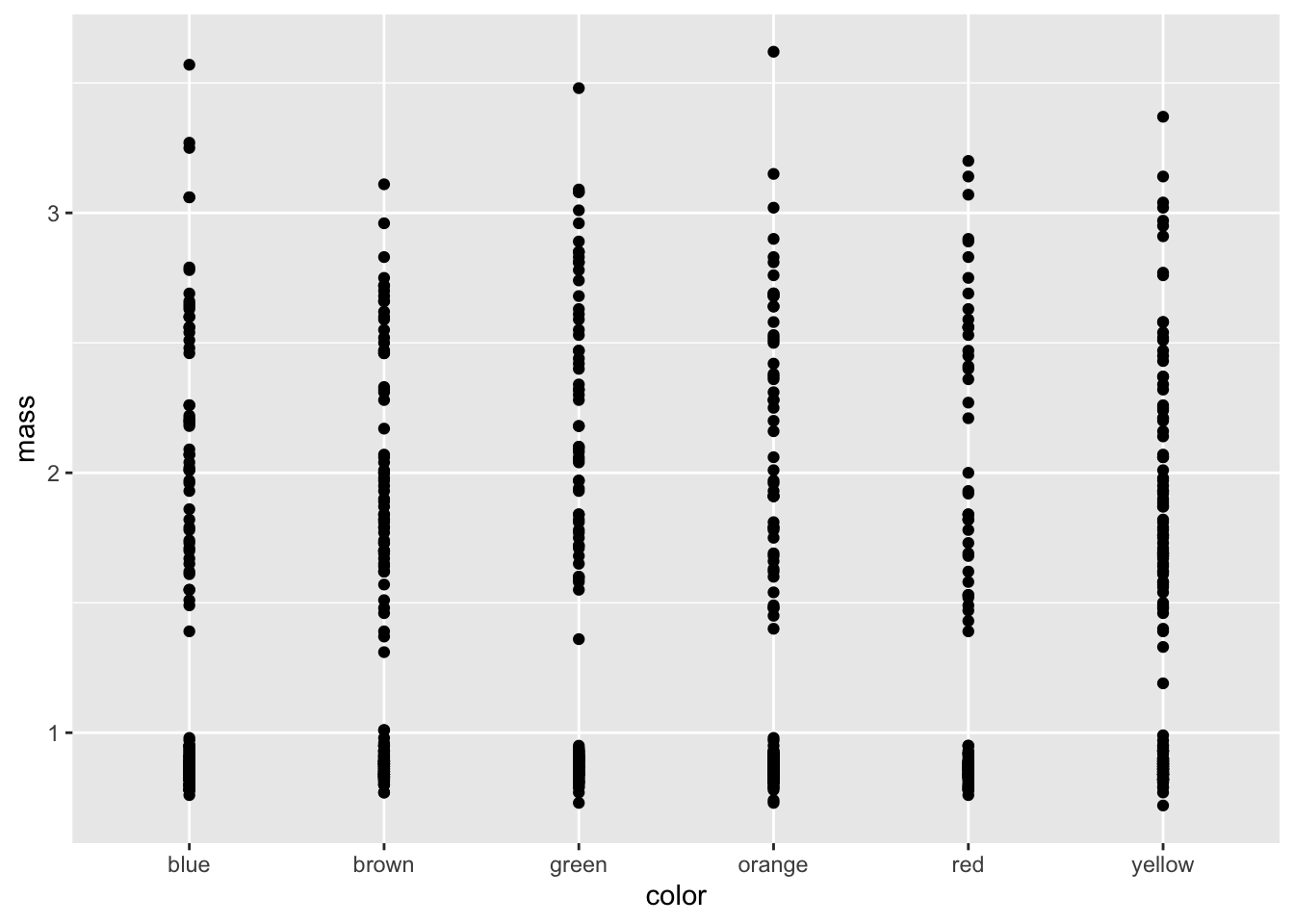
2. Mapping Additional Aesthetics
You can also map aesthetics like color and shape to your data. In the example below:
color = colormaps the candy color to the point color.shape = centermaps the candy center type to the point shape.
ggplot(mm_df, aes(color, mass, color = color, shape = center)) +
  geom_point()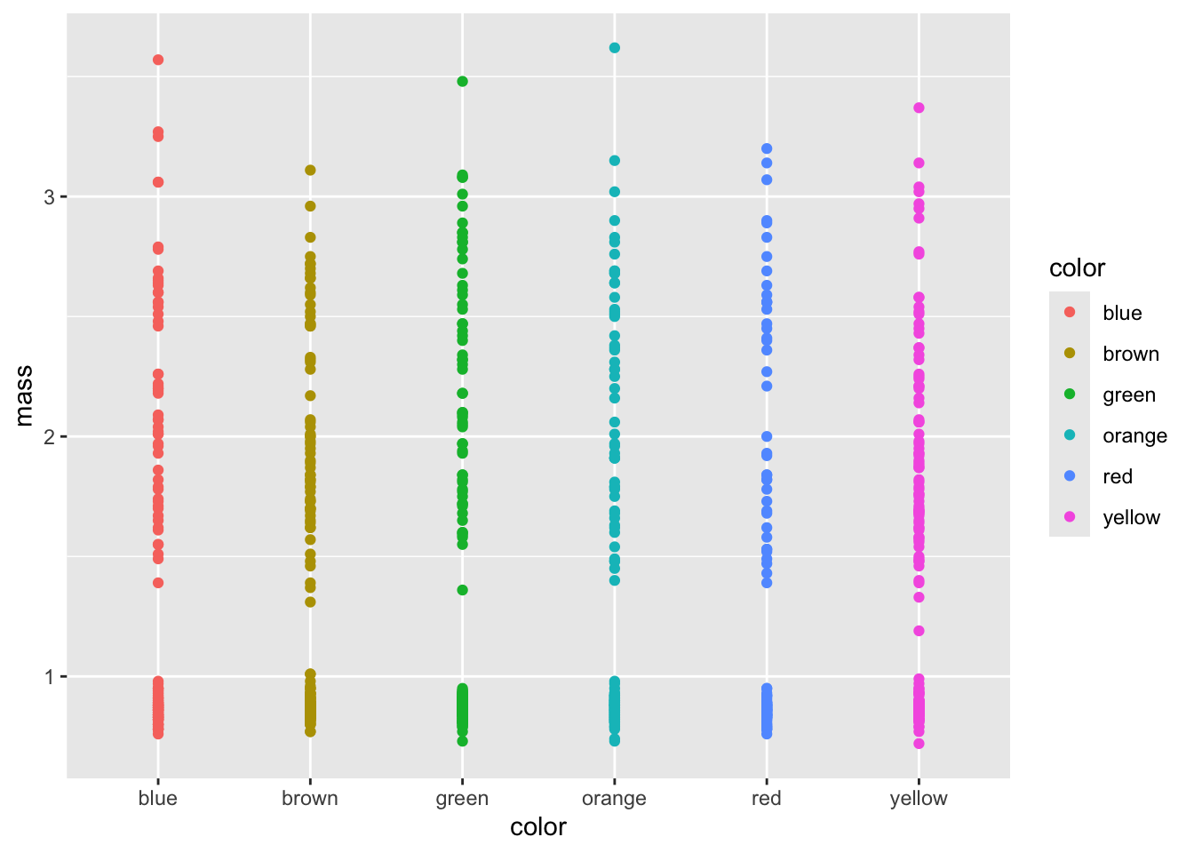
3. Adjusting Point Positions
To reduce point overlap, you can adjust positions using:
Jitter: Adds random noise to points.
Dodge: Offsets points based on a grouping variable.
Jitter-Dodge: Combines both techniques.
Example: Jittering Points
ggplot(mm_df, aes(color, mass, color = color, shape = center)) +
  geom_point(position = position_jitter(width = 0.4))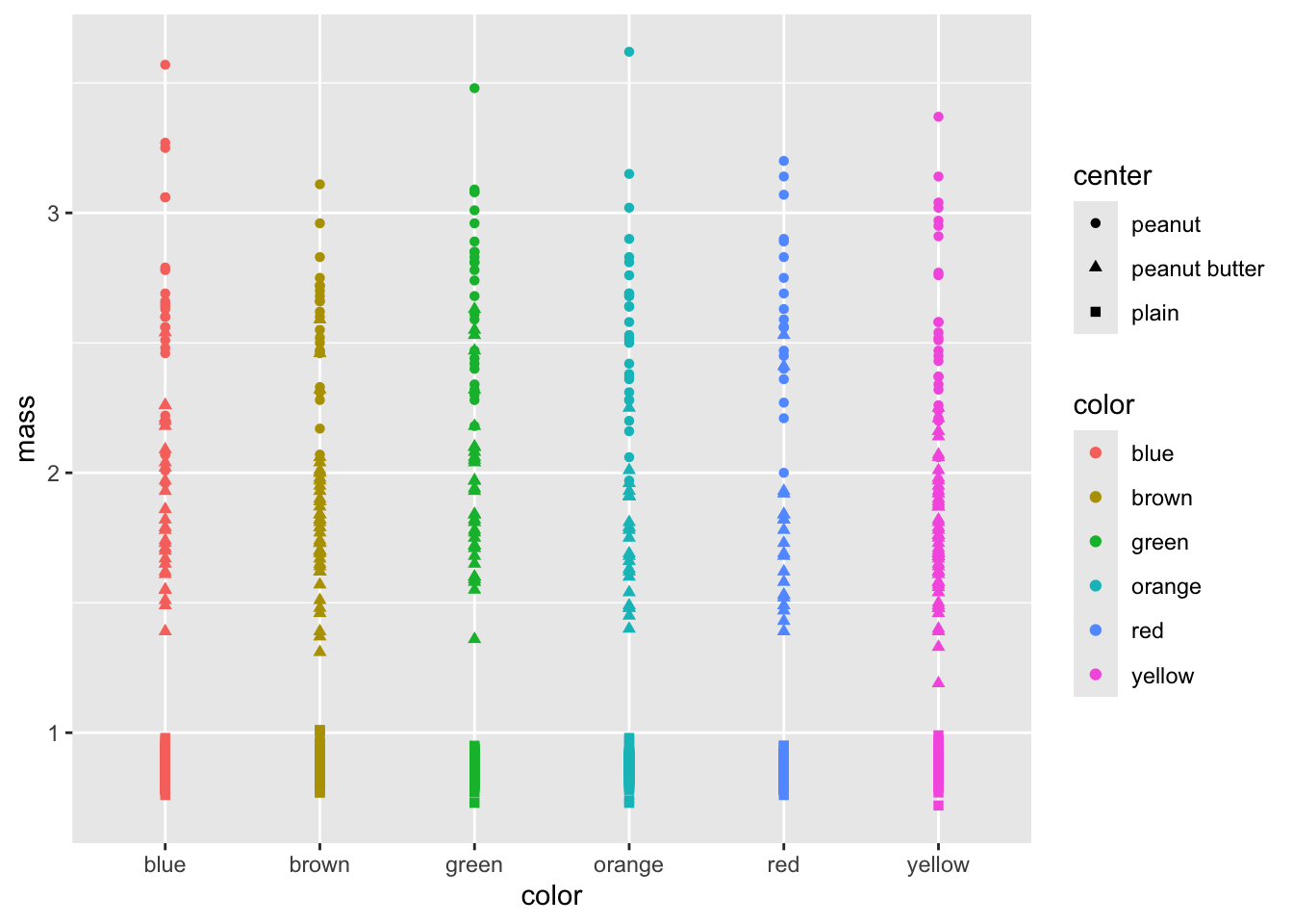
4. Customizing Colors
Method 1: Manual Color Assignment (Order-Dependent)
This method sets a palette by order. (Be cautious if the order of factor levels changes.)
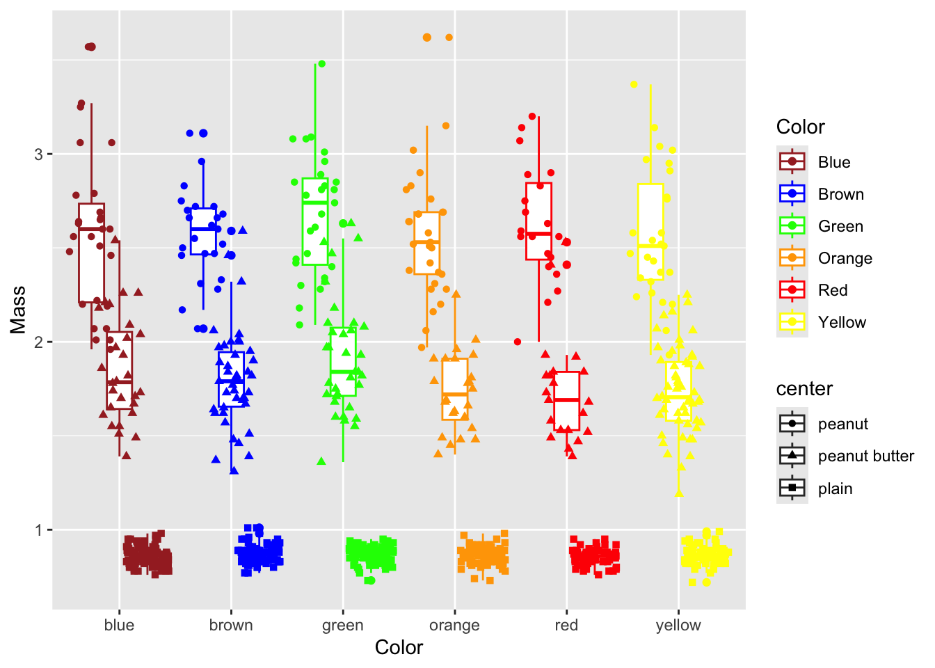
ggplot(mm_df, aes(color, mass, color = color, shape = center)) +
  geom_boxplot() +
  geom_point(position = position_jitterdodge(jitter.width = 0.4)) +
  labs(x = "Color", y = "Mass") +
  scale_color_manual(
    name = "Color",
    values = c("brown", "blue", "green", "orange", "red", "yellow"),
    labels = c("Blue", "Brown", "Green", "Orange", "Red", "Yellow")
  )
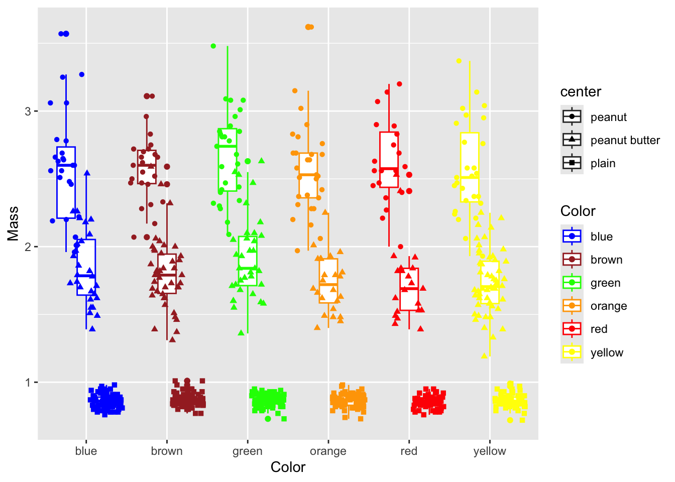
Method 2: Safer Manual Color Assignment (1:1 Mapping)
This method explicitly assigns colors to each factor level.
ggplot(mm_df, aes(color, mass, color = color, shape = center)) +
  geom_boxplot() +
  geom_point(position = position_jitterdodge(jitter.width = 0.4)) +
  labs(x = "Color", y = "Mass") +
  scale_color_manual(
    name = "Color",
    values = c(
      "blue" = "blue",
      "brown" = "brown",
      "green" = "green",
      "orange" = "orange",
      "red" = "red",
      "yellow" = "yellow"
    ),
    labels = c(
      "blue" = "Cool Blue",
      "brown" = "Earth Brown",
      "green" = "Leaf Green",
      "orange" = "Bright Orange",
      "red" = "Vivid Red",
      "yellow" = "Sunny Yellow"
    )
  )
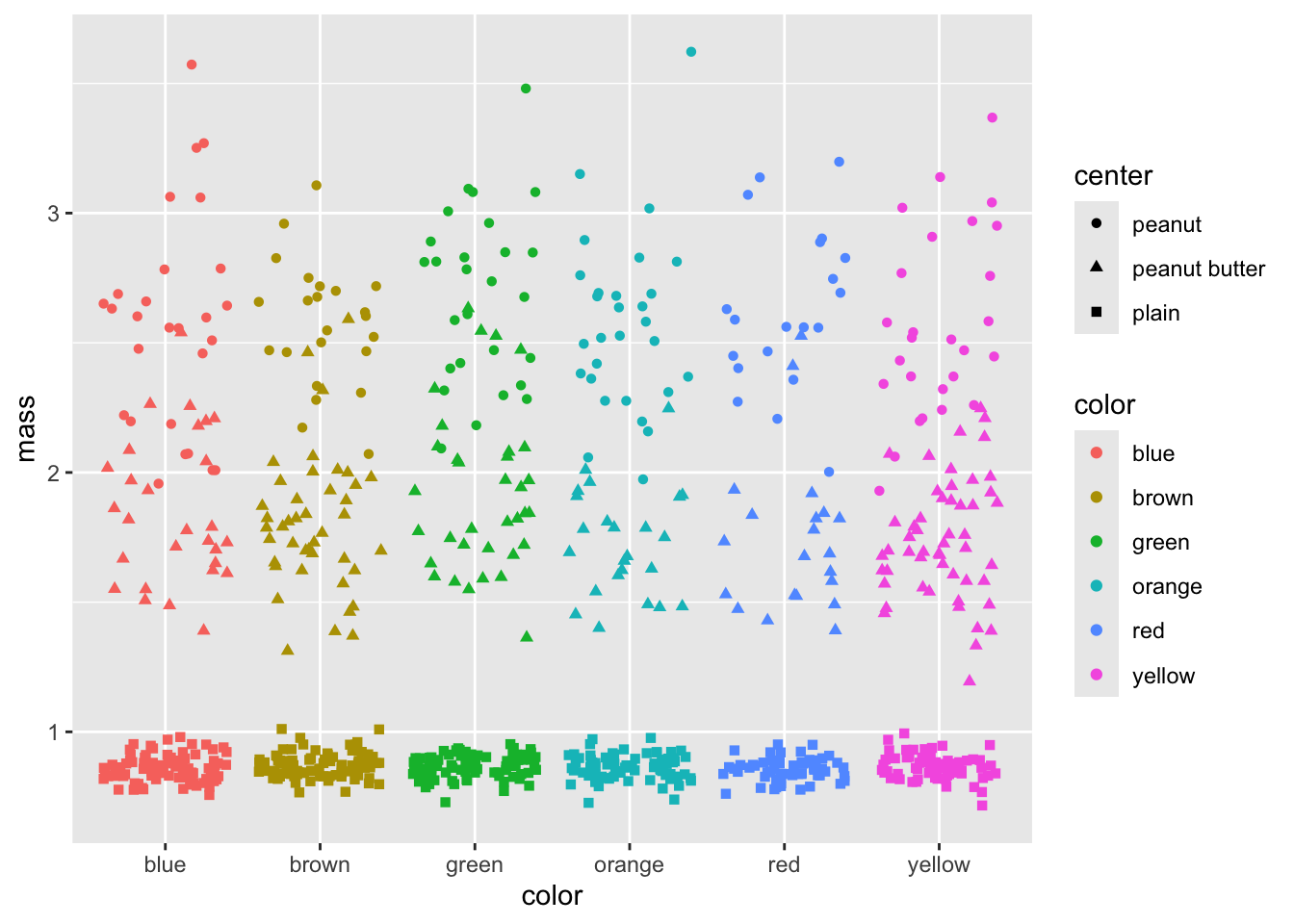
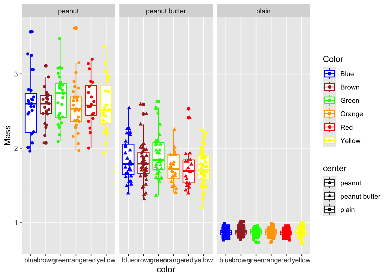
5. Customizing shapes of points
Method 1: Manual shape Assignment (Order-Dependent)
This method sets a shape by order. (Be cautious if the order of factor levels changes.)
ggplot(mm_df, aes(color, mass, color = color, shape = center)) +
  geom_boxplot() +
  geom_point(position = position_jitterdodge(jitter.width = 0.4)) +
  labs(x = "Color", y = "Mass") +
  scale_shape_manual(
    name = "Center",
    values = c(16, 17, 18, 15, 3, 8),  # shape codes assigned in order
    labels = c("Solid Circle", "Triangle", "Diamond", "Square", "Plus", "Star")
  )
Method 2: Safer Manual Shape Assignment (1:1 Mapping)
This method explicitly maps each factor level (using its name) to a specific shape code. This approach is more robust if the order of the factor levels changes.
ggplot(mm_df, aes(color, mass, color = color, shape = center)) +
  geom_boxplot() +
  geom_point(position = position_jitterdodge(jitter.width = 0.4)) +
  labs(x = "Color", y = "Mass") +
  scale_shape_manual(
    name = "Center",
    values = c(
      "plain"  = 16,  # e.g., plain center mapped to a solid circle
      "peanut" = 17,  # peanut center mapped to a triangle
      "crispy" = 18,  # crispy center mapped to a diamond
      "wafer"  = 15,  # wafer center mapped to a square
      "malted" = 3,   # malted center mapped to a plus
      "other"  = 8    # other center mapped to a star
    ),
    labels = c(
      "plain"  = "Plain Center",
      "peanut" = "Peanut Center",
      "crispy" = "Crispy Center",
      "wafer"  = "Wafer Center",
      "malted" = "Malted Center",
      "other"  = "Other Center"
    )
  )
Key Points:
1:1 Mapping: Each factor level in
centeris explicitly mapped to a specific shape code.Custom Labels: The
labelsargument lets you customize the legend text for clarity.