# Load packages at the top -----------------------------
library(tidyverse) # dplyr + ggplot2
library(janitor)   # clean_names()
library(GSODR) # NOAA weather station dataLecture 12 — Real Climate Data in R
How fast is your city warming? (regression on time)
tidyverse
descriptive-stats
Download real weather station data from inside R, summarize it to yearly means, and use lm() to estimate a warming rate in degrees per decade — for Duluth, for each season, and for a city you choose.
Where we left off (Lecture 11 — Regression)
lm(Y ~ X, data = df)fits a straight line through a cloud of pointssummary(model)gives you:- the slope — how much Y changes per 1 unit of X
- its p-value — is that slope real, or could it be chance?
- R² — how tightly the points follow the line
geom_smooth(method = "lm")draws the lineplot(model)checks the residuals
Note
✅ Where today comes in
- Last time X was paper mass and the slope converted grams into cm²
- Today X is time
- the slope becomes a rate of change — degrees per year
- and that is exactly what a “warming rate” is
Goals for Today
- Download real weather station data from inside R — no Excel, no copy-paste
- Clean the names with
janitorso the code stays easy to type - Summarize ~28,000 daily records into one mean per year
- Fit
lm(temp ~ year)and read the warming rate straight offsummary() - Split by season — is winter warming faster than summer?
- Find a station for a city you choose and run the whole thing again
Tip
🖐 Where this is going
- The analysis is the same four lines every time
- Change the station, and it is a new city
- That is your out-of-class extension
Tools today:
GSODR— download NOAA station datajanitor—clean_names()tidyverse— summarize and plotlm()— the slope is the answer
Reading:
- 📖 R for Data Science 2e
- 📖 Whitlock & Schluter Ch. 17 — Regression
Naming conventions:
- data frames →
_df - plots →
_plot - models →
_model
🧩 Chunk 1 of 3 · The Question
We will cover: where the data comes from, why the slope of a regression on time is a warming rate, and why you have to summarize before you can see it. No code in this chunk.
Where Does This Data Come From?
- GSOD = Global Surface Summary of the Day, run by NOAA
- daily weather from thousands of stations worldwide
- many records reach back to the 1940s
- free, and no account needed
- The
GSODRpackage pulls it straight into R- you give it a station ID and a range of years
- it hands back a data frame
Our station to start:
- Duluth International Airport
- Station ID
727450-14913 - Daily records since 1948
- Why this matters:
- this is the same messy, real-world data you will meet in your own project
- the workflow — download → summarize → model — is the one you will reuse all term
- And it is yours to reuse:
- every city with a long station record can be run through the exact same code
- you will pick one later today
The Slope Is the Warming Rate
Last lecture:
\[\widehat{\text{area}} = a + b \times \text{mass}\]
- b was cm² per gram — a conversion factor
Today:
\[\widehat{\text{temp}} = a + b \times \text{year}\]
- b is °C per year — a rate of change
Nothing about the code changes. Only what X means.
- Reading the slope:
- b positive → warming
- b negative → cooling
- b near 0 → no trend
- Make it human: °C per year is a tiny number
- multiply it by 10 → °C per decade
- 0.027 °C/year → about 0.27 °C per decade
- The p-value still does the same job
- H₀: the slope is 0 — no trend at all
- small p → the trend is real, not chance
Why You Must Summarize First
- A station reports one row per day
- 78 years × 365 days ≈ 28,000 rows
- Every one of those days carries the seasonal cycle
- January is 30 °C colder than July, every single year
- that swing is enormous compared with a few tenths of a degree of warming
- So the trend you want is buried in the noise you don’t
| Summary level | group_by() |
Rows left |
|---|---|---|
| Daily (raw) | none | ~28,000 |
| Yearly | year |
78 |
Important
Summarizing is not throwing data away.
- It is choosing which question you are answering
- Want to study a heat wave? Use daily
- Want to study climate? Use yearly
- One
group_by(year) %>% summarize()— the same two lines from Summary Statistics - That is the whole fix
🧩 Chunk 2 of 3 · Duluth’s Warming Rate
We will cover: downloading the Duluth record, cleaning the names, summarizing to yearly means, and fitting lm(temp ~ year).
Load Libraries and Download the Data
# Download daily Duluth weather, 1948-2025 -------------
# clean_names() makes every column lower case
duluth_df <- readRDS("duluth_cached.rds") %>%  # STUB
clean_names()get_GSOD()takes years and a station and goes and gets the data1948:2025is a vector — “every year in this range”- it takes a minute; 78 years of daily data is a lot
clean_names()is the important habit here- NOAA ships columns as
TEMP,YEARMODA,MXSPD - R is case-sensitive, so
tempwould error clean_names()makes everything lower case and snake case, once, at the top
- NOAA ships columns as
Tip
Clean the names as you load the data, and you never think about capitals again.
What Did We Get?
# How big is it, and what is in it? --------------------
dim(duluth_df)
[1] 25441 47names(duluth_df)[13:18][1] "yearmoda" "year" "month" "day" "yday"
[6] "temp" - ~28,000 rows — one per day
- 47 columns — temperature, dew point, wind, precipitation, flags…
- The handful we care about:
yearmoda— the dateyear,month,daytemp— daily mean temperature in °C
Note
names(df) is how you find out what a downloaded data set actually calls things. Always look before you type.
Trim to What We Need
# Keep only the columns we actually use ----------------
dlh_df <- duluth_df %>%
  select(name, yearmoda, year, month, temp)

head(dlh_df, 3)
name yearmoda year month temp
<char> <Date> <int> <int> <num>
1: DULUTH INTERNATIONAL AIRPORT 1948-01-01 1948 1 -8.2
2: DULUTH INTERNATIONAL AIRPORT 1948-01-02 1948 1 -4.1
3: DULUTH INTERNATIONAL AIRPORT 1948-01-03 1948 1 -8.4- 47 columns is more than anyone needs to look at
select()keeps the five that answer our question- Same
select()from the Wrangling lecture — just on a much wider real file
Tip
Trim early. Every later line is easier to read when the data frame has 5 columns instead of 47.
Look at the Raw Daily Data
# Every single daily temperature -----------------------
raw_temp_plot <- dlh_df %>%
  ggplot(aes(x = yearmoda, y = temp)) +
  geom_point(alpha = 0.2, size = 0.5)
raw_temp_plot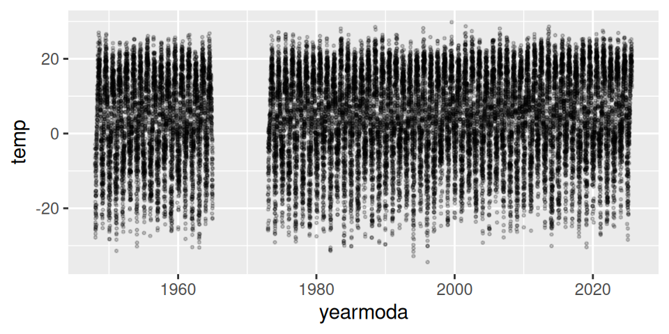
- A solid band about 60 °C tall — that is summer vs winter, repeated 78 times
- ~28,000 points on top of each other
- Any warming trend is in there, but it is a fraction of a degree against a 60 °C swing
So you cannot see it. That is not a plotting problem — it is a summarizing problem.
Summarize to One Mean per Year
# Mean temperature per year ----------------------------
dlh_year_df <- dlh_df %>%
  group_by(year) %>%
  summarize(temp = mean(temp, na.rm = TRUE))

head(dlh_year_df, 3)
# A tibble: 3 × 2
year temp
<int> <dbl>
1 1948 3.76
2 1949 4.10
3 1950 1.60group_by(year)— one group per yearsummarize(temp = mean(temp))— one number per group- 28,000 rows become 78
na.rm = TRUEignores days the station missed
Note
Reusing the name temp on the left means every line below keeps working — the same trick from T-Tests II.
Plot the Yearly Means
# Yearly means with the regression line ----------------
yearly_temp_plot <- dlh_year_df %>%
  ggplot(aes(x = year, y = temp)) +
  geom_point() +
  geom_smooth(method = "lm")
yearly_temp_plot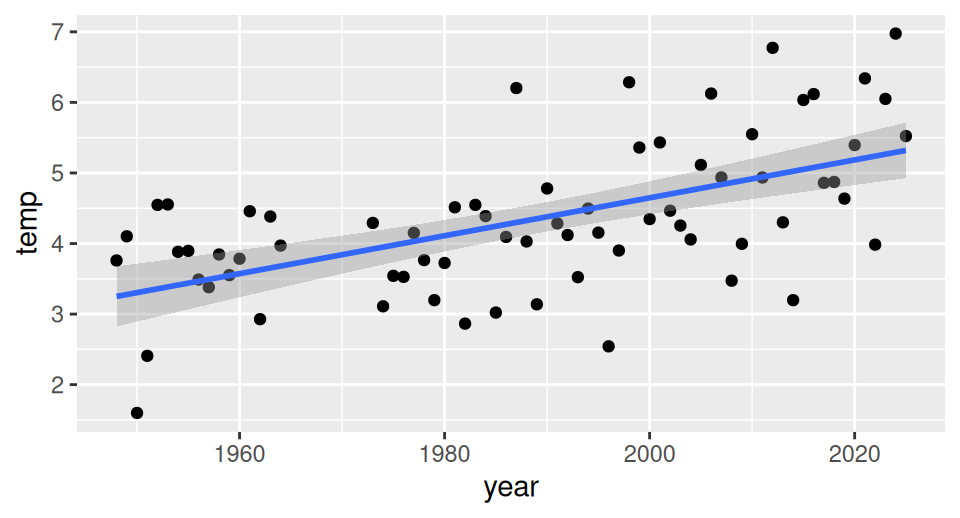
- Now you can see it. The line clearly rises
- 78 points instead of 28,000 — and the story is clearer, not weaker
- Still plenty of scatter: single years are weather, the line is climate
- Exactly the same
geom_smooth(method = "lm")as the Regression lecture
But “it looks like it goes up” is not a result. We need the number.
Fit the Trend
# Temperature predicted by year ------------------------
dlh_year_model <- lm(temp ~ year,
                     data = dlh_year_df)

summary(dlh_year_model)
Call:
lm(formula = temp ~ year, data = dlh_year_df)

Residuals:
     Min       1Q   Median       3Q      Max
-1.99794 -0.51059  0.00688  0.49950  1.90458

Coefficients:
              Estimate Std. Error t value Pr(>|t|)
(Intercept) -49.096842   9.119103  -5.384 9.77e-07 ***
year          0.026872   0.004585   5.860 1.49e-07 ***
---
Signif. codes:  0 '***' 0.001 '**' 0.01 '*' 0.05 '.' 0.1 ' ' 1

Residual standard error: 0.8774 on 68 degrees of freedom
Multiple R-squared:  0.3356,    Adjusted R-squared:  0.3258
F-statistic: 34.34 on 1 and 68 DF,  p-value: 1.489e-07
lm(temp ~ year)reads “temperature is predicted by year”- Y on the left, X on the right — same as always
- The three numbers you want are all in this output:
- the slope (
year→Estimate) - its p-value (
year→Pr(>|t|)) - R² (
Multiple R-squared)
- the slope (
Reading the Warming Rate
Look at the year row of the Coefficients table.
Estimate≈ 0.027 — that is the slope- units: °C per year
- positive → Duluth is warming
- ×10 → about 0.27 °C per decade
- over ~78 years → roughly 2 °C
Pr(>|t|)is tiny (far below 0.001)- the warming is real, not year-to-year luck
Multiple R-squared≈ 0.34- year explains about a third of the variation in annual temperature
- the other two thirds is weather — some years are just cold
- a modest R² next to a rock-solid p is completely normal in climate data
Important
The intercept looks absurd — about −49 °C.
- That is the predicted temperature at “year 0”
- Year 0 is 2,000 years outside the data
- The intercept is bookkeeping; the slope is the science
→ ACTIVITY 12 Parts 1–5 now
🧩 Chunk 3 of 3 · Seasons, and Your Own City
We will cover: labelling each day with a season, fitting a separate model for summer and winter, and finding the station ID for a city you choose.
A Better Question — Which Season Is Warming?
- The annual mean says Duluth warmed about 0.27 °C per decade
- But an annual mean hides which part of the year moved
- That distinction is the biologically interesting one:
- ice-out dates and frozen soil depend on winter
- heat stress and drought depend on summer
- growing season length depends on the shoulders
The plan — three steps you already know:
mutate()+case_when()to label each daygroup_by(year, season)+summarize()- One
lm()per season
Important
⚠️ Seasons are not months — they are hemispheres.
- June–August is summer north of the equator
- June–August is winter south of it
- If you pick Melbourne, Santiago or Cape Town later, you must swap the labels
- A station’s
latitudecolumn tells you which hemisphere you are in- positive → northern
- negative → southern
Label Each Day with a Season
# Northern hemisphere seasons --------------------------
# SOUTHERN hemisphere: swap summer and winter
dlh_season_df <- dlh_df %>%
  mutate(season = case_when(
    month %in% c(6, 7, 8) ~ "summer",
    month %in% c(12, 1, 2) ~ "winter",
    TRUE ~ "shoulder"
  ))

# Did it work? -----------------------------------------
dlh_season_df %>% count(season)
season n
<char> <int>
1: shoulder 12718
2: summer 6436
3: winter 6287case_when()reads top to bottom: condition~answer- the first matching line wins
month %in% c(6, 7, 8)= “is month 6, 7 or 8?”TRUE ~ "shoulder"is the catch-all for everything left over — spring and fallcount()is the check: roughly a quarter of the days in each of summer and winter, half in the shoulder
📖 R4DS §3.4 — case_when()
Summarize by Year and Season
# Drop the shoulder, then one mean per year per season -
season_year_df <- dlh_season_df %>%
  filter(season != "shoulder") %>%
  group_by(year, season) %>%
  summarize(temp = mean(temp, na.rm = TRUE),
            .groups = "drop")

head(season_year_df, 4)
# A tibble: 4 × 3
year season temp
<int> <chr> <dbl>
1 1948 summer 17.4
2 1948 winter -12.6
3 1949 summer 18.4
4 1949 winter -11.4filter(season != "shoulder")—!=means “is not”- keeps only the two extremes
group_by(year, season)— two grouping columns- one row per year per season
- 78 years × 2 seasons ≈ 156 rows
.groups = "drop"tidies up afterwards
This is the same two-column group_by() from T-Tests II.
Plot Both Seasons
# One line per season ----------------------------------
season_temp_plot <- season_year_df %>%
  ggplot(aes(x = year, y = temp, color = season)) +
  geom_point() +
  geom_smooth(method = "lm")
season_temp_plot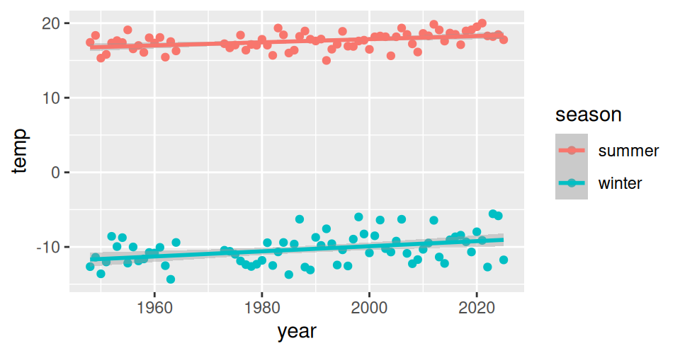
color = seasoninsideaes()does two jobs at once:- colors the points by season
- makes
geom_smooth()fit a separate line per season
- Two bands, far apart — winter near −11 °C, summer near 18 °C
- Don’t compare the heights. Compare the steepness.
- the height is just “winter is cold”
- the slope is the warming rate
- Winter’s line looks steeper — but we need the numbers
A Model for Summer
# Summer only ------------------------------------------
summer_df <- season_year_df %>%
  filter(season == "summer")

summer_model <- lm(temp ~ year, data = summer_df)
summary(summer_model)
Call:
lm(formula = temp ~ year, data = summer_df)

Residuals:
    Min      1Q  Median      3Q     Max
-2.6841 -0.7543  0.1585  0.6622  2.1918

Coefficients:
              Estimate Std. Error t value Pr(>|t|)
(Intercept) -24.267149  10.815992  -2.244 0.028116 *
year          0.021059   0.005439   3.872 0.000245 ***
---
Signif. codes:  0 '***' 0.001 '**' 0.01 '*' 0.05 '.' 0.1 ' ' 1

Residual standard error: 1.041 on 68 degrees of freedom
Multiple R-squared:  0.1807,    Adjusted R-squared:  0.1686
F-statistic: 14.99 on 1 and 68 DF, p-value: 0.0002448filter()first, then the samelm()as before- Two small models are far easier to read than one complicated one
Summer slope ≈ 0.021 °C/year
- ×10 → about 0.21 °C per decade
- p = 0.0002 → real
Now do exactly the same thing for winter.
A Model for Winter
# Winter only ------------------------------------------
winter_df <- season_year_df %>%
  filter(season == "winter")

winter_model <- lm(temp ~ year, data = winter_df)
summary(winter_model)
Call:
lm(formula = temp ~ year, data = winter_df)

Residuals:
    Min      1Q  Median      3Q     Max
-3.5398 -1.3901  0.0164  1.1662  4.0695

Coefficients:
             Estimate Std. Error t value Pr(>|t|)
(Intercept) -78.24857   20.10231  -3.893 0.000229 ***
year          0.03417    0.01011   3.380 0.001202 **
---
Signif. codes:  0 '***' 0.001 '**' 0.01 '*' 0.05 '.' 0.1 ' ' 1

Residual standard error: 1.934 on 68 degrees of freedom
Multiple R-squared:  0.1439,    Adjusted R-squared:  0.1313
F-statistic: 11.43 on 1 and 68 DF,  p-value: 0.001202
Winter slope ≈ 0.034 °C/year
- ×10 → about 0.34 °C per decade
- p = 0.001 → real
Winter is warming about 1.6× as fast as summer.
- This is the expected pattern across the northern continents
- Fewer extreme-cold nights, shorter ice seasons, earlier thaw
- The annual mean — 0.27 °C/decade — sat right between the two and told you neither
Reading Two Models Side by Side
Both slopes come straight off the year row of each summary():
| Model | Slope (°C/yr) | ×10 (°C/decade) | p |
|---|---|---|---|
| Annual | 0.027 | 0.27 | <0.001 |
| Summer | 0.021 | 0.21 | <0.001 |
| Winter | 0.034 | 0.34 | 0.001 |
- Winter’s slope has a bigger standard error too — winters are more variable than summers
- A bigger p with a bigger slope is not a contradiction; it is noisier data
How to write it up:
Mean annual temperature at Duluth rose significantly from 1948 to 2025 (linear regression: slope = 0.027 °C yr⁻¹, equivalent to 0.27 °C per decade; F(1, 68) = 34.3, p < 0.001, R² = 0.34). Winter warmed roughly 1.6 times faster than summer (0.34 vs 0.21 °C per decade).
- Give the slope with units
- Convert to per decade so a reader can feel it
- Report p and R² the same way as any regression
Now Do It for Your City
# Find stations near a place you care about ------------
# Duluth is 46.84 N, -92.19 W
nearest_stations(LAT = 46.84, LON = -92.19,
                 distance = 50) %>%
  clean_names() %>%
  select(stnid, name, begin, end) %>%
  head(3)
stnid name begin end
<char> <char> <int> <int>
1: 727450-14913 DULUTH INTERNATIONAL AIRPORT 19480101 20250827
2: 999999-14913 DULUTH WILLIAMSN-JOHNSN MUNI 19650101 19721231
3: 997269-99999 DULUTH 20080101 20081231nearest_stations()takes a latitude, a longitude, and a radius in km- Look up your city’s lat/long in any search engine
- south of the equator → negative latitude
- west of Greenwich → negative longitude
- Then read the table:
stnidis what you paste intoget_GSOD()beginandendtell you the years available
Important
Pick a station with a long record. A trend needs decades — aim for a begin date of 1970 or earlier.
Swap One Line, Get a New City
# The ONLY line that changes ---------------------------
city_df <- get_GSOD(years = 1973:2025,
                    station = "948660-99999") %>%
  clean_names()

# Everything below is identical ------------------------
city_year_df <- city_df %>%
  group_by(year) %>%
  summarize(temp = mean(temp, na.rm = TRUE))

city_model <- lm(temp ~ year, data = city_year_df)
summary(city_model)- That is the whole point of today
- one line names the place
- the rest of the analysis never changes
- Use the
years =range your station actually has — don’t ask for years beforebegin
Important
If your city is in the southern hemisphere, swap the season labels in case_when():
month %in% c(12, 1, 2)→ summermonth %in% c(6, 7, 8)→ winter
→ ACTIVITY 12 Parts 6–10 now
What We Learned Today
The ideas:
- A regression on time turns a slope into a rate of change — ×10 for per decade
- Raw daily data hides the trend;
group_by(year) %>% summarize()is the fix - An annual mean hides which season moved — Duluth’s winter warms ~1.6× faster
- Seasons are set by hemisphere, not by month number
- A modest R² with a tiny p is normal — real trend, weather scatter
The code:
get_GSOD(years =, station =)andnearest_stations()clean_names()— lower-case names, once, at the topgroup_by()+summarize()— to the right levelcase_when()— build the seasonlm(temp ~ year)+summary()— the rate
Hand in: your finished activity script, plus the warming rate you found for your own city.
References:
- 📖 R4DS Ch. 3 — Data transformation
- 📖 W&S Ch. 17 — Regression
- NOAA GSOD —
ncei.noaa.gov
Up next:
- The final project — the same pipeline, on data you choose
- Download → clean → summarize → plot → model → report