Lecture: T-Tests: One, Two, Paired

Comparing means

Mean comparison
T-test
The hypothesis-testing framework, the t-distribution, and one-sample, two-sample (Student’s and Welch’s), and paired t-tests — with assumption checks and degrees of freedom made explicit — on the pine needle data the class collected.
Author

Bill Perry

Where We Left Off

Last time:

  • Histograms / frequency distributions
  • Probability distribution functions (PDFs)
  • Z-scores and t-scores
  • Tests of means using t-tests: one sample, two sample
Note

✅ Key idea from last lecture

A t-score is just a z-score computed with the sample standard deviation instead of the population standard deviation
— that substitution is why we need the t-distribution at all. Today we put it to work.

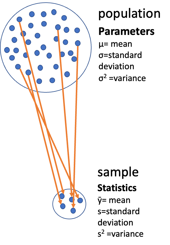
Diagram of a large circle labeled ‘population’ with dots representing individuals and Greek-letter parameters (mu, sigma, sigma-squared), with orange arrows showing a subset of dots being drawn down into a small circle labeled ‘sample’ with its statistics (y-bar, s, s-squared), illustrating that a sample is used to estimate unknown population parameters.
Note

Today’s roadmap

  1. Hypothesis testing framework
  2. The t-distribution and degrees of freedom
  3. One-sample t-test — two-tailed and one-tailed
  4. Two-sample t-test (Student’s and Welch’s)
  5. Paired t-test
  6. Checking assumptions throughout

Part 1 · Our Data

Setup — One source() Line, Two Tools

library(tidyverse)
library(janitor)
library(car)   # qqPlot(), leveneTest()

source("themes_functions/r_themes_and_functions.R")

pine_df <- read_csv("data/pine_data.csv")

pine_df
# A tibble: 64 × 6
   source_file            team  replicate side  needle_length_mm needle_width_mm
   <chr>                  <chr>     <dbl> <chr>            <dbl>           <dbl>
 1 Bartell_Shingledecker… grac…         1 sunny             18.4            0.79
 2 Bartell_Shingledecker… grac…         2 sunny             12.5            0.99
 3 Bartell_Shingledecker… grac…         3 sunny             17.7            1.12
 4 Bartell_Shingledecker… grac…         4 sunny             14.0            0.94
 5 Bartell_Shingledecker… grac…         5 sunny             14.2            1   
 6 Bartell_Shingledecker… grac…         6 sunny             19.2            0.99
 7 Bartell_Shingledecker… grac…         7 sunny             10.9            0.81
 8 Bartell_Shingledecker… grac…         8 sunny             17.3            1.29
 9 Bartell_Shingledecker… grac…         1 shady             16.6            0.75
10 Bartell_Shingledecker… grac…         2 shady             17.0            0.84
# ℹ 54 more rows
📥 Download the data 📥 Download the tools script

Note

✅ What source() just gave you

  • theme_regular() — the publication theme from the Graphing lecture
  • summary_stats() — hand it a column of numbers, get back n, mean, sd, se and a 95% CI

Save the file in a themes_functions/ folder in your project and this exact line works. One line at the top of a script, and both tools are available for the rest of the semester — fix the theme once, and every figure in every script updates.

Tip

🖐 Recap

This is the data you collected: team is your field team (one tree each), side is sunny vs. shady, replicate is which of the 8 needles.

64 rows — but only 4 trees.

Look at All the Data — Spread

raw_box_plot <- pine_df %>%
  ggplot(aes(side, needle_length_mm)) +
  geom_boxplot() +
  geom_point(position = position_jitter(width = 0.08)) +
  theme_regular(base_size = 10)

raw_box_plot

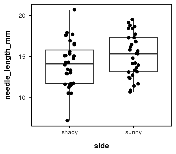
Boxplot of needle length for the shady and sunny sides using all 64 raw needle measurements, with every needle plotted as a jittered point in front of the box, showing wide and heavily overlapping spread.

Note

Start where the data start

This is every needle we measured — all 64 rows, 32 per side, exactly as they came out of the field. Before we do anything clever, look at it.

Wide spread. Heavy overlap. Nothing obviously going on.

Tip

🖐 Why jitter here?

32 needles land on a single x value, so plain geom_point() would stack them into a line and hide the duplicates. position_jitter() nudges them sideways so you can see how many there are.

Look at All the Data — Mean ± SE

raw_mean_se_plot <- pine_df %>%
  ggplot(aes(side, needle_length_mm)) +
  stat_summary(fun = mean, geom = "point") +
  stat_summary(fun.data = mean_se, geom = "errorbar", width = 0.2) +
  theme_regular(base_size = 10)

raw_mean_se_plot

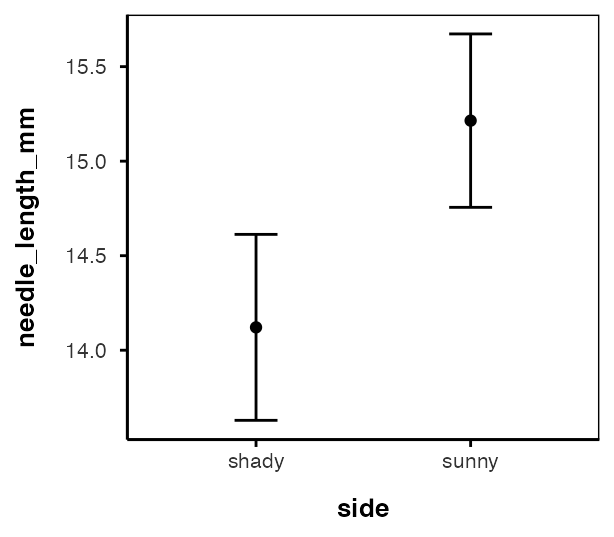
Point and error bar plot of mean needle length plus or minus one standard error for the shady and sunny sides, computed from all 64 raw needles, showing very short error bars.

Warning

⚠️ Those error bars are a lie

They look tight — and tight error bars feel like strong evidence. They are computed as SD / √n with n = 32.

But we did not measure 32 independent things per side. We measured 4 trees, eight times each. The 32 is fake, so the precision is fake.

Hold this picture in your head. We are going to fix it on the next slide and then look again.

Averaging Out Pseudoreplication

# The 8 needles from one side of one tree are pseudoreplicates —
# average them so each tree/side is ONE data point
p_df <- pine_df %>%
  group_by(team, side) %>%
  summarise(needle_length_mm = mean(needle_length_mm, na.rm = TRUE),
            .groups = "drop")

shady_df <- p_df %>% filter(side == "shady")
sunny_df <- p_df %>% filter(side == "sunny")

p_df
# A tibble: 8 × 3
  team       side  needle_length_mm
  <chr>      <chr>            <dbl>
1 botany     shady             16.1
2 botany     sunny             17.3
3 grace_jace shady             15.4
4 grace_jace sunny             15.5
5 one        shady             13.2
6 one        sunny             14.2
7 waterbugs  shady             11.7
8 waterbugs  sunny             13.8
Important

Why average first? The true experimental unit here is tree side, not needle.
Treating every needle as independent would inflate our sample size and our confidence
— the same pseudoreplication trap from Getting Started.

This is the two-stage summary from Describing Your Data: group_by() down to the unit you actually replicated, then analyse.

Warning

⚠️ 64 rows became 8

That is not data loss — it is the correct sample size. n = 4 trees per side. Every degree of freedom today comes from that 4.

Summary Statistics — the Long Way

stats_df <- p_df %>%
  group_by(side) %>%
  summarize(
    n    = sum(!is.na(needle_length_mm)),
    mean = mean(needle_length_mm, na.rm = TRUE),
    sd   = sd(needle_length_mm, na.rm = TRUE),
    se   = sd / sqrt(n),
    .groups = "drop"
  )
stats_df
# A tibble: 2 × 5
  side      n  mean    sd    se
  <chr> <int> <dbl> <dbl> <dbl>
1 shady     4  14.1  2.02 1.01 
2 sunny     4  15.2  1.57 0.786
Note

This is the block you typed in the Probability activity.

Four lines of summarize() that you will want again in every analysis for the rest of the course — correlation, regression, ANOVA, all of it.

Which is exactly why we turned it into a function.

Summary Statistics — the summary_stats() Way

# one group of numbers
summary_stats(p_df$needle_length_mm)
# A tibble: 1 × 6
      n  mean    sd    se ci_lower ci_upper
  <int> <dbl> <dbl> <dbl>    <dbl>    <dbl>
1     8  14.7  1.77 0.627     13.2     16.1
# by group -- group_by() as usual, then reframe()
p_df %>% group_by(side) %>% reframe(summary_stats(needle_length_mm))
# A tibble: 2 × 7
  side      n  mean    sd    se ci_lower ci_upper
  <chr> <int> <dbl> <dbl> <dbl>    <dbl>    <dbl>
1 shady     4  14.1  2.02 1.01      10.9     17.3
2 sunny     4  15.2  1.57 0.786     12.7     17.7
# a different column, no retyping
pine_df %>% group_by(side) %>% reframe(summary_stats(needle_width_mm))
# A tibble: 2 × 7
  side      n  mean    sd     se ci_lower ci_upper
  <chr> <int> <dbl> <dbl>  <dbl>    <dbl>    <dbl>
1 shady    32  1.00 0.208 0.0368    0.929     1.08
2 sunny    32  1.15 0.192 0.0339    1.08      1.21
Note

✅ Key idea

summary_stats() is the same summarize() block, packaged once and source()d forever. It also hands back ci_lower and ci_upper — the 95% confidence interval we build by hand later this lecture.

There is no new notation inside it. It takes a column of numbers, calls it x, and computes exactly what you computed on the last slide.

Tip

🖐 Why reframe() and not summarize()?

summarize() wants one value per group. summary_stats() hands back a whole row — six columns at once — so we use reframe(), which allows that. Same group_by() you already know in front of it.

The Same Two Plots, After Averaging — Boxplot

box_plot <- p_df %>%
  ggplot(aes(side, needle_length_mm)) +
  geom_boxplot() +
  geom_point() +
  theme_regular(base_size = 10)

box_plot

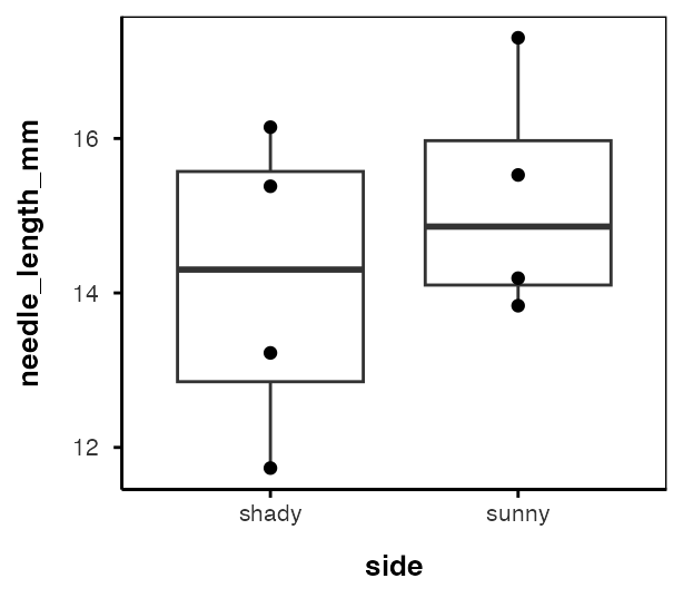
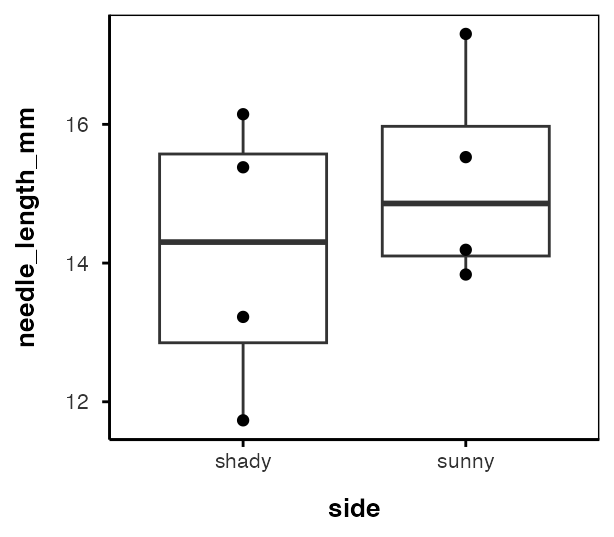
Boxplot of mean needle length for the shady and sunny sides using the four tree-side means per side, with each tree plotted as a point in front of the box.

Important

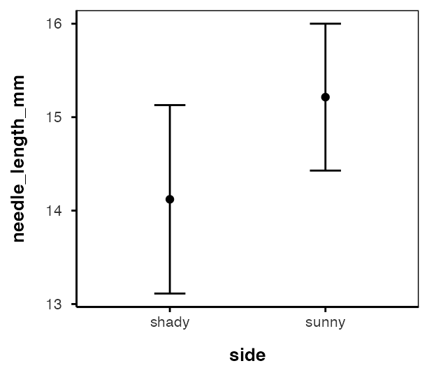
✅ Key idea · The means did not move. The error bars did.

raw needles tree means
n per side 32 4
shady mean 14.12 14.12
sunny mean 15.21 15.21
shady SE 0.49 1.01
sunny SE 0.46 0.79

Averaging changed the means not at all and doubled the standard errors.

That is the whole cost of pseudoreplication, in one table. The raw plot was not more precise — it was just wrong about how much we knew.

The Same Two Plots, After Averaging — Mean ± SE

mean_se_plot <- p_df %>%
  ggplot(aes(side, needle_length_mm)) +
  stat_summary(fun = mean, geom = "point") +
  stat_summary(fun.data = mean_se, geom = "errorbar", width = 0.2) +
  theme_regular(base_size = 10)

mean_se_plot

Point and error bar plot of mean needle length plus or minus one standard error for the shady and sunny sides, computed from the four tree-side means per side, showing error bars about twice as long as the raw-data version.

Tip

🖐 No jitter needed now

Four points per side, so plain geom_point() is enough. And a boxplot of four numbers is a thin thing — which is exactly why we plot the points in front of it.

The Pairing Is Hiding in Plain Sight

slope_plot <- p_df %>%
  ggplot(aes(side, needle_length_mm, group = team)) +
  geom_line() +
  geom_point() +
  theme_regular(base_size = 10)

slope_plot

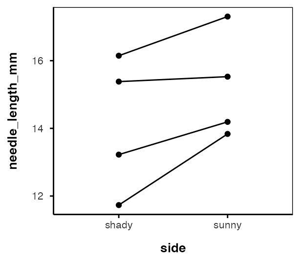
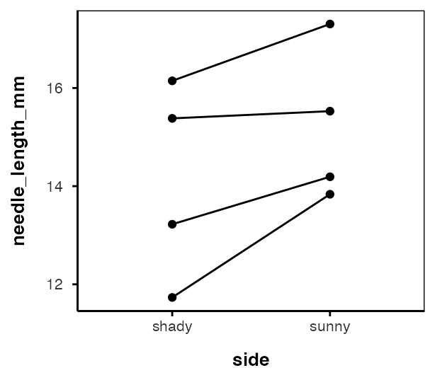
Slope plot with one line per field team joining that team's shady tree mean to its sunny tree mean; all four lines slope the same way.

Tip

🖐 Look at the lines before we test anything

The boxes overlap a lot. But every line slopes the same way.

Hold that thought — it is the whole story of today’s last section.

Part 2 · Hypothesis Testing Framework

Hypothesis Testing — the Key Components

Every test you will ever run starts with the same five lines, in this order, written down before you look at the output:

  1. Question — the biology, in plain English. Does the sunny side of a pine tree grow longer needles than the shady side?
  2. Prediction — what you expect to see, and why. Sunny needles will be longer, because more light means more photosynthate available for growth.
  3. Null hypothesis (H₀) — “no effect,” the thing the test actually evaluates. H₀: μsunny = μshady
  4. Alternative hypothesis (Hₐ) — what is true if H₀ is not. Hₐ: μsunny ≠ μshady
  5. Significance level (α) — your threshold, chosen up front. Typically α = 0.05.

Decision rule: reject H₀ if p < α.

Important

The prediction and the alternative are not the same thing

The prediction is directional and biological — sunny is longer. The alternative hypothesis here is two-tailed — they differ, either way.

If your prediction is genuinely directional and you commit to it beforehand, you can run a one-tailed test. Deciding that after seeing the data is cheating.

Note

📖 Reference

Gotelli & Ellison, A Primer of Ecological Statistics, Ch. 4 — Framing and Testing Hypotheses.

The Logic of a Statistical Test

A test assesses the likelihood of the null hypothesis being true.

  • If H₀ is likely false, Hₐ is assumed correct
  • More precisely: the long-run probability of obtaining our sample value (or a more extreme one) if the null hypothesis is true
  • Written p(data | H₀) — the probability of the data, given H₀
Important

✅ Key idea

p(data | H₀) is not the same as p(H₀ | data). A t-test never tells you the probability that H₀ is true — only how surprising your data would be if it were.

p-value Interpretation
p > 0.10 No evidence against H₀
0.05 – 0.10 Weak evidence against H₀
0.01 – 0.05 Moderate evidence against H₀
0.001 – 0.01 Strong evidence against H₀
p < 0.001 Very strong evidence against H₀

Part 3 · The t-Distribution

One-Tailed Questions

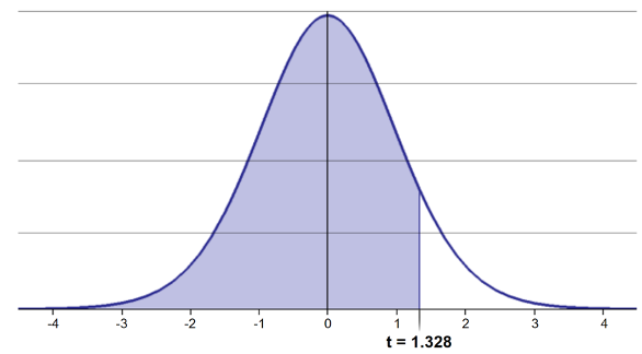
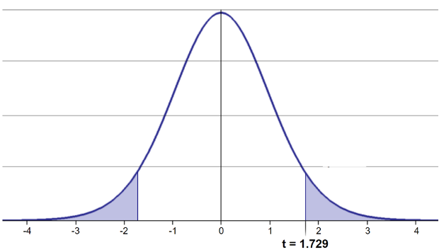
One-tailed questions ask about the area of the distribution to the left (or right) of a certain value.

Note

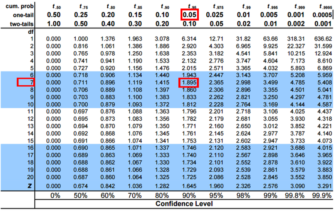
Table-reading example — not our data

A study with n = 8 has df = n − 1 = 7. That is the row highlighted in the table beside this slide, and the only reason 8 and 7 appear together here.

  • 95% of the observations fall to the left of t = 1.895
  • 5% fall outside, in the one tail

Bell-shaped t-distribution curve with the area to the left of the critical value shaded, illustrating a one-tailed cutoff where the shaded region represents the proportion of the distribution below that t-value (here t = 1.895 at df = 7).

Student’s t critical-value table with the one-tail 0.05 column and df = 7 row highlighted, intersecting at the critical value 1.895, the value used for a one-tailed test at alpha = 0.05.

Two-Tailed Questions

Two-tailed questions refer to the area between certain values.

Same table-reading example — n = 8, so df = 7:

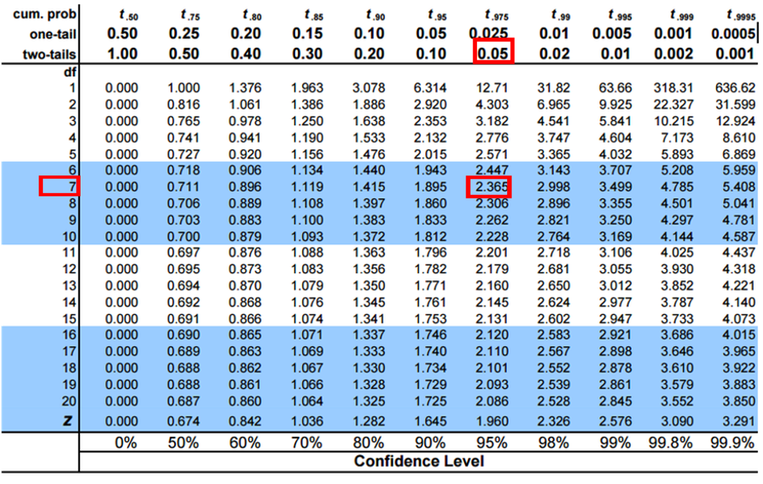
  • 95% of the observations lie between t = −2.365 and t = 2.365 (2.5% outside on each side)
  • Compare to the one-tailed cutoff: t = 1.895 (5% outside)

Bell-shaped t-distribution curve with both tails shaded beyond the critical values (here t = -2.365 and t = 2.365 at df = 7), illustrating a two-tailed cutoff where the two shaded regions together represent the proportion of the distribution outside that range.

Student’s t critical-value table with the two-tail 0.05 column and df = 7 row highlighted, intersecting at the critical value 2.365, the value used for a two-tailed test/95% confidence interval at alpha = 0.05.
Tip

🖐 Notice

The two-tailed critical value is farther from zero than the one-tailed value
— splitting 5% into two tails means each tail only gets 2.5%.

✅ Key Idea · Degrees of Freedom, Once and For All

What df means: the number of values that were free to vary once you estimated a mean. Estimate one mean from n numbers and you spend one df — the last value is pinned down by the others.

So you lose one df for every mean you estimate.

Our data: 4 trees, one shady side and one sunny side each.

  • One-sample t-test — one group, one mean estimated df = n − 1 = 4 − 1 = 3 (4 shady tree means, compared to a fixed number like 15 mm)

  • Two-sample t-test — two groups, two means estimated df = n₁ + n₂ − 2 = 4 + 4 − 2 = 6 (8 tree means in total, minus one for each group mean)

  • Paired t-test — you first collapse each tree to one difference, then it is a one-sample test on those differences df = npairs − 1 = 4 − 1 = 3 (4 differences, not 8 values)

  • Welch’s t-test — the odd one out. df comes from the Welch–Satterthwaite equation, is usually not a whole number, and is always ≤ the Student’s df. Here: df ≈ 5.66.

Test What n counts df formula Our df
One-sample trees in the one group n − 1 3
Two-sample trees in both groups n₁ + n₂ − 2 6
Paired differences npairs − 1 3
Welch’s both groups, penalised Welch–Satterthwaite ≈ 5.66
Important

The number that keeps changing is not arbitrary

n is always trees, never needles. What changes is how many means you had to estimate to run the test.

The paired test has half the df of the two-sample test on the identical 8 numbers — because it only ever looks at 4 numbers, the differences.

Calculating a Confidence Interval

Using a two-sided test:

\[\text{CI} = \bar{y} \pm t_{0.975,\,df} \cdot \frac{s}{\sqrt{n}}\]

Our own shady-side trees — n = 4, so df = 3:

n_shady    <- sum(!is.na(shady_df$needle_length_mm))
mean_shady <- mean(shady_df$needle_length_mm)
se_shady   <- sd(shady_df$needle_length_mm) / sqrt(n_shady)
t_crit     <- qt(0.975, df = n_shady - 1)

mean_shady + c(-1, 1) * t_crit * se_shady
[1] 10.91210 17.32978

And the same interval, for free, from the function we sourced:

summary_stats(shady_df$needle_length_mm)
# A tibble: 1 × 6
      n  mean    sd    se ci_lower ci_upper
  <int> <dbl> <dbl> <dbl>    <dbl>    <dbl>
1     4  14.1  2.02  1.01     10.9     17.3
Warning

⚠️ Four trees is a wide interval

With df = 3 the critical t is 3.182, not 1.96 and not the 2.365 highlighted in the table image (that is df = 7).

Small n costs you twice: a bigger multiplier and a bigger standard error.

Student’s t critical-value table with the two-tail 0.05 column and df = 7 row highlighted, intersecting at the critical value 2.365, the value used for a two-tailed test/95% confidence interval at alpha = 0.05.

Applications of the t-Distribution

  • Can assess confidence that the population mean is within a certain range
  • Can use the t-distribution to ask:
    • “What is the probability of getting a sample with mean = ȳ from a population with mean = µ?” (1-sample t-test, df = n − 1)
    • “What is the probability that two samples came from the same population?” (2-sample t-test, df = n₁ + n₂ − 2)
    • “Is the average change within a subject different from zero?” (paired t-test, df = npairs − 1)
Tip

🖐 Try it yourself

Before the next slide: which of these three questions does our pine needle design actually ask?

Part 4 · One-Sample T-Test

One-Sample T-Test — Question, Prediction, Hypotheses

Question: Is the mean needle length on the shady side different from the 15 mm reported for this species?

Prediction: Shady needles are shorter than 15 mm, because they are light-limited.

  • H₀: μ = 15 mm
  • Hₐ: μ ≠ 15 mm (two-tailed)
  • α = 0.05

Assumptions for a t-test:

  1. Data are normally distributed
  2. Observations are independent
  3. No significant outliers
Note

✅ Degrees of freedom here

One group — the 4 shady tree means. One mean estimated.

df = n − 1 = 4 − 1 = 3

Note

📖 Reference

Whitlock & Schluter, Ch. 11, covers the one-sample t-test as the simplest hypothesis test on a normally distributed variable.

Checking Normality — QQ Plot

# The one-sample test is on the SHADY side, so that is the group
# whose normality we check -- not the two sides pooled.
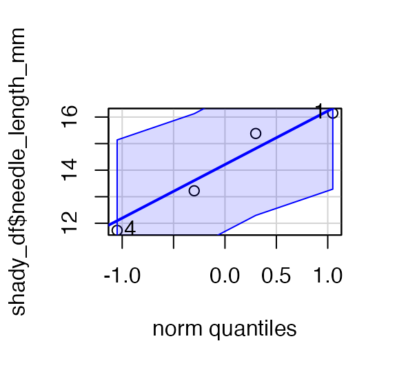
qqPlot(shady_df$needle_length_mm)

QQ-plot of shady-side needle length with a confidence envelope, used to check whether the data are approximately normally distributed.

[1] 4 1
Tip

🖐 Notice

Points that hug the line support normality; points that curve away — especially in the tails — are a warning sign.

qqPlot() from car adds a shaded confidence envelope automatically.

Checking Normality — QQ Plot, Base R

# The base R version -- same idea, no packages, no envelope
qqnorm(shady_df$needle_length_mm)
qqline(shady_df$needle_length_mm)

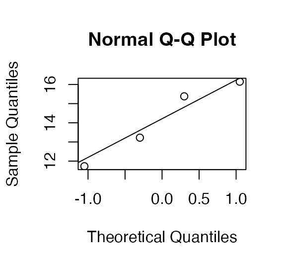
Base R QQ-plot of shady-side needle length with a reference line added by qqline.

Tip

🖐 Same idea, no package

qqnorm() + qqline() gives you the same picture as qqPlot(), just without the shaded envelope. Either is fine.

Warning

⚠️ With 4 points, this is a sanity check, not proof

Four points will look “fine” on almost any QQ plot.

Checking Normality — Shapiro-Wilk Test

shapiro.test(shady_df$needle_length_mm)

    Shapiro-Wilk normality test

data:  shady_df$needle_length_mm
W = 0.94326, p-value = 0.6743
Important

H₀ for Shapiro-Wilk is “the data ARE normal.” A non-significant result (p > 0.05) is what we’re hoping for — it means we fail to reject normality.

Warning

⚠️ With n = 4, this test proves almost nothing

Shapiro-Wilk on four numbers has essentially no power — it will pass almost anything. A high p-value here is not evidence that the data are normal; it is evidence that we don’t have enough data to tell.

Run it, report it, but lean on the QQ plot, the biology, and the design.

Tip

🖐 Why the shady side only?

We test the group the hypothesis is about. Pooling shady and sunny would mix two distributions with different means, which can look non-normal even when each group is perfectly normal.

Checking for Outliers

box_plot

The boxplot with points of needle length by side of tree, repeated here as the outlier check before running the t-tests.

Tip

🖐 Reuse the plot you already made

box_plot was built once in Part 1 — no reason to retype it. Points beyond the whiskers are potential outliers; always look before you test.

Running the One-Sample t-Test

one_sample_model <- t.test(shady_df$needle_length_mm, mu = 15)

one_sample_model

    One Sample t-test

data:  shady_df$needle_length_mm
t = -0.87183, df = 3, p-value = 0.4475
alternative hypothesis: true mean is not equal to 15
95 percent confidence interval:
 10.91210 17.32978
sample estimates:
mean of x 
 14.12094 
Note

✅ Read df = 3 in that output

R is telling you exactly what the Degrees of Freedom slide said: 4 shady trees, one mean estimated, df = 4 − 1 = 3.

Tip

🖐 Interpret it

  1. What was H₀? What was Hₐ?
  2. What does the p-value tell us?
  3. Reject or fail to reject at α = 0.05?
  4. What does that mean for a botanist?

One-Tailed Variation — the Same Test, One Direction

Our prediction was directional: shady needles are shorter than 15 mm. If we commit to that before collecting data, we can run a one-tailed test.

  • H₀: μ ≥ 15
  • Hₐ: μ < 15 — all 5% of α in the lower tail
one_tailed_model <- t.test(shady_df$needle_length_mm,
                           mu = 15,
                           alternative = "less")

one_tailed_model

    One Sample t-test

data:  shady_df$needle_length_mm
t = -0.87183, df = 3, p-value = 0.2237
alternative hypothesis: true mean is less than 15
95 percent confidence interval:
     -Inf 16.49382
sample estimates:
mean of x 
 14.12094 
Note

✅ Key idea

alternative = "less" or "greater" is the only thing that changed. Same data, same t, same df = 3.

Compare the two p-values:

Test Hₐ p
Two-tailed μ ≠ 15 0.448
One-tailed μ < 15 0.224

Exactly half. All of α now sits in one tail, so the observed t only has to beat one cutoff instead of two.

Warning

⚠️ Notice the confidence interval changed too

It now runs from −Inf to an upper bound. A one-tailed test makes no claim in the direction you ruled out.

One-Tailed vs. Two-Tailed — What It Costs You

Remember the critical values from Part 3. At df = 3:

qt(0.975, df = 3)   # two-tailed, 2.5% in each tail
[1] 3.182446
qt(0.95,  df = 3)   # one-tailed, 5% in one tail
[1] 2.353363

The one-tailed cutoff (2.353) is closer to zero than the two-tailed cutoff (3.182). That is the extra power — a smaller t will do.

Important

⚠️ The rule that makes one-tailed tests honest

You must pick the direction before you see the data, on biological grounds, and you must accept that a result in the other direction tells you nothing — no matter how big it is.

Choosing the tail after looking at your means is not a one-tailed test. It is a two-tailed test with the p-value secretly halved.

One-Tailed, the Wrong Direction

But run the same one-tailed test the other way and watch what happens:

t.test(shady_df$needle_length_mm, mu = 15,
       alternative = "greater")

    One Sample t-test

data:  shady_df$needle_length_mm
t = -0.87183, df = 3, p-value = 0.7763
alternative hypothesis: true mean is greater than 15
95 percent confidence interval:
 11.74806      Inf
sample estimates:
mean of x 
 14.12094 

Same data, same t = −0.87, and now p = 0.776.

Tip

🖐 When is one-tailed defensible?

When the opposite result would lead to the same action as no result. A drug that makes patients worse and a drug that does nothing are both “do not approve.”

For our pine needles, “sunny is longer” and “shady is longer” are both interesting biology. Two-tailed is the honest default.

Visualizing the One-Sample Test — t Scale

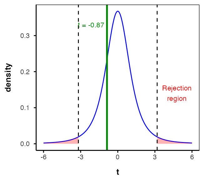
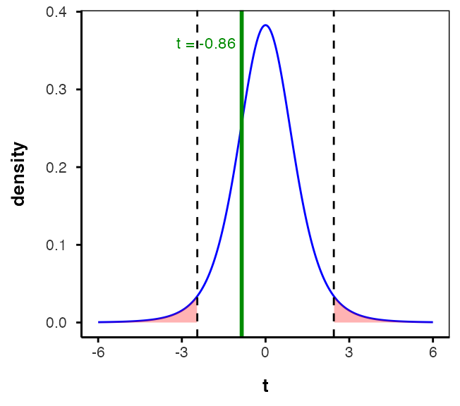
T-distribution curve with 3 degrees of freedom, the two-tailed rejection regions shaded red beyond the critical t-values, and a green line marking the observed t-statistic, which falls inside the non-rejection region.

Note

✅ Key idea

This curve is drawn with df = 3, straight out of one_sample_model — not from a textbook example. The critical value is 3.182, which is why a wide, short-tailed picture like this needs a big t to reach significance.

The green line (our observed t) sits inside the dashed lines — that is what “fail to reject” looks like.

Visualizing the One-Sample Test — Original Units

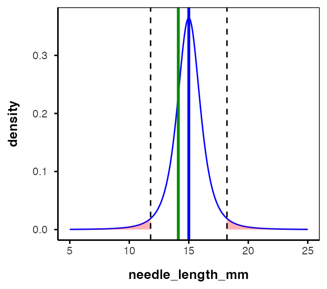
The same one-sample t-test re-plotted on the millimetre scale, with a blue line at the hypothesized mean of 15mm and a green line at the observed sample mean, and the rejection regions shaded red in each tail.

Tip

🖐 Notice

Same test, same conclusion — just relabelled onto the millimetre scale instead of the t scale.

The blue line is H₀ (15 mm), the green line is our sample mean. The green line sits inside the dashed critical values, so 15 mm is a perfectly plausible population mean for these four trees.

Interpreting the One-Sample T-Test

Activity: interpret the t-test results

  • What does the p-value tell us?
  • Should we reject or fail to reject the null hypothesis?
  • Does the 95% CI from summary_stats() contain 15 mm — and does that agree with the p-value?
Note

How to report this result in a scientific paper

“A two-tailed, one-sample t-test at α = 0.05 showed that the mean needle length (… mm, SD = …) [was/was not] significantly different from the expected 15 mm, t(3) = …, p = …”

Two things you must always report: the degrees of freedom, in parentheses after t, and whether the test was one- or two-tailed.

Part 5 · Two-Sample T-Test

Two-Sample T-Tests — the Question

Question: Do needles differ in length between the sunny and shady sides?

Prediction: Sunny needles are longer — more light, more growth.

  • H₀: μshady = μsunny
  • Hₐ: μshady ≠ μsunny (direction not specified)
  • α = 0.05

A two-sample t-test compares means from two independent groups.

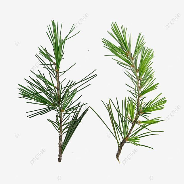
Photo of two separate green pine branches side by side, each with needle clusters, representing the two independent samples (populations X and Y) being compared in a two-sample t-test.
Note

✅ Degrees of freedom here

Two groups, two means estimated from 8 tree means.

df = n₁ + n₂ − 2 = 4 + 4 − 2 = 6

Two-Sample T-Test Framework

\[t = \frac{\bar{x}_1 - \bar{x}_2}{S_p\sqrt{\frac{1}{n_1} + \frac{1}{n_2}}} = \frac{\text{SIGNAL}}{\text{NOISE}}\]

Where:

  • x̄₁, x̄₂: sample means of the two groups
  • s²ₚ: pooled variance = [(n₁−1)s₁² + (n₂−1)s₂²] / (n₁+n₂−2)
  • Sₚ = √s²ₚ: the pooled standard deviation
  • Sₚ√(1/n₁ + 1/n₂): the standard error of the difference — the whole denominator
Important

The df is sitting right inside the formula

Look at the denominator of the pooled variance: n₁ + n₂ − 2. That is the degrees of freedom. It is the divisor that turns two sums of squares into one variance estimate, and the same number then indexes the t-distribution you compare your t to.

df is not a rule to memorise — it is whatever you divided by.

Note

📖 Reference

Whitlock & Schluter, Ch. 12 — Comparing Two Means.

Checking Assumptions — Normality by Group

p_df %>%
  group_by(side) %>%
  summarize(
    shapiro_p = shapiro.test(needle_length_mm)$p.value,
    .groups = "drop")
# A tibble: 2 × 2
  side  shapiro_p
  <chr>     <dbl>
1 shady     0.674
2 sunny     0.516
Tip

🖐 Each group separately

For a two-sample test the normality assumption is about the residuals within each group, so test each side on its own — never the pooled column.

Checking Assumptions — Equal Variances

leveneTest(needle_length_mm ~ factor(side), data = p_df)
Levene's Test for Homogeneity of Variance (center = median)
      Df F value Pr(>F)
group  1  0.6355 0.4557
       6               
Important

H₀ for Levene’s test is “the variances are equal.”

You want a non-significant result. If p > 0.05, the standard (Student’s) t-test is fine. If p < 0.05, use Welch’s.

leveneTest() needs the grouping variable as a factor.

Conducting the Two-Sample T-Test

Standard (Student’s) — equal variances

two_sample_model <- t.test(needle_length_mm ~ side,
                           data = p_df, var.equal = TRUE)

two_sample_model

    Two Sample t-test

data:  needle_length_mm by side
t = -0.85529, df = 6, p-value = 0.4252
alternative hypothesis: true difference in means between group shady and group sunny is not equal to 0
95 percent confidence interval:
 -4.221663  2.034788
sample estimates:
mean in group shady mean in group sunny 
           14.12094            15.21438 

Welch’s — unequal variances

welch_model <- t.test(needle_length_mm ~ side,
                      data = p_df, var.equal = FALSE)

welch_model

    Welch Two Sample t-test

data:  needle_length_mm by side
t = -0.85529, df = 5.6627, p-value = 0.4271
alternative hypothesis: true difference in means between group shady and group sunny is not equal to 0
95 percent confidence interval:
 -4.267394  2.080519
sample estimates:
mean in group shady mean in group sunny 
           14.12094            15.21438 

Standard vs. Welch’s t-Test

Standard t-test (Student’s)

  • Assumes equal variances between groups
  • Uses a pooled variance estimate combining both groups
  • Higher power when the equal-variance assumption is met
  • df = n₁ + n₂ − 2 = 6 — a whole number, every time

Welch’s t-test

  • Does not assume equal variances
  • Uses separate variance estimates for each group
  • More robust when group variances differ
  • df from the Welch–Satterthwaite equation — typically not a whole number, and always smaller than n₁ + n₂ − 2. Here df ≈ 5.66
Tip

🖐 The fractional df is the price of the robustness — Welch’s buys safety by spending degrees of freedom.

Interpreting the Two-Sample T-Test

What can we conclude about needle lengths on the sunny vs. shady sides?

Note

How to report this result in a scientific paper

“A two-tailed, two-sample t-test at α = 0.05 showed [a significant/no significant] difference in needle length between sunny (M = …, SD = …) and shady (M = …, SD = …) sides of pine trees, t(6) = …, p = …”

For Welch’s you report the fractional df exactly as R gives it: t(5.66) = …

T-distribution curve with 6 degrees of freedom, red rejection regions in both tails beyond the critical t-values, and a dashed blue line marking the observed t-statistic, which falls well inside the non-rejection region.

df = 6 — compare the shape of this curve to the df = 3 one in Part 4.

Part 6 · Paired T-Test

What Does a Paired T-Test Tell Us?

Paired t-test:

  • Compares two measurements from the same subject or matched pair
  • Tests whether the mean difference between paired observations equals zero
  • Uses the differences between pairs as the data
  • Generally more powerful, because it removes subject-to-subject variation from the noise
Note

✅ Degrees of freedom here

4 trees → 4 differences → one mean difference estimated.

df = npairs − 1 = 4 − 1 = 3

Not 6. The 8 numbers became 4 the moment you subtracted.

Warning

⚠️ Order matters for the sign

t.test(shady, sunny, paired = TRUE) computes shady − sunny. Reverse the arguments and t flips sign — the p-value is identical, but the direction you report is backwards.

p_wide_df <- p_df %>%
  pivot_wider(names_from = side,
              values_from = needle_length_mm)

# shady first, then sunny -- the SAME order the
# two-sample test used
paired_model <- t.test(p_wide_df$shady,
                       p_wide_df$sunny,
                       paired = TRUE)

paired_model

    Paired t-test

data:  p_wide_df$shady and p_wide_df$sunny
t = -2.7227, df = 3, p-value = 0.07238
alternative hypothesis: true mean difference is not equal to 0
95 percent confidence interval:
 -2.3714897  0.1846147
sample estimates:
mean difference 
      -1.093438 

Same Data, Two Different Answers

Both tests used exactly the same 8 numbers, and both measured shady − sunny:

Test t df p
Two-sample −0.855 6 0.425
Paired −2.723 3 0.072

Same estimated difference (−1.09 mm, shady needles shorter). Same data. The p-value dropped by a factor of almost six.

Why?

  • The two-sample test throws the pairing away. Tree-to-tree variation (some teams’ trees just have longer needles) lands in the noise, swamping the signal.
  • The paired test looks only at the shady − sunny difference within each tree, so tree-to-tree variation cancels out entirely.
slope_plot

The slope plot from Part 1, repeated here: each team's tree is a line joining its shady mean to its sunny mean, and all four lines slope the same way.

Each line is one tree. All four shift the same way — that consistency is exactly what the paired test measures and the two-sample test cannot see.

Same Data, Two Different Answers — Why the Design Matters

Important

And notice it did that on half the degrees of freedom

3 instead of 6 — because it is working with 4 differences, not 8 values. A smaller df makes significance harder to reach. It still won by a mile, because the noise it removed mattered far more than the df it gave up.

Note

These data are paired by design — each team measured both sides of the same tree. The two-sample test is not just less powerful, it is answering a question our design never asked.

✅ A Paired Test Is a One-Sample Test

Here is the idea that makes the df finally click. Treat the shady side as each tree’s own control, and compute one difference per tree:

diff_df <- p_wide_df %>%
  mutate(difference = sunny - shady)

diff_df
# A tibble: 4 × 4
  team       shady sunny difference
  <chr>      <dbl> <dbl>      <dbl>
1 botany      16.1  17.3      1.16 
2 grace_jace  15.4  15.5      0.146
3 one         13.2  14.2      0.968
4 waterbugs   11.7  13.8      2.10 
Tip

🖐 Each tree is its own control

The shady side accounts for everything about that particular tree — its genetics, its soil, its water, its team’s measuring technique. Subtracting removes all of it at once, and what is left is the effect of sun.

This is the same logic as a before/after design, and it is the seed of the blocked designs you will meet in ANOVA.

✅ A Paired Test Is a One-Sample Test — Same Numbers

Now throw away the pairing language entirely and run a plain one-sample t-test on those 4 differences, against μ = 0:

diff_model <- t.test(diff_df$difference, mu = 0)

diff_model

    One Sample t-test

data:  diff_df$difference
t = 2.7227, df = 3, p-value = 0.07238
alternative hypothesis: true mean is not equal to 0
95 percent confidence interval:
 -0.1846147  2.3714897
sample estimates:
mean of x 
 1.093438 
Important

Identical. Same t, same df, same p.

t.test(sunny, shady, paired = TRUE) and t.test(sunny - shady, mu = 0) are the same test. paired = TRUE is nothing more than a convenience that does the subtraction for you.

That is why the paired df is npairs − 1 = 3 and not n₁ + n₂ − 2 = 6: once you subtract, you genuinely only have four numbers. A one-sample test on four numbers has 3 df. Always.

Part 7 · Assumptions and Wrap-Up

Assumptions of Parametric Tests

Common assumptions for t-tests:

  1. Normality — the data (or, for a paired test, the differences) come from a normally distributed population
  2. Equal variances — two-sample tests only
  3. Independence — observations are independent
  4. No outliers — extreme values can dominate a small sample

What do we do if our data violate these?

Alternatives when assumptions are violated:

  • Data transformation (log, square root)
  • Non-parametric tests — Mann-Whitney U for two samples, Wilcoxon signed-rank for paired
  • Robust methods
Tip

🖐 Note the paired case

You check normality of the differences, not of the two groups. Which follows directly from the last slide — the differences are the data.

Summary and Conclusions

In this lecture we:

  1. Went from question → prediction → H₀ / Hₐ → α, before looking at output
  2. Tested assumptions — QQ plot, Shapiro-Wilk, Levene’s
  3. Ran one-sample (two- and one-tailed), two-sample (Student’s and Welch’s), and paired t-tests
  4. Saw that a paired test is a one-sample test on the differences
  5. Learned to read and report t(df) = …, p = …
Important

Degrees of freedom — the one-line version

  • One-sample: n − 1 = 3
  • Two-sample: n₁ + n₂ − 2 = 6
  • Paired: npairs − 1 = 3
  • Welch’s: fractional, ≤ n₁ + n₂ − 2 ≈ 5.66

n is trees, never needles. You lose one df per mean you estimate.

Note

Key takeaways

  • Always check assumptions before you test
  • Plot the data before you test
  • Match the test to the design, not to the p-value you want
  • Non-parametric alternatives are coming up next