library(tidyverse)
pine_df <- read_csv("data/pine_data.csv")Lecture: Getting Started
Asking a question, meeting R, and making your first graph
Foundations
R
Graphing
A question worth testing, a project worth organizing, and a first look at R, Positron, and ggplot — all built around one pine needle experiment.
Welcome to Biostatistics
- This course teaches the whole pipeline: raw data → clean → summarize → visualize → test → report
- You do not need prior coding experience — everyone starts exactly here
- The only way to learn this is to type the code yourself and break it
Important
Getting stuck is not failing — it is the job.
Every working scientist reads error messages and searches for answers every day.
Note
Today’s roadmap
- Asking a good question
- Organizing a project
- Meeting R and Positron
- Loading data and your first plot
Part 1 · Asking a Good Question
What makes something science?
- Science makes predictions and tests them with a falsifiable approach — statistics
- A claim that could never be shown wrong is not testable, and not science
Example:
- “Needles on the shady side of a tree are longer” — testable ✅
- “The forest decides needle length” — not testable ❌
Note
📖 New word
Falsifiable = a prediction that could, in principle, be proven wrong. A good hypothesis is one you could disprove.
Note
📖 Reference
Whitlock & Schluter, The Analysis of Biological Data, Ch. 1 — Statistics and Samples.
Gotelli & Ellison, A Primer of Ecological Statistics, Ch. 4 — Framing and Testing Hypotheses.
Two ways of reasoning toward that question
Inductive (specific → general)
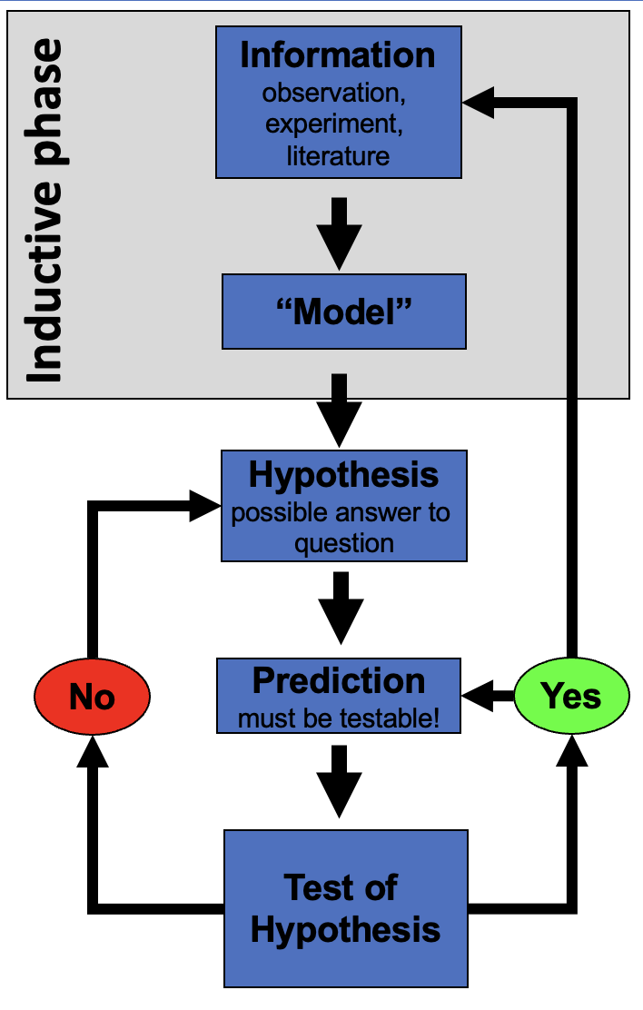
You measure needles on a few trees, notice a pattern, and generalize: “needle length seems to vary with side of tree.”
Note
Weakness: the pattern held in your sample — it is not guaranteed to hold everywhere.
Deductive (general → specific)
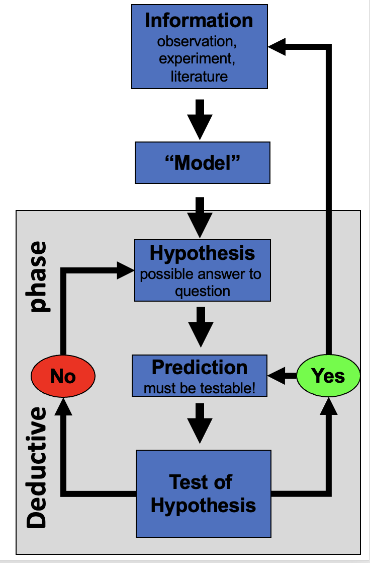
You start from a general rule — “exposure affects needle length” — and predict what a new tree should show, then check.
Note
Weakness: only as strong as the general rule you started from.
Tip
In practice we do both, back and forth — notice a pattern (induction), propose a rule, then test it on new data (deduction).
Our class question
Pine needles on the shady side of a tree vs. the sunny side:
- Question:
- Prediction:
- H₀ (null):
- Hₐ (alternate):
Note
📖 New words
- Question: what is your question
- Prediction: what do you think will happen
- H₀ — the “nothing is happening” claim
- Hₐ — the claim we suspect might be true
- Note: Hₐ does NOT say which side is longer — that would be a prediction, a stronger, riskier claim
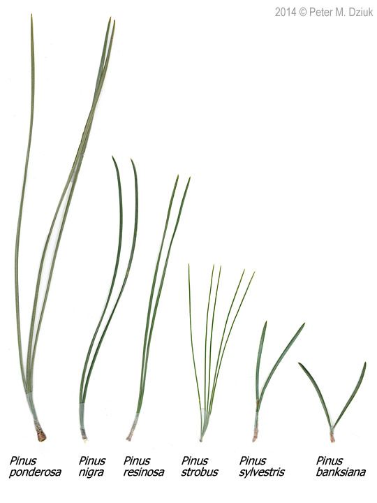
Designing a defensible sample
- Can we test this with needles from one tree?
- No — that tree could just happen to have short needles on one side due to other drivers.
- Treating many needles from one tree as if they were independent replicates is called pseudoreplication (Hurlbert 1984).
- The tree — not the needle — is the unit of replication.
- We need needles from many trees, sampled the same way each time.
- Randomize which trees and branches you sample, so your own bias doesn’t sneak into the data.
Important
Dependent vs. independent variables
- Independent (X): sun exposure — shady or sunny — what we group by
- Dependent (Y): needle length — what we measure
Tip
🖐 Today in the field
Each team collects needles from the shady side and the sunny side of the same tree, using one agreed-on method — same height, same “mature needle” definition, same spot on the branch.
Then we come back, agree on how to measure, measure the needles, and enter the data in Excel.
Note
Because both sides come from the same tree, the two measurements are paired. Keep track of which team measured which tree — we will need that structure later today, and again in Week 4.
Note
📖 Reference
Whitlock & Schluter, Ch. 1 — Statistics and Samples, on random sampling and what makes a sample representative.
Gotelli & Ellison, Ch. 6 — Designing Successful Field Studies, on replication and pseudoreplication.
Part 2 · Organizing Your Project
Data is the raw material — treat it that way
- Decide your variable names and units before you collect anything — this is a controlled vocabulary
- Example:
needle_length_mm, notNeedle Length (mm)— all lowercase, no spaces, no parentheses - Put the unit in the name as a suffix (
_mm,_g,_c) so it can never get separated from the number - Plan where data goes the moment you collect it — do not let it pile up in email or texts
Note
✅ Key idea
A few minutes of naming discipline today saves hours of confusion in Wrangling Your Data, when we clean messy data.
Tip
Controlled vocabulary example
| Bad | Good |
|---|---|
Needle Length (mm) |
needle_length_mm |
Sun Exposure |
side |
Team Name |
team |
One folder per project
pine_project/
├── data/       ← raw files, never overwritten
├── scripts/    ← your .R code
├── figures/    ← plots you save
└── output/ ← place to save modified data- Open this folder as your workspace in Positron (File → Open Folder…)
- Every file path then becomes relative
- no more
C:/Users/.../Desktop/final_FINAL2.xlsx - never call
setwd()to set the working directory — not once, not ever
- no more
Note
✅ Key idea
Keep raw data untouched.
R writes new, processed files — so you can always trace your steps back to the original numbers.
Note
📖 New word
Metadata = data about your data: who collected it, when, how, with what instrument.
Without it, data are nearly useless — even to future-you.
Note
📖 Reference
Gotelli & Ellison, Ch. 8 — Managing and Curating Data.
Tip
🖐 Preview
Tidy data — one row per observation, one column per variable — is the target we’re organizing toward. We’ll formalize this in Wrangling Your Data.
Part 3 · Meet R and Positron
R is the engine, Positron is the dashboard
- R — a free language for data and statistics
- Positron — the editor (IDE) you drive it through
- Four panes you’ll use constantly:
| Pane | Where | What it does |
|---|---|---|
| Editor | top-left | your scripts live here |
| Console | bottom | where code actually runs |
| Environment | right | everything you’ve stored |
| Plots / Files | right | figures and project files |
Note
📖 New word
IDE = Integrated Development Environment. R is the car engine; Positron is the seat, wheel, and dashboard.
R as a calculator, and storing values
Type math into the console and press Enter:
3 + 5
12 / 7
2 ^ 10
To keep a value, give it a name with the assignment operator <-:
x <- 7      # store 7 under the name x
x           # read it back
x * 2       # use it in math
Warning
⚠️ Watch out!
R is case-sensitive: x and X are different objects. Use <-, not =, to assign.
Note
📖 New word
Object = a named container holding a value. Watch it appear in the Environment pane the moment you create it.
Names, comments, and functions
- Use
lower_snake_case:needle_length, notx2orNeedleLength - Anything after
#is a comment — a note for humans, ignored by R
# average of four needle lengths, in mm
needle_length <- c(20, 21, 23, 25)
mean(needle_length)     # a function call
A function takes arguments in () and returns a result. Stuck? Ask for help:
?mean
args(mean)
Tip
🖐 Try it yourself
Predict what these return, then run them:
round(0.5)    # you expect 1 ...
round(1.5)    # you expect 2 ...
round(2.5)    # you expect 3 ...
You get 0, 2, 2. R rounds a value ending in exactly .5 to the nearest even number, not always upward. This is the IEEE 754 standard (“round half to even”), and it is deliberate — it keeps rounding errors from accumulating in one direction.
If you want the school-textbook rule instead, use janitor::round_half_up(), which turns those into 1, 2, 3.
Note
📖 New words
- Comment — ignored by R, read by humans
- Argument — an input handed to a function
- Function — a named, reusable operation
Vectors, data types, and scripts
A vector is a row of values made with c() — a spreadsheet column is really just a vector:
needle_length_mm <- c(20, 21, 23, 25)      # numeric
side             <- c("shady", "sunny")    # character — needs quotes
The console forgets. A script (.R file) remembers:
- File → New File → R File, save it, run lines with Ctrl/Cmd+Enter
Warning
⚠️ Watch out!
Without quotes, shady means “find an object called shady,” not the text "shady".
R will error if no such object exists.
Note
✅ Key idea
Console = scratch paper.
Script = the lab notebook you keep and rerun.
Packages — extending what R can do
Install once, in the console:
install.packages("tidyverse")Load every session, at the top of every script:
library(tidyverse) # wrangling + ggplot2
Warning
⚠️ Watch out!
“could not find function…” almost always means you forgot the library() line for that session.
Note
📖 New words
- Package — the installed toolbox (once)
- Library — loading it for today’s session (every time)
📖 R4DS §1 — Data visualization opens with installing and loading the tidyverse.
Part 4 · Load Data and Make Your First Plot
Bring the data in
Put the file in data/, then:
Note
✅ Key idea
read_csv() comes free with library(tidyverse). Your file’s first row becomes the column names in R.
Note
Our columns
team— which team collected the treeside—"shady"or"sunny"replicate— which needle (1–8) within a team-and-sideneedle_length_mm— needle length in mmneedle_width_mm— needle width in mm
Look before you trust it
glimpse(pine_df)Rows: 64
Columns: 6
$ source_file <chr> "Bartell_Shingledecker_tree_needle_data_2026.csv", "B…
$ team <chr> "grace_jace", "grace_jace", "grace_jace", "grace_jace…
$ replicate <dbl> 1, 2, 3, 4, 5, 6, 7, 8, 1, 2, 3, 4, 5, 6, 7, 8, 1, 2,…
$ side <chr> "sunny", "sunny", "sunny", "sunny", "sunny", "sunny",…
$ needle_length_mm <dbl> 18.44, 12.48, 17.73, 13.98, 14.18, 19.17, 10.92, 17.3…
$ needle_width_mm <dbl> 0.79, 0.99, 1.12, 0.94, 1.00, 0.99, 0.81, 1.29, 0.75,…dim(pine_df)[1] 64 6
Tip
🖐 Notice
64 rows — but only 4 teams, each measuring 8 needles on 2 sides of one tree. Rows are not the same thing as independent observations. Hold that thought.
Warning
⚠️ Watch out!
If a number column shows as <chr> in glimpse(), a stray letter or comma is hiding in that column.
Your first plot: ggplot, built in layers
Every ggplot needs three things, joined with +:
- data — which data frame
- aes() — which columns map to x and y
- geom — how to draw it
ggplot(pine_df, aes(x = side, y = needle_length_mm)) +
  geom_point()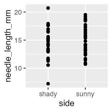
Warning
⚠️ Watch out!
+ sits at the end of a line, never the start.
this is what adds layers to the plot and order matters
Note
✅ Key idea
Seeing your data is the single most important habit in this course — before you summarize or test anything, plot it.
Note
One layer at a time
ggplot(pine_df, aes(x = side, y = needle_length_mm)) +
  geom_boxplot() +
  geom_jitter(width = 0.15, alpha = 0.6, color = "tomato") +
  labs(x = "Sun exposure",
       y = "Needle length (mm)",
       title = "Needle length by sun exposure")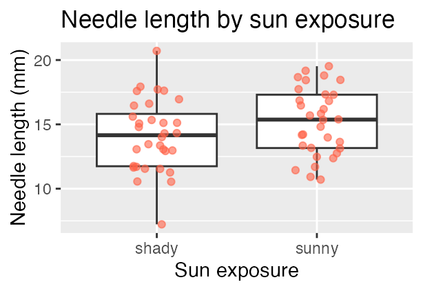
Tip
🖐 Try it yourself
Swap side for team. That plot answers a different question — how much do the four teams differ from each other? Keep the answer in mind for the next slide.
Note
✅ Key idea
A boxplot shows the summary; the jittered points show every real value underneath it. Show both when you can.
Part 5 · 64 Rows, But How Many Observations?
The tempting (wrong) picture
The boxplot you just made pooled all 64 needles as if each were an independent measurement:
ggplot(pine_df, aes(x = side, y = needle_length_mm)) +
  geom_boxplot(outlier.shape = NA) +
  geom_jitter(aes(color = team), width = 0.15, alpha = 0.8) +
  labs(x = "Sun exposure", y = "Needle length (mm)", color = "Team")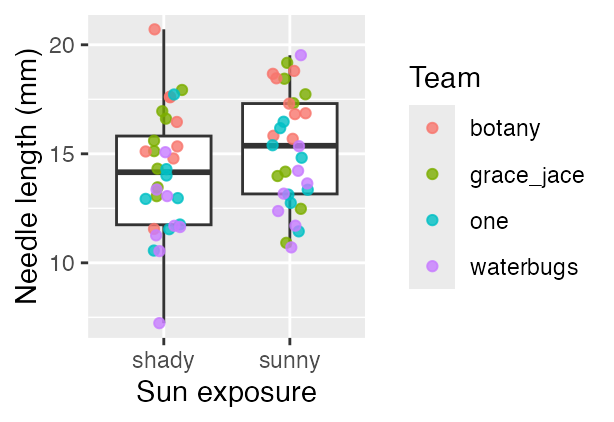
Colour by team and the problem jumps out: the four teams sit in different bands. A needle is not independent of the other seven from the same tree.
Important
⚠️ Pseudoreplication
We have n = 4 trees, not n = 64 needles.
Counting needles inflates our confidence in a difference we have barely measured.
Doing it the right way: group_by() + summarise()
Collapse each team-and-side down to one number — the thing we actually replicated:
team_means <- pine_df |>
  group_by(team, side) |>
  summarise(mean_length_mm = mean(needle_length_mm),
            .groups = "drop")

team_means
# A tibble: 8 × 3
team side mean_length_mm
<chr> <chr> <dbl>
1 botany shady 16.1
2 botany sunny 17.3
3 grace_jace shady 15.4
4 grace_jace sunny 15.5
5 one shady 13.2
6 one sunny 14.2
7 waterbugs shady 11.7
8 waterbugs sunny 13.864 rows became 8 — four teams × two sides. This is the dataset our question is really about.
Note
📖 New words
group_by()— split the data into groupssummarise()— collapse each group to one row- Pipe
|>— send the result of one step into the next
We’ll go deep on all three in Wrangling Your Data.
The two pictures side by side
ggplot(team_means, aes(x = side, y = mean_length_mm, group = team)) +
  geom_line(aes(color = team), linewidth = 0.8) +
  geom_point(aes(color = team), size = 2) +
  labs(x = "Sun exposure", y = "Mean needle length (mm)", color = "Team")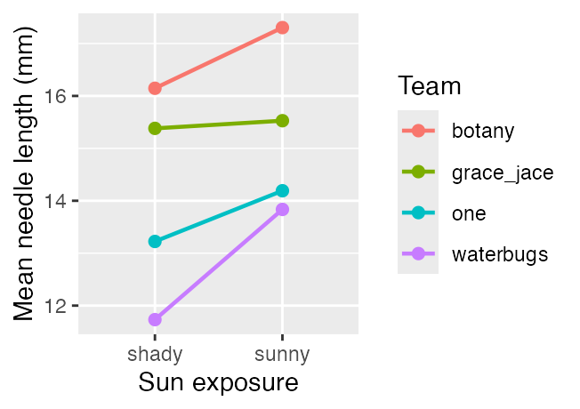
Each line is one tree. The teams are far apart vertically — but every single line slopes the same way.
Note
✅ Key idea
Because both sides come from the same tree, these are paired measurements. Comparing each tree to itself cancels out the big between-team differences.
Tip
🖐 Coming in Week 4
We’ll put numbers on this — and see how a paired t-test finds a signal that the naive test on 64 needles misses.
Save your plot
needle_plot <- ggplot(pine_df, aes(x = side, y = needle_length_mm)) +
  geom_boxplot() +
  geom_jitter(width = 0.15, alpha = 0.6, color = "tomato") +
  labs(x = "Sun exposure", y = "Needle length (mm)")

ggsave("figures/needle_length.png",
       plot = needle_plot,
       width = 3, height = 3, units = "in", dpi = 300)
Warning
⚠️ Watch out!
ggsave() wants the filename first, then plot =. Always use dpi = 300 — print/poster quality.
Note
📖 File format tip
Save figures as PNG for reports and submissions.
Wrap-up
Today you:
- Turned a question into a testable H₀ / Hₐ
- Organized a project folder with data/scripts/figures
- Ran your first R code — objects, functions, vectors, packages
- Loaded real data and made — and saved — your first
ggplot - Saw why 64 rows is not 64 observations, and collapsed them to the 4 trees we actually replicated
Tip
🖐 Before next class
Finish the worksheet: load pine_data.csv, run glimpse(), and make one more plot — needle_width_mm by side this time. Save it to figures/.
Note
Up next — Wrangling Your Data
filter(),select(),mutate(),arrange()- Cleaning a genuinely messy version of this dataset
- The pipe
|>and building a pipeline
Readings
Before next class — both chapters are posted as PDFs on Canvas:
- Whitlock & Schluter, The Analysis of Biological Data — Ch. 1, Statistics and Samples (populations vs. samples, why we sample, sampling error)
- Gotelli & Ellison, A Primer of Ecological Statistics — Ch. 8, Managing and Curating Data (raw data, metadata, project organization)
If you want more on the science and hypothesis side:
- Whitlock & Schluter, Ch. 2 — Displaying Data
- Gotelli & Ellison, Ch. 4 — Framing and Testing Hypotheses
Note
📖 R for Data Science (2e)
Free online at r4ds.hadley.nz — the R side of today:
Getting unstuck
When code breaks — and it will, that is normal:
- Read the error message out loud; it usually names the line
- Check the usual suspects:
library(tidyverse)loaded? Spelling? A missing)or+at the start of a line? ?function_nameopens the help page- Bring the exact error (copy-paste it) to class or office hours
📖 R4DS §8 — Workflow: getting help shows how to write a question others can actually answer.
Note
✅ Key idea
Every working scientist googles error messages daily. Getting stuck is not failing — it is the job.