# Load all packages at the top of every script ----------
library(readxl) # reading Excel files
library(tidyverse) # data wrangling + ggplot2
library(janitor) # cleans up messy column namesLecture 03 — GGPlot I
Grouped summaries, facets, and the pipe into ggplot
ggplot
tidyverse
Custom colors with scale_color_manual(), splitting plots into panels with facet_wrap()/facet_grid(), and building a mean ± SE plot with stat_summary() — all piped straight into ggplot().
Where we left off (Lecture 02 — Meeting R)
- Project structure —
data/,scripts/,figures/ - Packages —
install.packages()once,library()every session - Loading data —
read_excel(),clean_names()intoleaf_df - The pipe —
%>%reads as “then” - Our first plot — a bare
geom_point()
Note
✅ Key idea from Lecture 02
You can already load data and make one honest point on a page. Today that one geom becomes a whole toolkit: custom colors, side-by-side panels, and a proper mean ± SE summary.
Goals for Today
- Start every plot with the pipe:
leaf_df %>% ggplot(...) - Assign colors on purpose with
scale_color_manual() - Split one plot into panels with
facet_wrap()andfacet_grid() - Build a mean ± SE plot with
stat_summary()
Tip
🖐 Try it yourself
By the end you will make a publication-style figure: raw leaf data, grouped and colored on purpose, with the mean and its uncertainty layered on top.
How to Use These Slides — Predict · Type · Run
This lecture runs in three short chunks. After each chunk you switch to the activity and type the code yourself into your R script.
For every code block, do three things:
- Predict — before it runs, say what you think the output will be
- Type it out by hand — do not copy-paste
- Run it and compare to your prediction
Note
✅ Why bother?
facet_wrap()andfacet_grid()look interchangeable until you’ve typed both and watched one wrap into rows while the other insists on a strict grid.- Typing
scale_color_manual(values = c(...))yourself is what makes you notice the color names have to match your group names exactly.
Load Libraries and Data
# Read the leaf data from the data folder ---------------
leaf_df <-
  read_excel("data/2026_09_03_data_sci_leaf_area.xlsx") %>%
  clean_names()

glimpse(leaf_df)
Rows: 53
Columns: 8
$ twig_id <chr> NA, NA, NA, NA, NA, NA, NA, NA, NA, NA, NA…
$ leaf_id <chr> NA, NA, NA, NA, NA, NA, NA, NA, NA, NA, NA…
$ teams <chr> "12345", "12345", "12345", "12345", "12345…
$ shade <chr> "sunny", "sunny", "sunny", "sunny", "sunny…
$ mass_g <dbl> 0.4000, 0.4800, 0.3400, 0.6500, 0.2700, 0.…
$ petiole_mm <dbl> 79.0000, 63.0000, 68.0000, 35.0000, 34.000…
$ thickness_mm <dbl> 0.15, 0.14, 0.14, 0.15, 0.11, 0.16, 0.14, …
$ paper_mass_g <dbl> 0.2100, 0.2100, 0.2100, 0.2400, 0.1500, 0.…🧩 Chunk 1 of 3 · Piping into ggplot, on Purpose
We will cover: starting a plot with the pipe, and choosing colors with scale_color_manual().
Every Plot Starts the Same Way
# Pipe the data frame straight into ggplot() -----------
leaf_df %>%
  ggplot(aes(x = shade, y = mass_g, fill = shade)) +
  geom_boxplot(alpha = 0.6, outlier.shape = NA) +
  geom_jitter(width = 0.15, alpha = 0.6) +
  labs(title = "Leaf Mass by Shade", x = "Shade",
       y = "Leaf Mass (g)", fill = "Shade") +
  theme_minimal()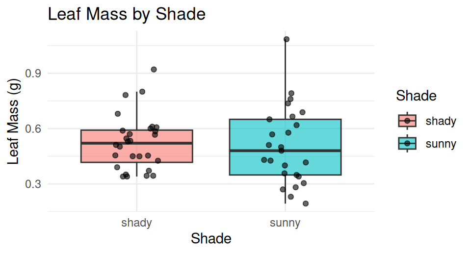
leaf_df %>% ggplot(...)= “takeleaf_df, then plot it”- Everything after
ggplot()is added with+, not%>% fill = shademaps a column to color — ggplot picks the colors
Warning
⚠️ Watch out!
%>% connects data-wrangling steps. + connects plot layers. Mixing them up is the single most common ggplot error.
Choosing Colors on Purpose — scale_color_manual()
Note
🔮 Predict first: scale_fill_manual() needs one color per group. We have two groups — how many colors do we supply?
# scale_fill_manual() assigns exact colors to exact groups
leaf_df %>%
  ggplot(aes(x = shade, y = mass_g, fill = shade)) +
  geom_boxplot(alpha = 0.6, outlier.shape = NA) +
  geom_jitter(width = 0.15, alpha = 0.6) +
  scale_fill_manual(values = c("sunny" = "goldenrod",
                               "shady" = "forestgreen")) +
  labs(title = "Leaf Mass by Shade", x = "Shade",
       y = "Leaf Mass (g)", fill = "Shade") +
  theme_minimal() +
  theme(legend.position = "none")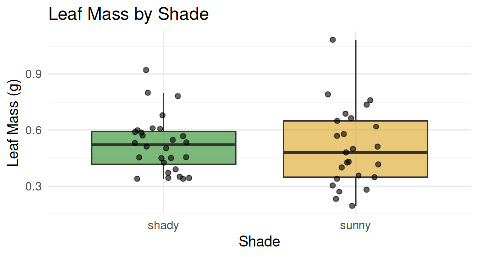
scale_fill_manual()— forfill =aesthetics (boxes, bars, columns)scale_color_manual()— forcolor =aesthetics (points, lines)- The names in
c()must exactly match your data’s values — case and spelling count
Warning
⚠️ Watch out! A name that doesn’t match falls back to grey, with a warning.
→ ACTIVITY 3 Parts 1–2 now
🧩 Chunk 2 of 3 · Small Multiples with Facets
We will cover: facet_wrap() and facet_grid() — splitting one plot into a panel per group.
facet_wrap() — One Panel per Group
# facet_wrap() splits into one panel per level ---------
leaf_df %>%
  ggplot(aes(x = mass_g, fill = shade)) +
  geom_histogram(binwidth = 0.05, color = "white") +
  facet_wrap(~shade) +
  scale_fill_manual(values = c("sunny" = "goldenrod",
                               "shady" = "forestgreen")) +
  labs(x = "Leaf Mass (g)", y = "Count",
       title = "Mass Distribution by Shade") +
  theme_minimal() +
  theme(legend.position = "none")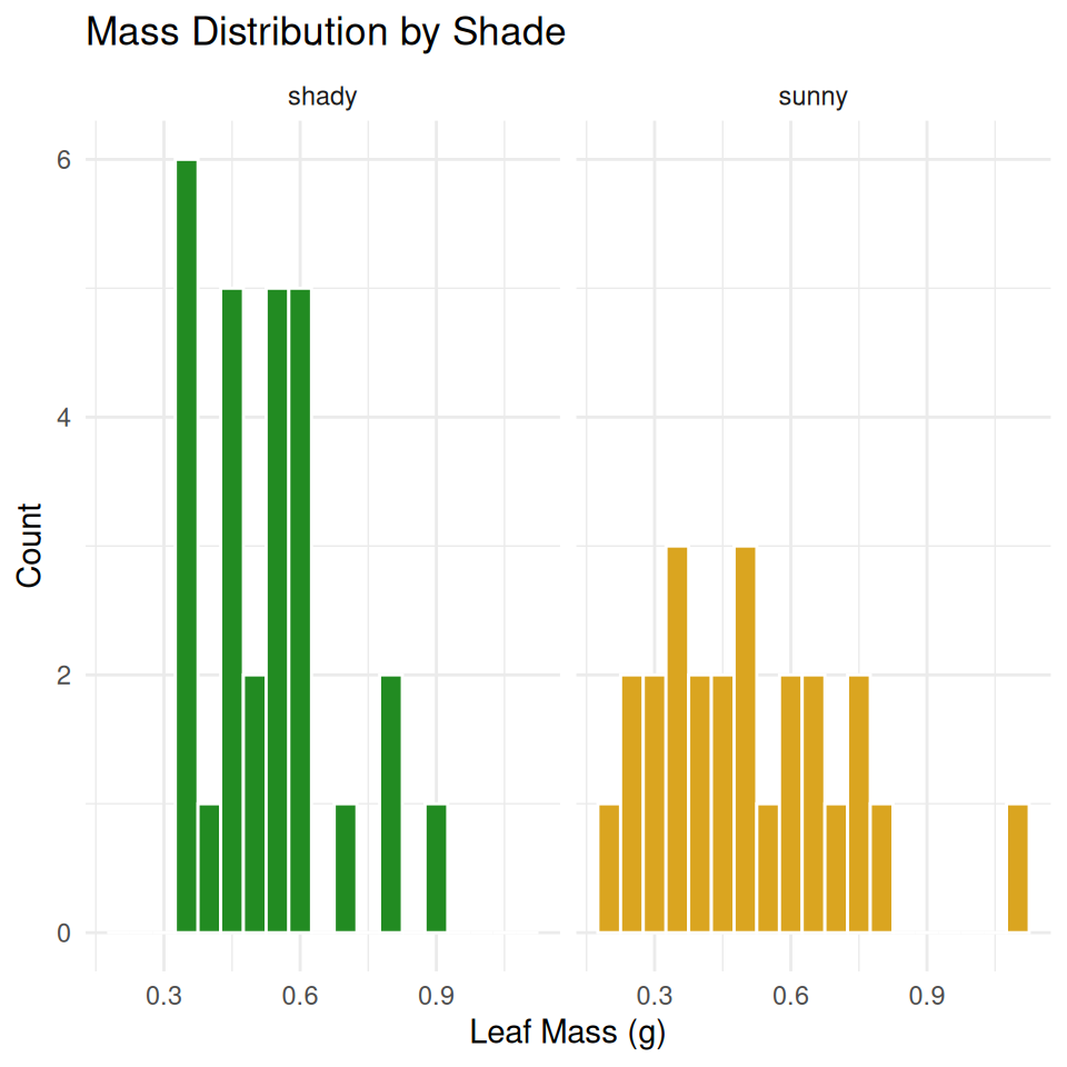
~shadereads as “by shade” — the~is required- Each panel gets its own copy of the plot, filtered to that group
facet_wrap(~shade, scales = "free_y")lets each panel’s y-axis rescale independently
facet_grid() — a Strict Rows-and-Columns Grid
# facet_grid(rows ~ cols) — use "." for "no grouping" --
leaf_df %>%
  ggplot(aes(x = mass_g, fill = shade)) +
  geom_histogram(binwidth = 0.05, color = "white") +
  facet_grid(shade ~ .) +
  scale_fill_manual(values = c("sunny" = "goldenrod",
                               "shady" = "forestgreen")) +
  labs(x = "Leaf Mass (g)", y = "Count") +
  theme_minimal() +
  theme(legend.position = "none")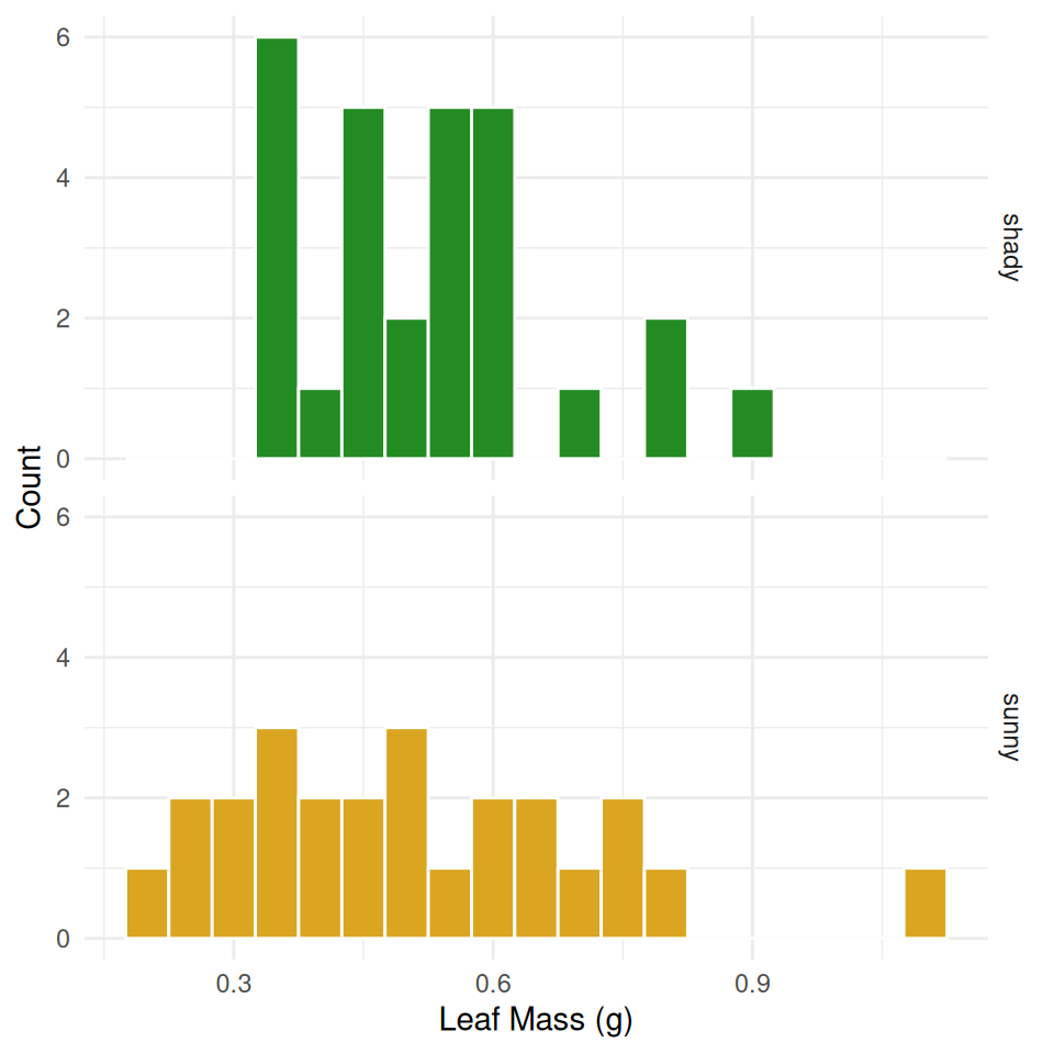
facet_grid(shade ~ .)stacks panels in rows;facet_grid(. ~ shade)arranges them in columns- The dot
.means “nothing on this side of the grid” facet_grid()really shines with two grouping variables (rows ~ cols) — we only have one (shade) today, but you’ll use the two-variable form the moment your data has a second grouping column
Note
💡 facet_wrap vs facet_grid
Use facet_wrap() for one grouping variable — it wraps panels into a grid automatically. Use facet_grid() when you have two variables and want rows and columns to each mean something specific.
→ ACTIVITY 3 Part 3 now
🧩 Chunk 3 of 3 · Mean ± SE with stat_summary()
We will cover: layering a group mean and its standard error directly on top of raw data — no summary table needed.
stat_summary() — the Mean as a Layer
# stat_summary() computes the mean straight from the data
leaf_df %>%
  ggplot(aes(x = shade, y = mass_g, color = shade)) +
  geom_jitter(width = 0.15, alpha = 0.4, size = 2) +
  stat_summary(fun = mean, geom = "point", size = 4,
               color = "black") +
  scale_color_manual(values = c("sunny" = "goldenrod",
                                "shady" = "forestgreen")) +
  labs(title = "Leaf Mass with Group Means",
       x = "Shade", y = "Leaf Mass (g)") +
  theme_minimal() +
  theme(legend.position = "none")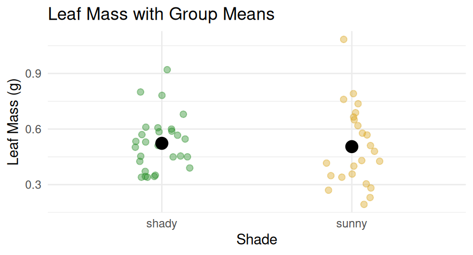
- Computes a statistic from the raw data — no summary table needed
fun = mean— any function returning one number (median,max, …)geom = "point"— draw it as a point- Put
geom_jitter()beforestat_summary()so the mean sits on top
stat_summary() — Mean ± SE
# fun.data = returns THREE values: y, ymin, ymax -------
leaf_mean_se_plot <- leaf_df %>%
  ggplot(aes(x = shade, y = mass_g, color = shade)) +
  geom_jitter(width = 0.15, alpha = 0.35, size = 2) +
  stat_summary(fun = mean, geom = "point", size = 4) +
  stat_summary(fun.data = mean_se, geom = "errorbar",
               width = 0.15, linewidth = 0.9) +
  scale_color_manual(values = c("sunny" = "goldenrod",
                                "shady" = "forestgreen")) +
  labs(title = "Mean ± SE Leaf Mass by Shade",
       x = "Shade", y = "Leaf Mass (g)") +
  theme_minimal() +
  theme(legend.position = "none")

leaf_mean_se_plot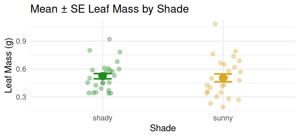
🔮 Predict first: fun.data = mean_se returns three numbers per group, not one — what are they?
Two stat_summary() layers, stacked:
| call | what it draws |
|---|---|
fun = mean |
a point at the mean |
fun.data = mean_se |
error bars for ± 1 SE |
- Raw points in the background, mean as a larger point, bars = ± 1 SE
📖 Whitlock & Schluter, Ch. 3 — Describing Data
→ ACTIVITY 3 Parts 4–5 now
What We Learned Today
- Pipe straight into a plot:
leaf_df %>% ggplot(...) scale_color_manual()/scale_fill_manual()— colors you choose, not colors ggplot guessesfacet_wrap(~var)— one panel per group, wraps automaticallyfacet_grid(rows ~ cols)— strict grid, best with two grouping variablesstat_summary()— mean and mean ± SE, drawn directly from raw data