# Load packages at the top — always -------------------
library(tidyverse) # data manipulation + ggplot2
library(janitor) # clean_names() and friendsLecture 15 — Wide, Long, and Wild: Pivoting Real Data
Reshaping Lake Superior ice cover data with pivot_longer() and pivot_wider()
tidyverse
descriptive-stats
Lake Superior Ice Data and how to pivot and summarize data.
Where We Left Off (Lecture 14)
- Started the final project — claimed a topic and a candidate dataset
- Sized up a new dataset in R with
read_csv(),glimpse(),dim(),head() - Wrote H₀ and Hₐ for a question you chose yourself
Note
✅ Transition
- Every dataset we’ve analyzed so far came to us already tidy — one row per observation, one column per variable.
- Today’s dataset will not be tidy.
- We’ll learn how to fix that.
Goals for Today
- Download a genuinely messy, wide real-world dataset — Lake Superior daily ice cover
- Understand why wide data is hard for R (and great for humans)
- Learn
pivot_longer()— turn wide data into tidy long data - Learn
pivot_wider()— turn long data back into a human-readable summary table - Handle a tricky real-world wrinkle: winter seasons that cross the new year
- Recreate NOAA’s own “spaghetti plot” comparing every year of ice cover
- Ask: is Lake Superior’s maximum ice cover changing over time?
Tip
🖐 Try it yourself
By the end you’ll have reshaped real NOAA ice data and built the same kind of plot NOAA scientists publish.
Tools today:
tidyverse,janitor
Textbook:
- 📖 R4DS 2e — Hadley Wickham
- 📖 Data Carpentry — R for Ecologists
How to Use These Slides — Predict · Type · Run
This lecture runs in four short chunks. After each chunk you switch to the activity and type the code yourself.
For every code block, do three things:
- Predict — before it runs, say what you think the output will be
- Type it out by hand — do not copy-paste
- Run it and compare to your prediction
Note
✅ Why bother? (the evidence)
- Guessing the shape of
ice_longbefore you pivot forces you to reason about whatpivot_longer()actually does, instead of just watching it happen. - Typing
names_prefix,names_to, andvalues_toyourself is how you notice which argument does which job — copy-pasting lets you skip right past that. - Reshaping wrong in front of an error message (a missing
datecolumn, a strayX) teaches you more about tidy data than reshaping right on the first try.
🧩 Chunk 1 of 4 · Why Wide Data Is a Problem
We will cover: where the ice data comes from, why “wide” data breaks tidy tools, and reading the messy text file into R.
Tip
🖐 After this chunk: Activity Parts 1–2 (read the raw file and inspect its wide shape).
Meet the Data: Lake Superior Ice Cover
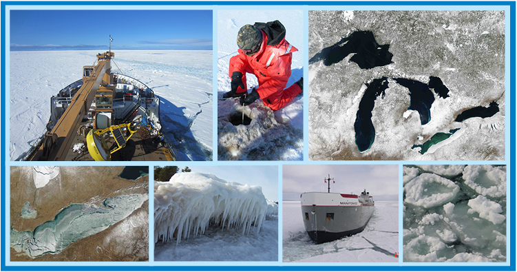
NOAA-GLERL (Great Lakes Environmental Research Laboratory) has tracked daily Great Lakes ice cover since 1973 — over 50 years of satellite-derived ice charts.
Today’s dataset: daily percent ice cover for Lake Superior, one row per day-of-winter, one column per year.
Source:
https://www.glerl.noaa.gov/data/ice/glicd/daily/sup.txt
Important
This is a plain text file living on a government server — not a tidy CSV. This is what real environmental data often looks like.
What Does “Wide” Data Look Like?
Note
🔮 Predict first: This table has one column per year — 53 of them. Before the next slides: can ggplot() use this shape directly? If not, what has to change first?
        1973 1974 1975 ... 2024 2025
Nov-10    NA   NA   NA       NA   NA
Nov-11    NA   NA   NA       NA   NA
...
Jan-15   2.1  4.0  1.8      8.2  6.5
...- One row per calendar day-of-winter (Nov 10 → ~May)
- One column per year — 53 columns, one for each ice season since 1973
- Lots of
NA— many days simply had no ice that year or that month
This format is perfect for a human scanning a printed table. It’s terrible for R and ggplot.
Why this breaks tidy tools:
ggplot()wants one column to map tox, one toy- Here, “year” is hiding as 53 separate column names, not as data values
group_by(year)is impossible — there’s noyearcolumn to group by!
📖 R4DS Ch. 5.2 — “every value in its own cell”
Load Libraries and Read the Raw File
# Read the messy text file directly from the web -------
url <- "https://www.glerl.noaa.gov/data/ice/glicd/daily/sup.txt"

ice_raw <- read.table(
  url,
  header = TRUE,
  na.strings = c("-999", "-99.00", "NA")
) %>%
  rownames_to_column(var = "date") %>%
  as_tibble()

dim(ice_raw)       # rows x columns - look how WIDE
[1] 209 55ice_raw[1:3, 1:5] # just the first few columns# A tibble: 3 × 5
date X1973 X1974 X1975 X1976
<chr> <dbl> <dbl> <dbl> <dbl>
1 Nov-10 NA NA NA NA
2 Nov-11 NA NA NA NA
3 Nov-12 NA NA NA NAWhat’s happening here:
read.table()beatsread_csv()here — the file isn’t comma-separatedna.stringssays which placeholders really mean “missing”- The day labels (
Nov-10…) were row names, not a column —rownames_to_column()fixes that
Important
Column names X1973, X1974… — R adds an X because a name can’t start with a number!
🛑 Pause — Do Activity Parts 1–2 Now
Read sup.txt straight from the web with read.table(), turn the row labels into a real date column, and look at the wide shape. Predict how many columns it has before you run it.
🧩 Chunk 2 of 4 · Reshape with pivot_longer & Fix Dates
We will cover: pivot_longer() to make the data tidy, the before/after shape, and the tricky winters-cross-the-new-year date fix.
Tip
🖐 After this chunk: Activity Parts 3–4 (pivot to long, then fix the calendar-year wrinkle).
pivot_longer() — Collapsing Wide to Long
Note
🔮 Predict first: ice_raw is ~190 rows × 53 columns. After pivot_longer(), how many columns will ice_long have?
# Collapse all year columns into year + ice_cover ------
ice_long <- ice_raw %>%
  pivot_longer(
    cols = -date,
    names_to = "year",
    names_prefix = "X",
    values_to = "ice_cover"
  )

ice_long <- ice_long %>%
  arrange(year, date)

head(ice_long)
# A tibble: 6 × 3
date year ice_cover
<chr> <chr> <dbl>
1 Apr-01 1973 3
2 Apr-02 1973 2.7
3 Apr-03 1973 2.4
4 Apr-04 1973 2
5 Apr-05 1973 1.7
6 Apr-06 1973 1.4Reading the arguments:
cols = -date— pivot every column exceptdatenames_to = "year"— the old column names become values in a newyearcolumnnames_prefix = "X"— strip theXthat R glued onto the numbersvalues_to = "ice_cover"— the old cell values become a newice_covercolumn
📖 R4DS Ch. 5.3 — pivot_longer() for wide-to-long
Live Demo — Watch It Break (on purpose)
Suppose I forgot rownames_to_column(), so there is no date column yet:
# Try to pivot every column except date...
ice_raw %>% pivot_longer(cols = -date, names_to = "year")
R stops:
Error in `pivot_longer()`:
! Can't select columns that don't exist.
✖ Column `date` doesn't exist.
The fix — make the row labels a real column first:
ice_raw <- ice_raw %>% rownames_to_column(var = "date")
Tip
✅ Why show a broken run?
“Column date doesn’t exist” means you referenced a column R can’t see — here because the day labels were still row names, not data. Reading the message points you straight to the fix.
Before and After: Same Data, Different Shape
Wide (ice_raw):
| date | X1973 | X1974 | X1975 |
|---|---|---|---|
| Nov-10 | NA | NA | NA |
| Jan-15 | 2.1 | 4.0 | 1.8 |
Long (ice_long):
| date | year | ice_cover |
|---|---|---|
| Jan-15 | 1973 | 2.1 |
| Jan-15 | 1974 | 4.0 |
| Jan-15 | 1975 | 1.8 |
Same information. Completely different shape.
- Wide: 53 columns, ~190 rows
- Long: 3 columns, ~190 × 53 rows
- The long version has one row per observation — exactly what
ggplot()andgroup_by()expect
Tip
Once a dataset’s categories are trapped in column names instead of a column of values, this reshape is usually the first thing you reach for — it’s what turns a spreadsheet into something group_by() can work with.
A Tricky Real-World Wrinkle: Winters Cross the New Year
The problem: a season runs Nov → May, but NOAA labels it by the year winter ends in — so Nov-10 under 1974 really happened in November 1973.
# Assign Nov/Dec to the PREVIOUS calendar year ----------
ice_clean <- ice_long %>%
  mutate(
    year = as.numeric(year),
    calendar_year = if_else(
      str_starts(date, "Nov|Dec"),
      year - 1,
      year
    ),
    full_date = ymd(paste(calendar_year, date, sep = "-")),
    month = month(full_date, label = TRUE)
  ) %>%
  drop_na(ice_cover, full_date)

head(ice_clean)
# A tibble: 6 × 6
date year ice_cover calendar_year full_date month
<chr> <dbl> <dbl> <dbl> <date> <ord>
1 Apr-01 1973 3 1973 1973-04-01 Apr
2 Apr-02 1973 2.7 1973 1973-04-02 Apr
3 Apr-03 1973 2.4 1973 1973-04-03 Apr
4 Apr-04 1973 2 1973 1973-04-04 Apr
5 Apr-05 1973 1.7 1973 1973-04-05 Apr
6 Apr-06 1973 1.4 1973 1973-04-06 Apr Reading the logic:
str_starts(date, "Nov|Dec")— does this row’s day-of-winter text start with “Nov” or “Dec”?- If yes, subtract 1 from
yearto get the real calendar year ymd()(fromlubridate) glues the pieces into one real RDatedrop_na()removes rows with no real date or no ice reading
📖 R4DS Ch. 17 — working with dates and times
🛑 Pause — Do Activity Parts 3–4 Now
Pivot the data long with pivot_longer(), then fix the winters that cross the new year with if_else() + ymd(). Predict the new shape before you run it.
🧩 Chunk 3 of 4 · Summarize & Pivot Back Wider
We will cover: group_by() %>% summarize() on the newly-tidy data, and pivot_wider() to build a readable year-by-month table.
Tip
🖐 After this chunk: Activity Parts 5–6 (summarize by month, then make a pivot table).
Summarize Now That We’re Long
# Mean ice cover per year-month --------------------------
monthly_avg <- ice_clean %>%
  group_by(year, month) %>%
  summarize(
    mean_ice = mean(ice_cover, na.rm = TRUE),
    .groups = "drop"
  )

monthly_avg <- monthly_avg %>%
  mutate(month_date = ymd(paste(year, month, "01", sep = "-")))

head(monthly_avg)
# A tibble: 6 × 4
year month mean_ice month_date
<dbl> <ord> <dbl> <date>
1 1973 Jan 18.1 1973-01-01
2 1973 Feb 32.8 1973-02-01
3 1973 Mar 28.2 1973-03-01
4 1973 Apr 2.2 1973-04-01
5 1973 Dec 12.0 1973-12-01
6 1974 Jan 24.1 1974-01-01This should look familiar.
- Exactly the same
group_by() %>% summarize()pattern from Lecture 12’s Duluth weather data - We could not have written this on the wide data — there was no
yearormonthcolumn to group by until we pivoted
The reshape wasn’t just cosmetic — it unlocked every tidyverse tool we already know.
pivot_wider() — Going Back the Other Direction
# Turn long data into a year-by-month summary table ------
ice_pivot_table <- ice_clean %>%
  pivot_wider(
    id_cols = year,
    names_from = month,
    values_from = ice_cover,
    values_fn = mean
  )

print(ice_pivot_table)
# A tibble: 54 × 9
year Apr Dec Feb Jan Mar May Nov Jun
<dbl> <dbl> <dbl> <dbl> <dbl> <dbl> <dbl> <dbl> <dbl>
1 1973 2.2 12.0 32.8 18.1 28.2 NA NA NA
2 1974 23.9 8.4 58.4 24.1 64.0 3.3 NA NA
3 1975 8.70 NA 35.9 10.7 17.2 NA NA NA
4 1976 6.52 5.48 27.8 15.4 32.3 NA NA NA
5 1977 24.2 19.1 92.0 61.1 78.0 2.15 NA NA
6 1978 9.67 5.98 55.4 17.3 63.7 2.57 NA NA
7 1979 48.5 3.31 85.4 36.8 87.6 21.3 NA NA
8 1980 15.6 NA 58.8 8.95 41.9 NA NA NA
9 1981 11.7 14.2 74.5 30.7 41.3 NA NA NA
10 1982 14.5 1.91 66.5 25.2 54.1 2.5 NA NA
# ℹ 44 more rowspivot_wider() is the mirror image of pivot_longer():
id_cols = year— one row per yearnames_from = month— month values become new column headersvalues_from = ice_cover— fills the cellsvalues_fn = mean— averages if multiple days land in the same year-month cell
This recreates an Excel-style pivot table — but computed, not copy-pasted.
📖 R4DS Ch. 5.4 — pivot_wider()
Why Learn Both Directions?
| Direction | When to use it |
|---|---|
pivot_longer() |
Data arrives wide (one column per year/site/etc.) and you need it tidy for ggplot() or group_by() |
pivot_wider() |
You have tidy long data but need a human-readable summary table — for a report, a colleague, or Excel |
Real data rarely arrives tidy. Spreadsheets from agencies, field data sheets, and government text files are almost always shaped for human eyes, not for R.
Important
Expect to reach for pivot_longer() again in your own research. Government text files, field data sheets, and Excel exports are so often shaped one-column-per-year or one-column-per-site that this pivot comes up in almost any real dataset you didn’t design yourself.
🛑 Pause — Do Activity Parts 5–6 Now
Summarize mean ice cover by year-month, then use pivot_wider() to build the Excel-style table. Predict how many rows and columns the wide table will have.
🧩 Chunk 4 of 4 · Visualize & Model the Trend
We will cover: rebuilding NOAA’s spaghetti plot, pulling each year’s peak ice with slice_max(), and modeling whether maximum ice cover is declining.
Tip
🖐 After this chunk: Activity Parts 7–9 (spaghetti plot, yearly maximum, trend model).
NOAA’s Own “Spaghetti Plot”
NOAA publishes this plot live every winter — current year (black), historical average (red), every past year (thin blue):
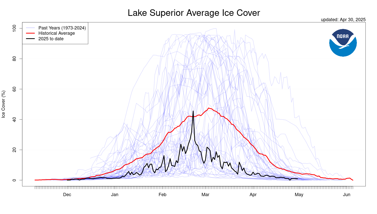
Today we build our own version from the data we just tidied.
Why “spaghetti plot”?
- Dozens of thin overlapping lines look like noodles
- Each line is one year’s whole ice season, Nov → May
- The pattern that emerges — or doesn’t — is the climate story
A good example of the same chart type showing up in published science.
Build the Spaghetti Plot
ice_spaghetti_plot <- ggplot() +
  geom_line(
    data = past_years,
    aes(x = plot_date, y = ice_cover, group = year),
    color = "blue",
    alpha = 0.15
  ) +
  geom_line(
    data = historical_avg,
    aes(x = plot_date, y = avg_ice),
    color = "red",
    linewidth = 1.2
  ) +
  geom_line(
    data = current_year_data,
    aes(x = plot_date, y = ice_cover),
    color = "black",
    linewidth = 1.2
  ) +
  scale_x_date(date_labels = "%b", date_breaks = "1 month") +
  labs(
    title = "Lake Superior Average Ice Cover",
    subtitle = paste("Comparing", current_yr,
                     "to Historical Data"),
    x = NULL,
    y = "Ice Cover (%)"
  ) +
  theme_bw()

ice_spaghetti_plot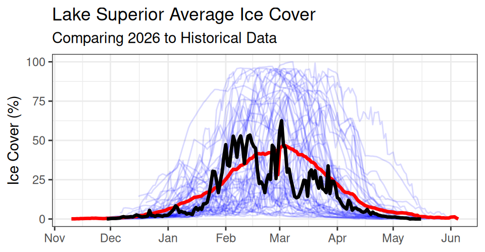
Three layers, three geom_line() calls:
- Thin blue — every past year, faded so patterns stand out
- Thick red — the 50+ year average
- Thick black — this year, drawn last so it sits on top
Compare it to NOAA’s published plot — did we recreate it?
A New Question: Is Maximum Ice Cover Changing?
Note
🔮 Predict first: Over 50+ years, is Lake Superior’s maximum winter ice cover declining, flat, or rising?
- New question: has each winter’s peak ice cover changed over 50 years?
# Find the single highest ice-cover day each year --------
max_ice_per_year <- ice_clean %>%
  group_by(year) %>%
  slice_max(order_by = ice_cover, n = 1, with_ties = FALSE)

head(max_ice_per_year %>% arrange(ice_cover))
# A tibble: 6 × 6
# Groups: year [6]
date year ice_cover calendar_year full_date month
<chr> <dbl> <dbl> <dbl> <date> <ord>
1 Jan-22 2012 8.2 2012 2012-01-22 Jan
2 Mar-17 2002 10.3 2002 2002-03-17 Mar
3 Jan-16 1998 11.1 1998 1998-01-16 Jan
4 Feb-19 2024 12 2024 2024-02-19 Feb
5 Jan-25 1987 14.5 1987 1987-01-25 Jan
6 Mar-02 2006 16.7 2006 2006-03-02 Mar slice_max() keeps only the single row with the highest value in each group — here, one row per year: the date and value of that winter’s ice peak.
This also gives us the “ice-on/ice-off” story:
- The date of each year’s maximum is itself meaningful — an early peak (Jan) vs. a late peak (Mar/Apr) tells you something about how long the ice season lasted
- 1998’s max ice cover was only ~11%, on Jan 16 — a nearly ice-free winter
- 1979’s max was ~97%, on Feb 25 — almost total coverage
Model the Trend in Maximum Ice Cover
Note
🔮 Predict first: Given the huge year-to-year scatter in Great Lakes ice, do you expect the slope’s p-value to be below or above 0.05? Predict before you read summary().
# Fit a regression: max ice cover by year ---------------
max_ice_model <- lm(ice_cover ~ year,
                    data = max_ice_per_year)

summary(max_ice_model)
Call:
lm(formula = ice_cover ~ year, data = max_ice_per_year)

Residuals:
    Min      1Q  Median      3Q     Max
-53.692 -24.810   3.811  20.982  48.599

Coefficients:
             Estimate Std. Error t value Pr(>|t|)
(Intercept) 1427.4557   498.1910   2.865  0.00600 **
year          -0.6841     0.2492  -2.746  0.00827 **
---
Signif. codes:  0 '***' 0.001 '**' 0.01 '*' 0.05 '.' 0.1 ' ' 1

Residual standard error: 28.54 on 52 degrees of freedom
Multiple R-squared:  0.1266,    Adjusted R-squared:  0.1098
F-statistic: 7.539 on 1 and 52 DF, p-value: 0.008274- Same
lm()as the Regression lecture, withX = yearandY = ice_cover - The slope = percentage points of max ice gained or lost per year
- Read the slope’s
Pr(>|t|)to decide if the trend is real
Plot the Trend
max_ice_plot <- max_ice_per_year %>%
  ggplot(aes(x = year, y = ice_cover)) +
  geom_point(size = 2) +
  geom_smooth(method = "lm", color = "firebrick") +
  labs(
    title = "Lake Superior — Annual Maximum Ice Cover",
    x = "Year",
    y = "Max Ice Cover (%)"
  ) +
  theme_minimal()

max_ice_plot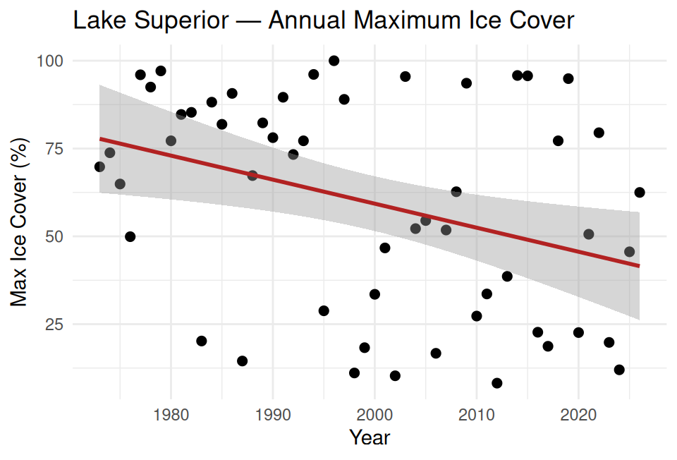
- Notice the huge year-to-year scatter
- Great Lakes ice is famously variable
- driven by short-term weather — ENSO, the polar vortex
- not just a steady climate trend
- This is real data
- the story is messier, and more honest, than a clean line
🛑 Pause — Do Activity Parts 7–9 Now
Build the spaghetti plot, pull each winter’s peak with slice_max(), and fit lm(ice_cover ~ year). Predict the trend’s direction and significance before you run it.
What We Learned Today
Concepts:
- Real data is often wide — shaped for human eyes, not for R
pivot_longer()collapses many columns into key-value pairs, unlockinggroup_by()andggplot()pivot_wider()does the reverse — builds a readable summary table from tidy data- Seasonal data that crosses the calendar year boundary needs careful date logic
slice_max()pulls out the single extreme value per group — useful for “ice-on/ice-off” type questions- The same
lm()workflow applies to any time-indexed variable
R skills:
read.table()+rownames_to_column()for messy text filespivot_longer()/pivot_wider()str_starts(),if_else(),ymd(),update()for date wranglingslice_max(order_by = ..., n = 1)
References:
- 📖 R4DS Ch. 5 — Data tidying
- 📖 R4DS Ch. 17 — Dates and times
- 📖 Data Carpentry — R for Ecologists
Data source:
- NOAA-GLERL Great Lakes Ice Cover Database
glerl.noaa.gov/data/ice
Up next — Extension (out of class):
- The same pivot workflow on a Great Lake of your choice
- Compare its maximum ice trend to Lake Superior’s