# Load all packages at the top ----------------------------
library(readxl)    # reading Excel files
library(tidyverse) # data manipulation + ggplot2
library(janitor)   # clean_names()
library(car) # Levene's testLecture 10 — T-Tests II: Two-Sample vs. Paired
Reading the output, the power of pairing, and rank-based tests
tidyverse
descriptive-stats
Reading and reporting t.test() output, then the sugar maple data: averaging pseudoreplicates, two-sample vs. paired t-tests (and why pairing adds power), and the rank-based partners Mann-Whitney U and Wilcoxon signed-rank.
Where we left off (Lecture 09 — T-Tests I)
- Five steps: hypotheses → normality → variance → run → report
- Normality: stacked histograms, box plot + QQ plot, Shapiro-Wilk
- Variance: Levene’s — we use Welch’s either way
- Leaf data: assumptions OK, ran Welch’s t-test — no significant difference
- Homework: checked the assumptions for the sugar maple leaves
Today we go back and ask a harder question: did we even have 53 leaves’ worth of information?
Note
✅ Key idea for today
The design of a study decides which test is right. The same numbers can give two very different answers depending on whether you respect how they were collected.
Goals for Today
- Read the
t.test()output and make a decision (steps 4–5) - Write a results sentence
- Run a two-sample and a paired t-test on our leaf data
- Spot pseudoreplication — and fix it with one
summarize()at the top, then rerun the same code - See how much the answer moves when you do
- Check the assumptions, then test the sugar maples the same way
- See why pairing adds power
- Plot a paired result
- Know the rank-based backups: Mann-Whitney U and Wilcoxon signed-rank
New tools today:
t.test(..., paired = TRUE)pivot_wider()— a sneak peekrow_number()— numbering rows within a groupscales::pvalue()— tidy p-values for plotswilcox.test()— rank-based tests
Reading:
- 📖 Whitlock & Schluter, Ch. 12 — Comparing two means
- 📖 Whitlock & Schluter, Ch. 13 — Handling violations of assumptions
Load Libraries and Data
# Load both data sets ------------------------------------
leaf_df <-
  read_excel("data/2026_09_03_data_sci_leaf_area.xlsx") %>%
  clean_names()

maple_df <-
  read_excel("data/2026_09_02_sugar_maple_leaf_area.xlsx") %>%
  clean_names()
🧩 Chunk 1 of 2 · The t-Test Code
We will cover: the t.test() code on the leaf data from last time — every line of the output, the decision, and a results sentence. Then we run the paired test on the same leaves, discover the data are pseudoreplicated, fix it with one summarize() at the top, and rerun the exact same code.
Step 4 — Run the Test (again)
# Welch's two-sample t-test on the leaf data ------------
leaf_model <- t.test(mass_g ~ shade, data = leaf_df,
                     var.equal = FALSE)
leaf_model
    Welch Two Sample t-test

data:  mass_g by shade
t = 0.35579, df = 42.527, p-value = 0.7238
alternative hypothesis: true difference in means between group shady and group sunny is not equal to 0
95 percent confidence interval:
 -0.08392774  0.11987117
sample estimates:
mean in group shady mean in group sunny
          0.5230357           0.5050640
Reading it top to bottom:
| Line | What it tells you |
|---|---|
t = |
gap between means ÷ noise |
df = |
degrees of freedom (Welch’s gives decimals — that’s normal) |
p-value = |
how often you’d see a gap this big if H₀ were true |
95 percent confidence interval |
plausible range for the true difference in means |
mean in group ... |
the two group means |
Step 5 — Make a Decision
The rule (set before the test): α = 0.05
| If… | Decision | Meaning |
|---|---|---|
| p < 0.05 | Reject H₀ | the means differ |
| p ≥ 0.05 | Fail to reject H₀ | no evidence the means differ |
Leaf data: p is far above 0.05 → fail to reject H₀.
The confidence interval tells the same story: it runs from below zero to above zero, so “no difference” is a plausible value.
Important
“Fail to reject” is not “proved equal.”
It means this sample did not give enough evidence of a difference. Maybe there is none — or maybe we had too few leaves, or too much noise, to see it.
Keep that second possibility in mind — it is the whole story of the next few slides.
Step 5 — Report It
# Pull the numbers for the sentence out of the model ----
tibble(
  t  = leaf_model$statistic,
  df = leaf_model$parameter,
  p  = leaf_model$p.value
)
# A tibble: 1 × 3
t df p
<dbl> <dbl> <dbl>
1 0.356 42.5 0.724leaf_model$statistic, $parameter, $p.value — the $ pulls one piece out of the result, so you never retype numbers by hand.
The template:
[Finding] (Welch’s t-test: t(df) = X.XX, p = X.XX).
Our leaves:
Mean leaf mass did not differ significantly between shady and sunny sides (Welch’s t-test: t(42.5) = 0.36, p = 0.72).
- Test name, t, df, and exact p
- Never write “p = 0.000” — write “p < 0.001”
- A non-significant result is still a result — report it plainly
Wait — Where Did These Leaves Come From?
# How many leaves did each team turn in? ----------------
leaf_df %>%
  count(teams, shade) %>%
  pivot_wider(names_from = shade,
              values_from = n)
# A tibble: 5 × 3
teams shady sunny
<chr> <int> <int>
1 12345 6 6
2 Oscar_Karl 6 6
3 fighting_mongooses 6 6
4 leaf_oglers 6 4
5 still_loading 4 3- 5 teams, not 53 independent leaves
- Each team went to one tree and picked leaves off the sunny side and the shady side of that tree
- So every team contributes a sunny and a shady value — the two sides are matched within a team
Two consequences. The data are paired, and they are pseudoreplicated. Let’s take them one at a time.
The Pairing Hiding in the Leaf Data
A paired test needs the two groups side by side in one row, so we reshape:
# Number the leaves within each team and side ----------
leaf_wide_df <- leaf_df %>%
  group_by(teams, shade) %>%
  mutate(leaf_n = row_number()) %>%
  ungroup() %>%
  select(teams, leaf_n, shade, mass_g) %>%
  pivot_wider(names_from = shade,
              values_from = mass_g) %>%
  mutate(diff = shady - sunny)

leaf_wide_df %>% head(4)
# A tibble: 4 × 5
teams leaf_n sunny shady diff
<chr> <int> <dbl> <dbl> <dbl>
1 12345 1 0.4 0.39 -0.0100
2 12345 2 0.48 0.45 -0.0300
3 12345 3 0.34 0.6 0.26
4 12345 4 0.65 0.57 -0.0800row_number()numbers the leaves 1, 2, 3… inside each team and sidepivot_wider()then puts the shady and sunny leaf with the same number in the same rowdiffis the shady − sunny gap for that row
Important
Look at what we just did. We paired shady leaf #1 with sunny leaf #1 because they happen to share a number. There is no reason those two leaves belong together — they’re just two leaves off the same tree.
Hold that thought.
Paired t-Test on Every Leaf
# Paired t-test on all the leaves ----------------------
leaf_paired_model <- t.test(leaf_wide_df$shady,
                            leaf_wide_df$sunny,
                            paired = TRUE)
leaf_paired_model
    Paired t-test

data:  leaf_wide_df$shady and leaf_wide_df$sunny
t = 0.58003, df = 24, p-value = 0.5673
alternative hypothesis: true mean difference is not equal to 0
95 percent confidence interval:
 -0.05746912  0.10239712
sample estimates:
mean difference
       0.022464
R ran it without complaint.
- It got p = 0.57 — no difference
df= 24, so it thinks it has 25 pairs of information
⚠️ Watch out! Two teams turned in uneven numbers of leaves (4 shady / 3 sunny). Those leftover leaves had no partner to pair with, so
t.test()silently dropped 3 of them. It never warns you.
R will answer any question you ask it — including a meaningless one. Our job is to ask the right one.
Problem: Pseudoreplication
The 6 shady leaves from team Oscar_Karl all came off one tree. They share that tree’s soil, water, light, age, and genetics. They are not independent — they are closer to one measurement taken six times.
Treating all 53 leaves as independent is pseudoreplication: it pretends we have far more information than we collected.
Count the real replicates. We did not sample 53 trees. We sampled 5.
| What the test used | What we actually have | |
|---|---|---|
| Two-sample | 28 + 25 leaves, df = 42.5 | 5 + 5 teams |
| Paired | 25 “pairs”, df = 24 | 5 pairs |
Important
Why this is serious. df drives the p-value. Inflate your df and every p-value you report is too small — you will claim differences that your data cannot support.
Here both tests said “no difference,” so nothing went wrong this time. That is luck, not method.
The fix is one line, and it is a line you already know: group_by() + summarize().
The Fix: One summarize() at the Top
Go back to where you loaded the data and add the averaging step to the end of the chain. Keep the same name, leaf_df, and the same column name, mass_g:
# Load the leaf data and average each team's side ------
leaf_df <-
  read_excel("data/2026_09_03_data_sci_leaf_area.xlsx") %>%
  clean_names() %>%
  group_by(teams, shade) %>%
  summarize(mass_g = mean(mass_g),
            .groups = "drop")

leaf_df
# A tibble: 10 × 3
teams shade mass_g
<chr> <chr> <dbl>
1 12345 shady 0.448
2 12345 sunny 0.428
3 Oscar_Karl shady 0.400
4 Oscar_Karl sunny 0.339
5 fighting_mongooses shady 0.653
6 fighting_mongooses sunny 0.544
7 leaf_oglers shady 0.588
8 leaf_oglers sunny 0.599
9 still_loading shady 0.526
10 still_loading sunny 0.789One value per team per side. 10 rows — 5 teams × 2 sides.
group_by(teams, shade)— two grouping columns, the pattern from Summary Statisticsmass_g = mean(mass_g)— reusing the name means every line of code below keeps working.groups = "drop"tidies up afterwards
Note
✅ This is how real analysis works. You don’t write a new script. You go back to the top, fix how the data are built, and rerun everything — because the code below never cared how many rows came in.
Rerun the Same Code
# Keep a copy of the pseudoreplicated results ----------
pseudo_2s     <- leaf_model
pseudo_paired <- leaf_paired_model

# Exactly the same two-sample code as before -----------
leaf_model <- t.test(mass_g ~ shade, data = leaf_df,
                     var.equal = FALSE)

# Exactly the same reshape + paired code as before -----
leaf_wide_df <- leaf_df %>%
  group_by(teams, shade) %>%
  mutate(leaf_n = row_number()) %>%
  ungroup() %>%
  select(teams, leaf_n, shade, mass_g) %>%
  pivot_wider(names_from = shade,
              values_from = mass_g) %>%
  mutate(diff = shady - sunny)

leaf_paired_model <- t.test(leaf_wide_df$shady,
                            leaf_wide_df$sunny,
                            paired = TRUE)

leaf_wide_df
# A tibble: 5 × 5
teams leaf_n shady sunny diff
<chr> <int> <dbl> <dbl> <dbl>
1 12345 1 0.448 0.428 0.0200
2 Oscar_Karl 1 0.400 0.339 0.0612
3 fighting_mongooses 1 0.653 0.544 0.110
4 leaf_oglers 1 0.588 0.599 -0.0102
5 still_loading 1 0.526 0.789 -0.263 Not one character of the test code changed. We only changed what leaf_df is — the two pseudo_ lines just park the old results so we can put them side by side in a moment.
- Each team now has a single row per side, so
row_number()is just 1 everywhere andpivot_wider()gives 5 clean pairs — one per team - Nothing gets silently dropped now
diffis finally a real quantity: this team’s shady side minus this team’s sunny side
Look at still_loading: a difference of −0.26 g, far bigger than anyone else’s.
Same Leaves, Four Answers
# Pull all four results out of the four models ---------
tibble(
  analysis = c("Two-sample, every leaf",
               "Paired, every leaf",
               "Two-sample, team means",
               "Paired, team means"),
  t  = c(pseudo_2s$statistic, pseudo_paired$statistic,
         leaf_model$statistic, leaf_paired_model$statistic),
  df = c(pseudo_2s$parameter, pseudo_paired$parameter,
         leaf_model$parameter, leaf_paired_model$parameter),
  p  = c(pseudo_2s$p.value, pseudo_paired$p.value,
         leaf_model$p.value, leaf_paired_model$p.value)
) %>%
  mutate(across(t:p, \(x) round(x, 3)))
# A tibble: 4 × 4
analysis t df p
<chr> <dbl> <dbl> <dbl>
1 Two-sample, every leaf 0.356 42.5 0.724
2 Paired, every leaf 0.58 24 0.567
3 Two-sample, team means -0.184 6.52 0.86
4 Paired, team means -0.254 4 0.812Two things to notice.
1. The df collapse. 42.5 → 6.5. We did not lose data; we stopped double-counting it.
2. The difference changes sign. Shady leaves looked heavier (+0.018 g) with every leaf, and lighter (−0.016 g) once we averaged.
Why? Teams turned in uneven numbers of leaves. A team with 6 shady leaves counted six times in the raw mean, a team with 4 counted four times. Averaging first gives every team one equal vote.
Important
Pseudoreplication does not just break your p-value — it can point the difference the wrong way.
→ ACTIVITY 10 Parts 1–6 now
🧩 Chunk 2 of 2 · The Maple Test
Same workflow, better data. We apply the same summarize() step to the sugar maple leaves, check the assumptions, run the two-sample and the paired t-test, see why pairing adds power, plot and report the paired result, and meet the rank-based backups.
The Sugar Maple Design
# How many leaves from each tree and side? --------------
maple_df %>%
  count(tree, side) %>%
  head(6)
# A tibble: 6 × 3
tree side n
<dbl> <chr> <int>
1 1 shady 2
2 1 sunny 2
3 2 shady 2
4 2 sunny 2
5 3 shady 2
6 3 sunny 2- 8 trees
- From each tree: 2 leaves from the sunny side and 2 from the shady side
- 32 leaves in total
In class we test leaf area (total_area_cm2). Your hand-in does the same for leaf mass.
Note
✅ Same structure as our leaf data — but designed on purpose.
Leaves inside a tree-side, so it needs the same summarize() step. The difference: it is perfectly balanced — exactly 2 leaves everywhere, 8 trees, nothing uneven and nothing missing.
So no team gets an unfair vote, and the pairing is real by design: both sides come off the same tree.
Step 1: The Same summarize(), One More Time
Two leaves off the sunny side of tree 3 share that tree’s soil, water, and light — not independent, exactly like our 6 leaves per team. So we start where we now always start: average up to the real replicate.
# Average the 2 leaves per tree and side ---------------
maple_tree_df <- maple_df %>%
  group_by(tree, side) %>%
  summarize(area = mean(total_area_cm2),
            .groups = "drop")
maple_tree_df %>% head(4)
# A tibble: 4 × 3
tree side area
<dbl> <chr> <dbl>
1 1 shady 136.
2 1 sunny 106.
3 2 shady 200.
4 2 sunny 159.32 leaves → 16 rows. The real replicate is the tree, so we get 8 shady values and 8 sunny values.
Note
✅ The habit, not the trick.
Ask this of every data set before you test it:
What is the thing I actually sampled, and is there exactly one row per one of those?
Here: 8 trees sampled, so 8 values per side. Same two-column group_by(), same summarize(), same .groups = "drop".
Because this design is balanced, averaging won’t flip anything the way it did for our leaves — every tree already had an equal say. Here averaging buys us something different: an honest df, and a clean shot at the pairing.
Two-Sample Test — Check the Assumptions First
Last lecture you checked all 32 leaves. We now test the tree means, so we check those:
# Normality of each side (tree means) -------------------
maple_tree_df %>%
  group_by(side) %>%
  summarize(shapiro_p = shapiro.test(area)$p.value)
# A tibble: 2 × 2
side shapiro_p
<chr> <dbl>
1 shady 0.338
2 sunny 0.316# Equal spread? -----------------------------------------
leveneTest(area ~ side, data = maple_tree_df)Levene's Test for Homogeneity of Variance (center = median)
Df F value Pr(>F)
group 1 0.4965 0.4926
14 A two-sample t-test needs:
- each group roughly normal → Shapiro p > 0.05 on both sides ✅
- (equal spread — Welch’s doesn’t need it, but good to know) → Levene p > 0.05 ✅
Decision: a two-sample t-test is OK. Now we run it.
Important
Check → decide → test. Never the other way round.
Two-Sample t-Test on the Tree Means
Note
🔮 Predict first: Shady trees average bigger leaves. With only 8 trees per side, will the two-sample test be significant?
# Welch's two-sample t-test on the 8 tree means -------
maple_2s_model <- t.test(area ~ side,
                         data = maple_tree_df,
                         var.equal = FALSE)
maple_2s_model
    Welch Two Sample t-test

data:  area by side
t = 2.2017, df = 13.426, p-value = 0.04573
alternative hypothesis: true difference in means between group shady and group sunny is not equal to 0
95 percent confidence interval:
  0.9668576 87.2303924
sample estimates:
mean in group shady mean in group sunny
           198.3656            154.2669
# Box plot of the tree means ---------------
maple_tree_df %>%
ggplot(aes(x = side, y = area)) +
geom_boxplot(outlier.shape = NA) +
geom_jitter(width = 0.1, size = 2) +
labs(x = "Side", y = "Mean leaf area (cm²)") +
theme_minimal()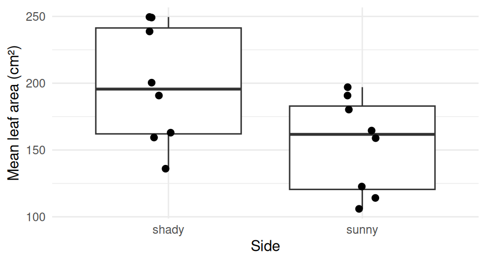
Just barely significant — p only just under 0.05. The boxes still overlap a lot; a couple of different trees and we would have missed it. Is this the best we can do?
The Pairing Is Hiding in Plain Sight
# One line per tree: sunny -> shady ----------------------
maple_tree_df %>%
  ggplot(aes(x = side, y = area, group = tree)) +
  geom_line() +
  geom_point(size = 2) +
  scale_x_discrete(limits = c("sunny", "shady")) +
  labs(x = "Side", y = "Mean leaf area (cm²)") +
  theme_minimal()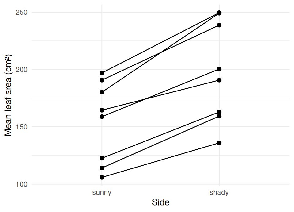
Same 16 numbers — but now each line is one tree.
Every line goes up. On every tree, the shady side has bigger leaves.
So why was the two-sample test such a close call?
- Some trees just have big leaves and some have small leaves
- That tree-to-tree difference is large compared with the shade effect
- The two-sample test lumps it all into the “noise” — and the signal nearly drowns
group = tree tells ggplot which points to join with a line. scale_x_discrete(limits = ) puts sunny on the left.
Paired Test — Step 1: One Row per Tree
A paired test compares the two sides within each tree, so tree-to-tree differences cancel out.
First, put each tree on one row with a sunny and a shady column, and compute the difference:
# One row per tree + the shady - sunny difference ------
maple_wide_df <- maple_tree_df %>%
  pivot_wider(names_from = side, values_from = area) %>%
  mutate(diff = shady - sunny)
maple_wide_df
# A tibble: 8 × 4
tree shady sunny diff
<dbl> <dbl> <dbl> <dbl>
1 1 136. 106. 30.1
2 2 200. 159. 41.5
3 3 250. 197. 52.5
4 4 191. 165. 26.2
5 5 249. 180. 68.9
6 6 239. 191. 48.0
7 7 159. 114. 45.2
8 8 163. 123. 40.3pivot_wider() is a sneak peek — you’ll learn it properly in the Pivoting lecture.
Before (maple_tree_df) — one row per tree and side (16 rows)
| tree | side | area |
|---|---|---|
| 1 | shady | … |
| 1 | sunny | … |
After (maple_wide_df) — one row per tree (8 rows)
| tree | shady | sunny | diff |
|---|---|---|---|
| 1 | … | … | … |
names_from = side→ the new column namesvalues_from = area→ what goes in them
Look at diff: every tree is positive.
Paired Test — Step 2: Check the Assumption First
# QQ plot of the 8 differences --------------------------
maple_wide_df %>%
  ggplot(aes(sample = diff)) +
  stat_qq() +
  stat_qq_line() +
  theme_minimal()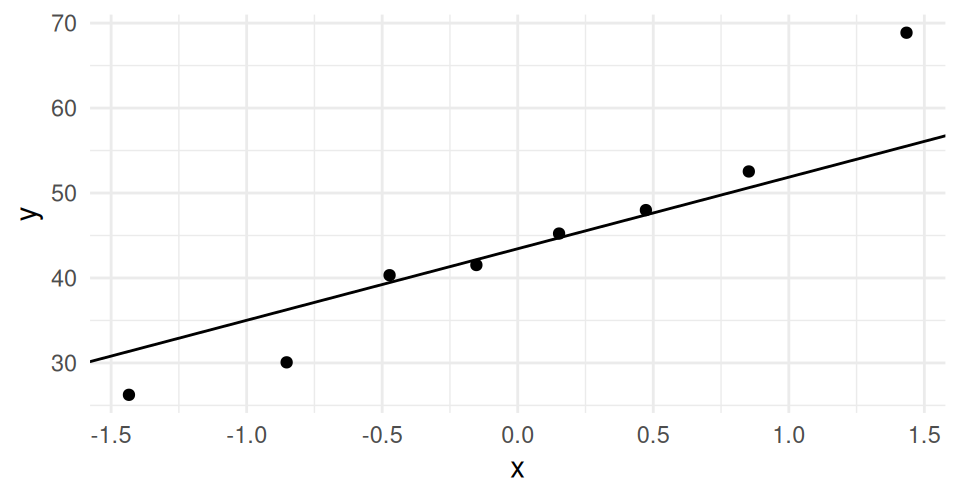
# Shapiro-Wilk on the differences -----------------------
shapiro.test(maple_wide_df$diff)
    Shapiro-Wilk normality test

data:  maple_wide_df$diff
W = 0.95881, p-value = 0.7987
A paired test needs the differences to be roughly normal — not each side.
- QQ plot: dots near the line ✅
- Shapiro-Wilk: p > 0.05 ✅
No Levene’s test — there is only one set of numbers (the differences), so there is no second spread to compare.
Decision: a paired t-test is OK. Now we run it.
Paired Test — Step 3: Run It
Note
🔮 Predict first: Every line went up. Will the paired p be bigger or smaller than the two-sample p?
# Paired t-test: shady vs. sunny on the SAME tree -------
maple_paired_model <- t.test(maple_wide_df$shady,
                             maple_wide_df$sunny,
                             paired = TRUE)
maple_paired_model
    Paired t-test

data:  maple_wide_df$shady and maple_wide_df$sunny
t = 9.3808, df = 7, p-value = 3.255e-05
alternative hypothesis: true mean difference is not equal to 0
95 percent confidence interval:
 32.98271 55.21454
sample estimates:
mean difference
       44.09862
Overwhelmingly significant — p is more than a thousand times smaller. Same trees, same numbers.
paired = TRUEmatches row 1 with row 1, row 2 with row 2 …- The order sets the sign: shady − sunny. Positive = shady is bigger.
mean difference= the average of thediffcolumn- df = 7 — 8 trees → 8 differences → 8 − 1
Warning
⚠️ Why not area ~ side here?
R does not allow paired = TRUE with a formula. That’s why we made the wide table first.
Same Data, Two Answers — Why Pairing Adds Power
# Put the two results side by side ---------------------
tibble(
  test = c("Two-sample (Welch)", "Paired"),
  t    = c(maple_2s_model$statistic,
           maple_paired_model$statistic),
  df   = c(maple_2s_model$parameter,
           maple_paired_model$parameter),
  p    = c(maple_2s_model$p.value,
           maple_paired_model$p.value)
)
# A tibble: 2 × 4
test t df p
<chr> <dbl> <dbl> <dbl>
1 Two-sample (Welch) 2.20 13.4 0.0457
2 Paired 9.38 7 0.0000326Same 16 numbers. Same difference in means.
- Two-sample: noise = tree-to-tree variation plus the shade effect’s wobble → big noise, small t
- Paired: subtracting within each tree removes its size, soil, water, age → small noise, big t
The paired test even has fewer df (7 vs. about 13) — and still wins easily, because the noise it removed mattered far more.
Important
The design picks the test. Both sides were measured on the same tree, so the data are paired. The two-sample test answers a question our design never asked.
When Is Data Paired?
| Paired ✅ | Not paired (two-sample) ❌ |
|---|---|
| Sunny and shady side of the same tree | Sunny leaves from some trees, shady from other trees |
| Before and after on the same fish | Fish from two different lakes |
| Left and right leg of the same person | Two groups of different people |
| Twins split between two treatments | Randomly assigned to two groups |
Ask: does each value in group 1 have a natural partner in group 2? If yes → paired.
Our class leaf data — each team sampled both sides of their own tree, so those data are paired too. That is why the paired test was the honest one there as well, once we had averaged each team’s side down to one value.
Plotting a Paired Result — Build the Label
# Label with the paired test result ----------------------
paired_label <- paste0(
  "Paired t-test: t = ",
  round(maple_paired_model$statistic, 2),
  ", df = ", maple_paired_model$parameter, ", ",
  scales::pvalue(maple_paired_model$p.value,
                 add_p = TRUE)
)
paired_label
[1] "Paired t-test: t = 9.38, df = 7, p<0.001"We’ll put the test result on the figure, pulled straight from the model — no retyping numbers.
paste0()glues text and numbers into one piece of textmaple_paired_model$statistic→ t,$parameter→ dfscales::pvalue(..., add_p = TRUE)writes “p<0.001” instead of an ugly3.3e-05
Plotting a Paired Result — the Figure
# Each tree in grey + mean ± SE in color -----------------
maple_results_plot <- maple_tree_df %>%
  ggplot(aes(x = side, y = area)) +
  geom_line(aes(group = tree), color = "grey70") +
  geom_point(color = "grey70") +
  stat_summary(fun.data = mean_se, geom = "errorbar",
               width = 0.1, color = "darkgreen") +
  stat_summary(fun = mean, geom = "point",
               size = 4, color = "darkgreen") +
  scale_x_discrete(limits = c("sunny", "shady")) +
  labs(x = "Side of tree",
       y = "Mean leaf area (cm²)",
       subtitle = paired_label) +
  theme_minimal()
maple_results_plot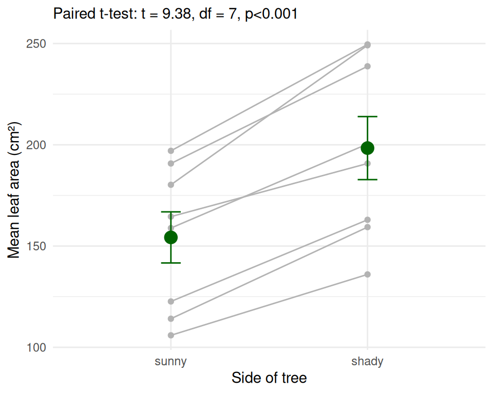
A box plot hides the pairing. This shows both: grey lines — every tree’s rise; green mean ± SE — the overall answer. aes(group = tree) sits only in geom_line(), so the green layers average over all trees.
Save the Figure
# Save the results plot ---------------------------------
ggsave("figures/maple_paired_plot.png",
       plot = maple_results_plot,
width = 5, height = 4, dpi = 300)- Goes into your
figures/folder dpi = 300is publication quality- The subtitle updates itself if the data change
Reporting a Paired Result
The template:
[Finding] (paired t-test: t(df) = X.XX, p = X.XXX; mean difference = X.X units).
Our sugar maples:
Shady-side leaves were significantly larger than sunny-side leaves on the same tree (paired t-test: t(7) = 9.38, p < 0.001; mean difference = 44.1 cm²).
For the two-sample version, the test name changes and there’s no “mean difference” — give the two means instead.
Where each number comes from:
| In the sentence | In the output |
|---|---|
| t(7) | t = and df = |
| p < 0.001 | p-value = (tiny) |
| mean difference | mean difference at the bottom |
Always say which test — “t-test” alone doesn’t tell the reader whether the data were paired.
Backup Plan: Rank-Based Tests
When the QQ plot and Shapiro-Wilk say the data are clearly not normal, use a test on ranks instead — the smallest value becomes 1, the next 2, and so on.
# Mann-Whitney U: two-sample partner --------------------
wilcox.test(area ~ side, data = maple_tree_df)
    Wilcoxon rank sum exact test

data:  area by side
W = 50, p-value = 0.06496
alternative hypothesis: true location shift is not equal to 0
# Wilcoxon signed-rank: paired partner ------------------
wilcox.test(maple_wide_df$shady, maple_wide_df$sunny,
paired = TRUE)
    Wilcoxon signed rank exact test

data:  maple_wide_df$shady and maple_wide_df$sunny
V = 36, p-value = 0.007813
alternative hypothesis: true location shift is not equal to 0- Ranks ignore how far apart values are — an outlier is just “the biggest”
- No normality needed
- R calls both
wilcox.test(); the statistic is W or V, not t
Look what happened:
- Mann-Whitney just misses (p a little above 0.05) where the two-sample t-test just made it — the power you give up by using ranks
- Signed-rank still finds the effect. V = 36 is the biggest possible for 8 trees — every tree went the same way
Choosing a Test
| Data roughly normal | Data clearly not normal | |
|---|---|---|
| Two independent groups | Welch’s two-sample t-test | Mann-Whitney U |
| Paired (natural partners) | Paired t-test | Wilcoxon signed-rank |
- Design first: paired or independent?
- Check the assumptions: each group (two-sample) or the differences (paired)
- Then run the test you chose — and say why in your report
Tip
Normal enough? Use the t-test. It uses the actual measurements, so it has more power. Rank tests are the backup, not the default.
→ ACTIVITY 10 Parts 7–12, then Part B
What We Learned Today
- Read
t.test()output: t, df, p, CI, means → decide → report - Pseudoreplication: many leaves from one tree-side are not many data points — they inflate
df, and with uneven sampling they can flip the difference’s sign - The fix is one
summarize()at the top — sameleaf_df, samemass_g, rerun everything below unchanged - Check → decide → test: each group for two-sample, the differences for paired
- Paired vs. two-sample: the design decides — pairing removes tree-to-tree noise
- Show it: lines per tree + mean ± SE, with the test in the subtitle
- Backup: Mann-Whitney U (two-sample), Wilcoxon signed-rank (paired)
R skills:
t.test(y ~ group, data, var.equal = FALSE)t.test(a, b, paired = TRUE)group_by(id, group) %>% summarize()— kill pseudoreplicationpivot_wider(names_from, values_from)geom_line(aes(group = tree))wilcox.test()
Up next — Lecture 11: linear regression