# Load all packages at the top of every script ----------
library(tidyverse)      # data wrangling + ggplot2
library(palmerpenguins) # penguins data, Palmer Station LTERLecture 04 — GGPlot II
New data, safe zooming, distributions, themes, and patchwork
ggplot
tidyverse
Practicing the plots you already know on a brand-new dataset, zooming safely with coord_cartesian() vs. the ylim()/scale_y_continuous(limits=) trap, histograms and density plots, a reusable custom theme file, and combining panels with patchwork.
Where we left off (Lecture 03 — GGPlot I)
- Piping straight into a plot:
leaf_df %>% ggplot(...) scale_color_manual()/scale_fill_manual()— colors you choosefacet_wrap()andfacet_grid()— one panel per groupstat_summary()— mean and mean ± SE, drawn from raw data
Note
✅ Key idea from Lecture 03
You already know how to build a grouped, colored, faceted figure — but only on leaf_df. Today’s real test: can you do it on data you’ve never seen before?
Goals for Today
- Practice your plotting skills on a brand-new dataset, and see where you’d find one yourself
- Zoom into a plot without silently dropping data —
coord_cartesian() - Build a histogram and a density plot — two views of one distribution
- Apply a reusable theme file, and combine panels with
patchwork
Tip
🖐 Try it yourself
By the end you will recognize the single most common ggplot mistake — zooming with ylim() / scale_y_continuous(limits = ) — before you ever make it yourself.
References:
- 📖 Whitlock & Schluter, Ch. 2 — Displaying Data
- 📖 R4DS Ch 1 — Data Visualization
Both PDFs are in the course readings/ folder.
How to Use These Slides — Predict · Type · Run
This lecture runs in five short chunks. After each chunk you switch to the activity and type the code yourself into your R script.
Note
✅ Why bother?
ylim() and coord_cartesian() produce plots that look identical for a simple scatter — the difference only shows up once you compute something (a boxplot, a smooth). Typing both yourself and comparing outputs is the only way this sticks.
🧩 Chunk 1 of 5 · New Data, Same Skills
We will cover: loading palmerpenguins, and rebuilding the two plot types you already know on data you’ve never seen.
A Dataset You Didn’t Collect
# palmerpenguins ships the data already clean -----------
penguins_df <- penguins %>%
  drop_na(species, bill_length_mm, bill_depth_mm,
          flipper_length_mm, body_mass_g)

glimpse(penguins_df)
Rows: 342
Columns: 8
$ species <fct> Adelie, Adelie, Adelie, Adelie, Adeli…
$ island <fct> Torgersen, Torgersen, Torgersen, Torg…
$ bill_length_mm <dbl> 39.1, 39.5, 40.3, 36.7, 39.3, 38.9, 3…
$ bill_depth_mm <dbl> 18.7, 17.4, 18.0, 19.3, 20.6, 17.8, 1…
$ flipper_length_mm <int> 181, 186, 195, 193, 190, 181, 195, 19…
$ body_mass_g <int> 3750, 3800, 3250, 3450, 3650, 3625, 4…
$ sex <fct> male, female, female, female, male, f…
$ year <int> 2007, 2007, 2007, 2007, 2007, 2007, 2…penguinscomes inside the package — noread_excel()needed, justlibrary(palmerpenguins)- 344 penguins, 3 species, Palmer Station, Antarctica
drop_na()removes the handful of rows missing a measurement — same idea as theNAs inleaf_df
The Same Simple XY Plot — On New Data
Note
🔮 Predict first: longer flippers, heavier birds. Will the three species separate into three clouds, or overlap into one?
# The exact same recipe you used on leaf_df ------------
penguins_df %>%
  ggplot(aes(x = flipper_length_mm, y = body_mass_g,
             color = species)) +
  geom_point(alpha = 0.7, size = 2) +
  labs(title = "Body Mass vs. Flipper Length",
       x = "Flipper Length (mm)", y = "Body Mass (g)",
       color = "Species") +
  theme_minimal()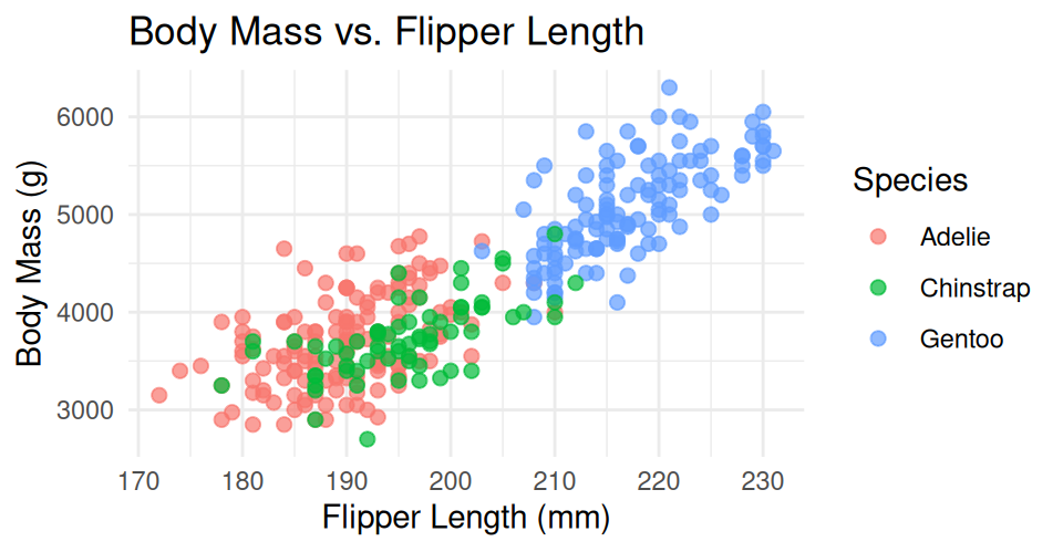
- Same
aes()+geom_point()+labs()+theme_minimal()you already typed for leaves - The dataset changed, the recipe didn’t — that’s the point
- Nothing here is new syntax; it’s proof you can already do this on any data
The Same Simple Categorical Plot — On New Data
# boxplot + jitter, exactly like the leaf_df pattern ---
penguins_df %>%
  ggplot(aes(x = species, y = body_mass_g, fill = species)) +
  geom_boxplot(alpha = 0.6, outlier.shape = NA) +
  geom_jitter(width = 0.15, alpha = 0.4) +
  labs(x = "Species", y = "Body Mass (g)",
       title = "Body Mass by Species") +
  theme_minimal() +
  theme(legend.position = "none")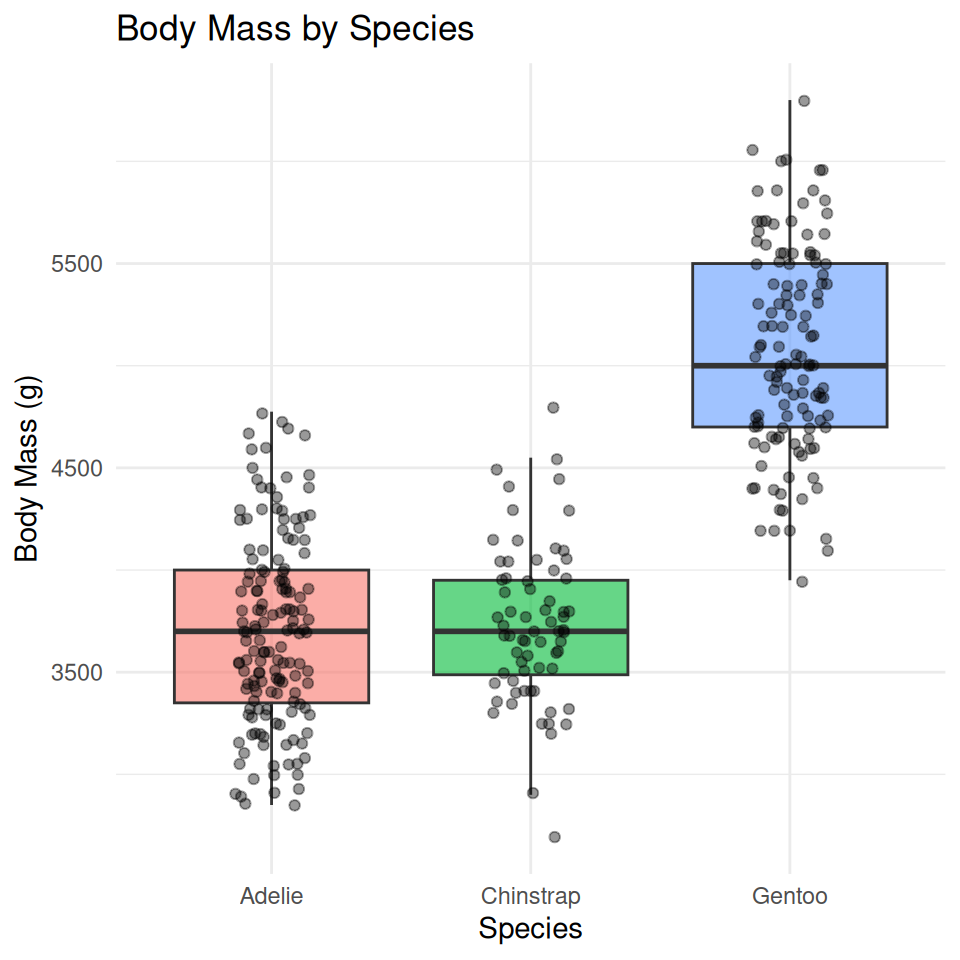
Tip
💡 Where would you find a dataset like this on your own?
library(palmerpenguins)orlibrary(FSA)(fish data, Derek Ogle) — real data bundled inside an R package, zero downloading- Kaggle — search “UFO sightings” or Kaggle — search “Bigfoot sightings” — download a
.csv, load it withread_csv()like any other file
Both a simple XY numeric plot and a simple categorical plot (like today’s two) work on almost any tidy dataset you find.
→ ACTIVITY 4 Parts 1–2 now
🧩 Chunk 2 of 5 · Zooming In Safely
We will cover: coord_cartesian() to zoom — and the ylim() / scale_y_continuous(limits = ) trap to avoid.
coord_cartesian() — Zoom the View, Keep the Data
# coord_cartesian() zooms the VIEW, keeps all the data -
penguins_df %>%
  ggplot(aes(x = species, y = body_mass_g, fill = species)) +
  geom_boxplot(alpha = 0.6, outlier.shape = NA) +
  coord_cartesian(ylim = c(3000, 5000)) +
  labs(x = "Species", y = "Body Mass (g)",
       title = "Zoomed with coord_cartesian()") +
  theme_minimal() +
  theme(legend.position = "none")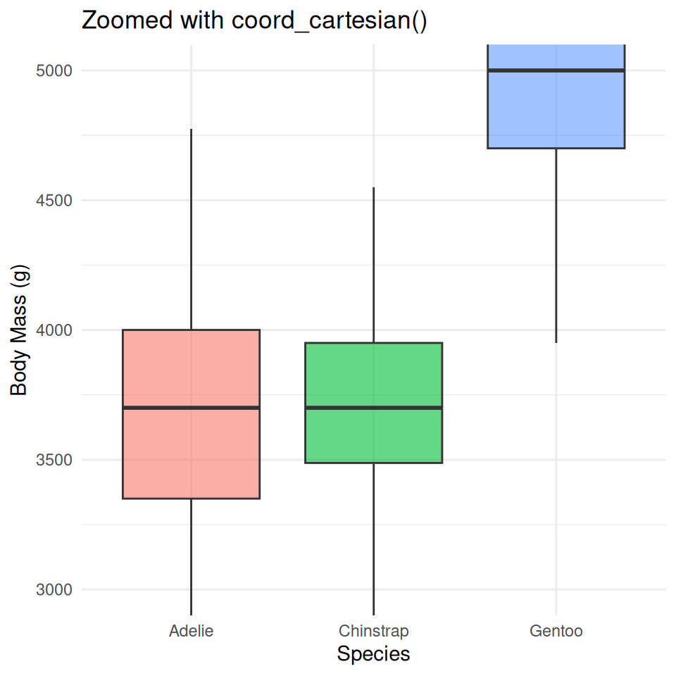
- Zooms the view — every penguin still contributes to each box’s median and quartiles
- The window just crops what you can see afterward
- This is the one to reach for whenever you just want a closer look
The Trap — ylim() / scale_y_continuous(limits = ) Delete Rows First
Note
🔮 Predict first: Many Gentoos sit above 5000 g. If we drop every penguin outside 3000–5000 g before drawing the boxes, what happens to the Gentoo box?
# ylim() DELETES rows outside the range first ----------
penguins_df %>%
  ggplot(aes(x = species, y = body_mass_g, fill = species)) +
  geom_boxplot(alpha = 0.6, outlier.shape = NA) +
  ylim(3000, 5000) +
  labs(x = "Species", y = "Body Mass (g)",
       title = "ylim() — boxes recomputed on fewer penguins") +
  theme_minimal() +
  theme(legend.position = "none")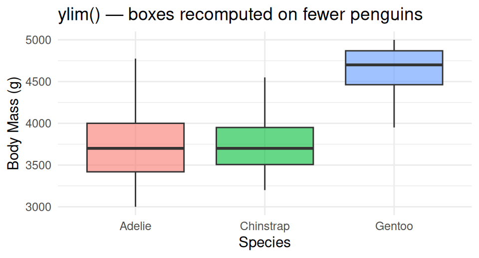
Warning
⚠️ Watch out!
ylim() — and scale_y_continuous(limits = ...) — silently delete every row outside the range before anything is computed. Compare the Gentoo box to the coord_cartesian() version: same window, different box.
Rule: zoom with coord_cartesian(). Only use ylim() / scale_y_continuous(limits = ) when you actually want those rows gone from the analysis.
→ ACTIVITY 4 Part 3 now
🧩 Chunk 3 of 5 · Two Views of One Distribution
We will cover: geom_histogram() and geom_density() — the two standard ways to show how one numeric variable is distributed.
geom_histogram() — Bars of Counts
# geom_histogram() bins the data and counts rows per bin
penguins_df %>%
  ggplot(aes(x = body_mass_g)) +
  geom_histogram(binwidth = 200, fill = "steelblue",
                 color = "white") +
  labs(x = "Body Mass (g)", y = "Count",
       title = "Distribution of Body Mass") +
  theme_minimal()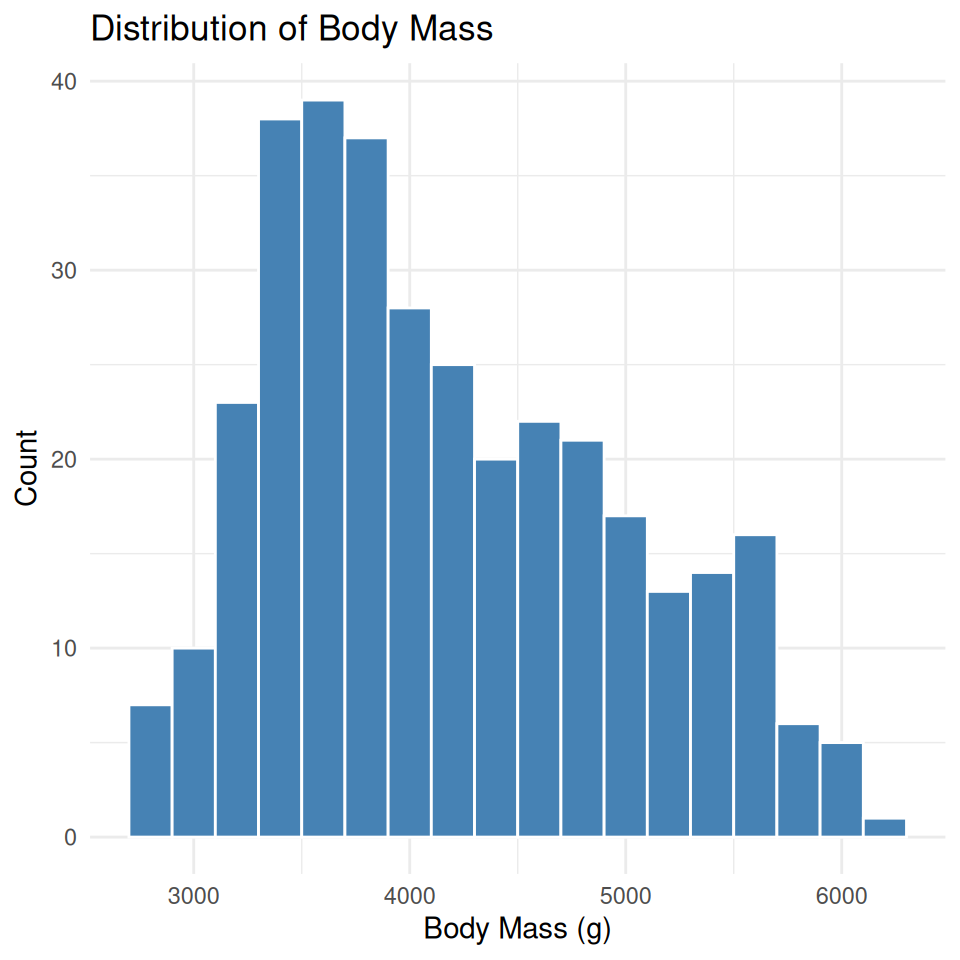
binwidthsets the width of each bar in the units ofx— here, 200 g per bin- Too narrow → noisy, spiky bars. Too wide → real structure gets smoothed away
- Try a few
binwidthvalues before settling on one
geom_density() — a Smooth Curve Instead of Bars
# geom_density() smooths the same shape into a curve ---
penguins_df %>%
  ggplot(aes(x = body_mass_g)) +
  geom_density(fill = "steelblue", alpha = 0.5) +
  labs(x = "Body Mass (g)", y = "Density",
       title = "Density of Body Mass") +
  theme_minimal()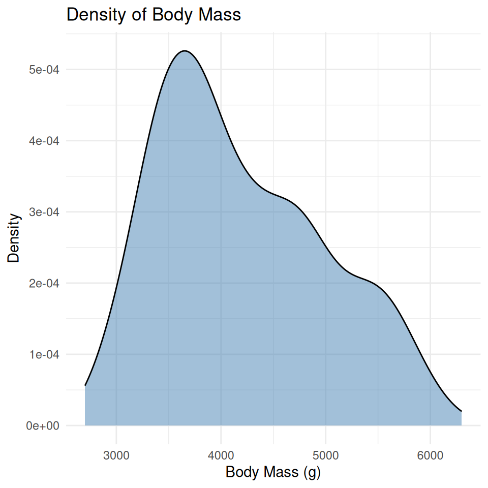
- Same variable, same shape — a density curve is a smoothed histogram, area under the curve sums to 1
- The y-axis is no longer a count — it’s a density, which is why the numbers look small
- 📖 Whitlock & Schluter, Ch. 2 — Displaying Data
Tip
Coming soon: in the Summary Statistics lecture we’ll come back to this exact curve and shade in the 95% range underneath it. Today, just get comfortable building both plot types.
→ ACTIVITY 4 Part 4 now
🧩 Chunk 4 of 5 · A Reusable Theme File
We will cover: sourcing a custom theme file and applying it — no need to build one from scratch today.
source() a Theme File Instead of Repeating theme()
# source() loads functions from another .R file -------
source("themes/r_themes_for_3_sizes.R")

penguins_df %>%
  ggplot(aes(x = species, y = body_mass_g, fill = species)) +
  geom_boxplot(alpha = 0.6, outlier.shape = NA) +
  labs(x = "Species", y = "Body Mass (g)",
       title = "Body Mass by Species") +
  theme_regular() +
  theme(legend.position = "none")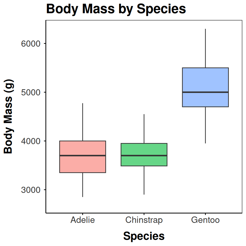
source("themes/r_themes_for_3_sizes.R")runs that file once and loadstheme_small(),theme_regular(),theme_large()into your session- You don’t need to understand every line inside the file today — just how to call it
- Pick the size that matches where the figure is going: slides/report →
theme_regular()
Tweaking Fonts and Colors on Top
# theme() and scale_fill_manual() still work as usual --
penguins_df %>%
  ggplot(aes(x = species, y = body_mass_g, fill = species)) +
  geom_boxplot(alpha = 0.6, outlier.shape = NA) +
  scale_fill_manual(values = c(
    "Adelie" = "darkorange", "Chinstrap" = "purple",
    "Gentoo" = "cyan4"
  )) +
  labs(x = "Species", y = "Body Mass (g)",
       title = "Body Mass by Species") +
  theme_regular() +
  theme(
    legend.position = "none",
    plot.title = element_text(size = rel(1.4), face = "bold")
  )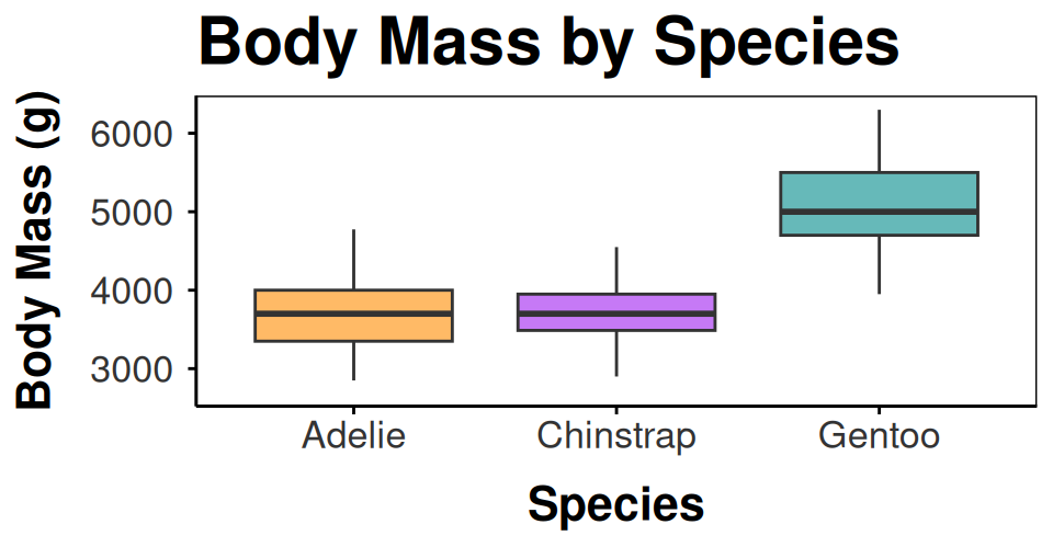
- A sourced theme is just a
theme()call —+ theme(...)after it overrides single pieces scale_fill_manual()still controls colors; the theme controls fonts, lines, margins
Note
✅ Key idea: one theme file sourced at the top of every script keeps a project consistent — change it once, every plot updates.
→ ACTIVITY 4 Part 5 now
🧩 Chunk 5 of 5 · Combining Panels with patchwork
We will cover: patchwork — putting two ggplot objects side by side as one figure.
patchwork — Two Plots, One Figure
library(patchwork) # combine ggplot objects with + and /

xy_plot <- penguins_df %>%
  ggplot(aes(x = flipper_length_mm, y = body_mass_g,
             color = species)) +
  geom_point(alpha = 0.7) +
  labs(x = "Flipper Length (mm)", y = "Body Mass (g)",
       color = "Species") +
  theme_regular()

box_plot <- penguins_df %>%
  ggplot(aes(x = species, y = body_mass_g, fill = species)) +
  geom_boxplot(alpha = 0.6, outlier.shape = NA) +
  labs(x = "Species", y = "Body Mass (g)") +
  theme_regular() +
  theme(legend.position = "none")

xy_plot + box_plot +
  plot_annotation(
    title = "Penguin Body Mass, Two Ways",
    tag_levels = "A"
  )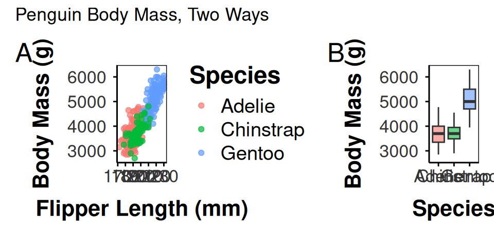
- Each panel is an ordinary saved ggplot object — build them separately first
+places two plots side by side;/stacks themplot_annotation()adds one title and A/B/C tags across the whole figure
→ ACTIVITY 4 Part 6 now
What We Learned Today
- The XY-scatter / boxplot+jitter recipe you already know works on any tidy dataset —
palmerpenguins,FSA, or a.csvfrom Kaggle coord_cartesian()zooms safely;ylim()/scale_y_continuous(limits = )silently deletes rows firstgeom_histogram()andgeom_density()— two views of one distributionsource()a theme file once, then calltheme_regular()(or_small()/_large()) everywherepatchwork(+//) combines saved plots;plot_annotation()titles and tags the whole figure
References:
- 📖 Whitlock & Schluter, Ch. 2 — Displaying Data
- 📖 R4DS Ch 1 — Data Visualization
Up next — Lecture 05, Wrangling:
filter(),select(),mutate(),arrange()- Chaining verbs into one pipeline